
Content Modeling
Every content object in CrafterCMS is an object associated with a Content Model. Content Models allow you to add structure to your content and facilitate consumption via various visual representations or via APIs. One of the great things about CrafterCMS content models is that your content can be semi-structured which allows content authors the freedom to be as creative as they’d like to be, but provide the template/UI and API developers enough structure to produce solid multi-channel renditions of the content. This section will walk you through Content Type management in Crafter Studio to help you create the models that best fit your requirements.
Content Types in Crafter Studio
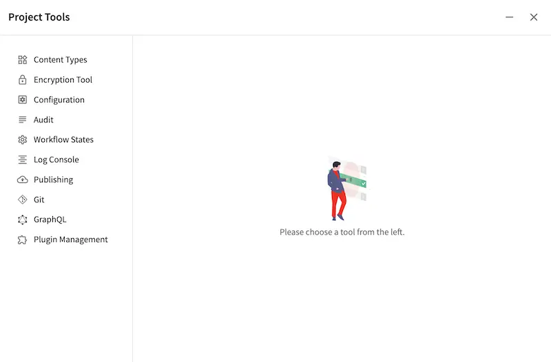
Content Type Management in Crafter Studio is located in the  .
.
Content Types are limited to two core types: Pages and Components. Both are made up of three ingredients:
Model: The content pieces that will be captured from the content authors for the page or component
View: The view template that will render the content, typically to HTML markup (for Templated, not Headless, projects)
Controller: The controller that handles the incoming request for the page or component
Pages
Pages are top-level container types. Pages hold content, and optionally components. Content within pages is made up of various types, for example content can be a date, an image, or a rich text field.
Components
Components only differ from pages in that they can’t render by themselves, instead, they must render within a container page or another component.
When to model as a page vs component
Model content as a component for meaningful chunks of content, say content containing all things about our “Our Team”, or say, content containing all things for a header or footer.
Model content as a page for content made up of various texts, images, components, etc.
Content Type Model Definition
Content models are defined via Crafter Studio’s graphical modeling tool under Content Types:
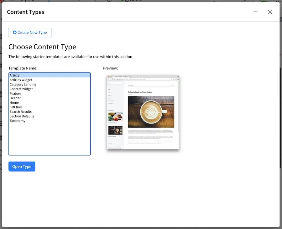
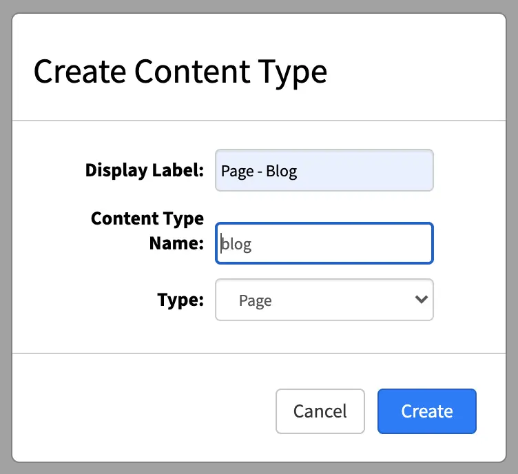
You can now either create a new content type or open an existing type. Creating a new content type brings up a dialog that requests some basic content type information.
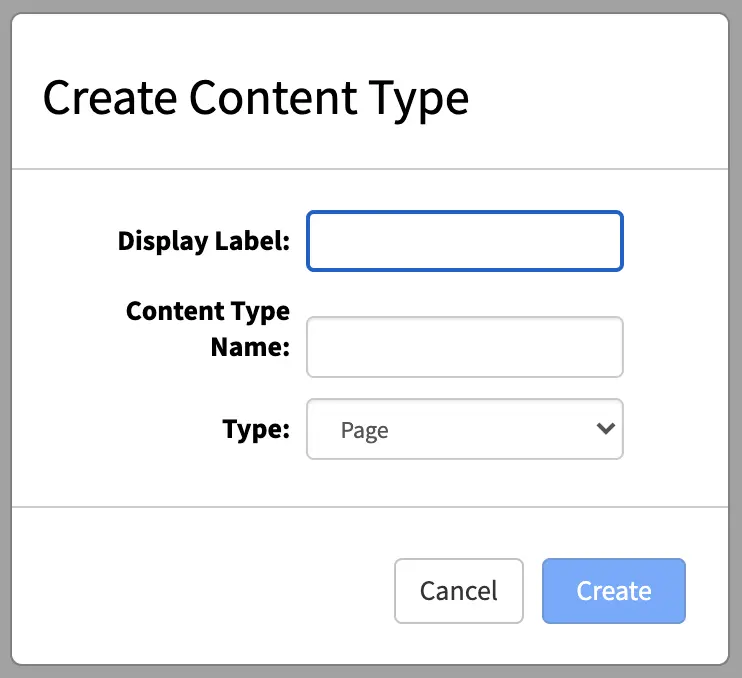
You now specify:
Display Label: The name of your new content type as you’ll see it in Crafter Studio.
Content Type Name: The low-level system name of your content type, this field will be automatically generated for you. Modify this only if you know what you’re doing.
Type: Choose if you’re defining a Page or a Component.
Form Builder Basics
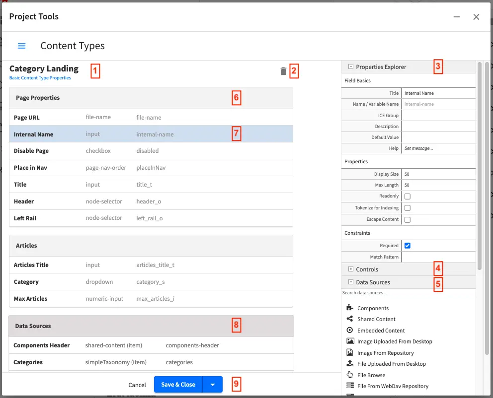
Crafter Studio’s Form Builder
Label
|
Description
|
1
|
Form Builder: The beginning of the form builder and it’s headed by the name of the
currently open Content Type.
Click here to explore the global properties of the type in the Properties Explorer,
#3.
|
2
|
Delete Icon: Deletes the current content type
|
3
|
Properties Explorer: Helps configure the properties of the currently
selected item. Clicking on an item on the left side of the screen,
like #2 or #7 will populate this control and allow you to modify
the selected item.
|
4
|
Form Controls: This is a list of available form controls for you to build your own
form with. Note that the list can be expanded or collapsed and a search can also be
performed instead of scrolling through the list.
Controls can be dragged from the controls list onto the form builder.
|
5
|
Data Sources: Shows the list of available data sources that can be attached to this
content type such that the content authors can pull content and incorporate it into
pages or components. Data Sources can be dragged over to the form builder
and configured as needed.
The content author will then use the control to pull data from that data source into
the content object.
|
6
|
Form Section: Form sections help cluster a number of controls together to make it
easier for content authors. Click on the form section to edit its properties in
the Properties Explorer.
|
7
|
Form Canvas: Actual controls that have been placed on this form.
Clicking on a control will allow you to configure this control in the Properties
Explorer.
|
8
|
Data Source: The data sources configured for this content type.
To configure a data source, click on it and then edit the properties
in the Properties Explorer.
|
9
|
Save or Cancel the changes to the Content Type.
|
Properties of Content Types
Let’s select the content type itself, by clicking on the content type name at the top of the Form Builder and explore its properties.
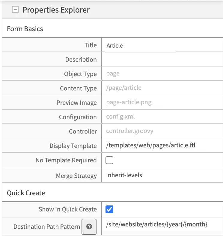
The fields available at this level are:
Field
|
Description
|
Title
|
Content Type’s friendly name
|
Description
|
Description of the Content Type
|
Object Type
|
Page or Component (read only)
|
Content Type
|
System name and path of this content type (read only)
|
Preview
Image
|
|
Configuration
|
Contains config.xml which holds information about the content type such as the
limit where content can be created, is it previewable, etc.
|
Controller
|
Contains controller.groovy which provides an extension/hook to authoring
lifecycle events.
|
Display
Template
|
View template to use when rendering this content
|
Merge
Strategy
|
The inheritance pattern to use with content of this type, please see Content
Inheritance for more detail on this feature Content Inheritance
|
Show in Quick
Create
|
Show this content type in the quick create menu from the context nav
|
Destination
Path Pattern
|
Path pattern where the content created from quick create will be stored.
The patterns available are the following:
{objectId} Inserts a GUID.
{year} Inserts the current year (4 digit year).
{month} Inserts the current month (2-digit month of the year).
{yyyy} Inserts the current year (4 digit year).
{mm} Inserts the current month (2-digit month of the year).
{dd} Inserts the current day (2-digit day of the month).
|
The 2 key properties are: the display template (Content Type View Templates) which is the HTML template that renders the final Web page; the content inheritance (Content Inheritance) which determines how this content type will inherit from parent XML files in the system.
Content Creation Permissions
Limiting where a content type can be created is through the Configuration Property of a content type (config.xml) using the following tags:
1<paths>
2  <includes>
3    <pattern>REG_EXP_HERE</pattern>
4  </includes>
5</paths>
OR
1<paths>
2  <excludes>
3    <pattern>REG_EXP_HERE</pattern>
4  </excludes>
5</paths>
You can only use one of either include or exclude. Use Include when you need to whitelist places, use exclude when you need to blacklist.
We’ll look at an example of limiting where you can create content from the Website_Editorial blueprint that comes out of the box.
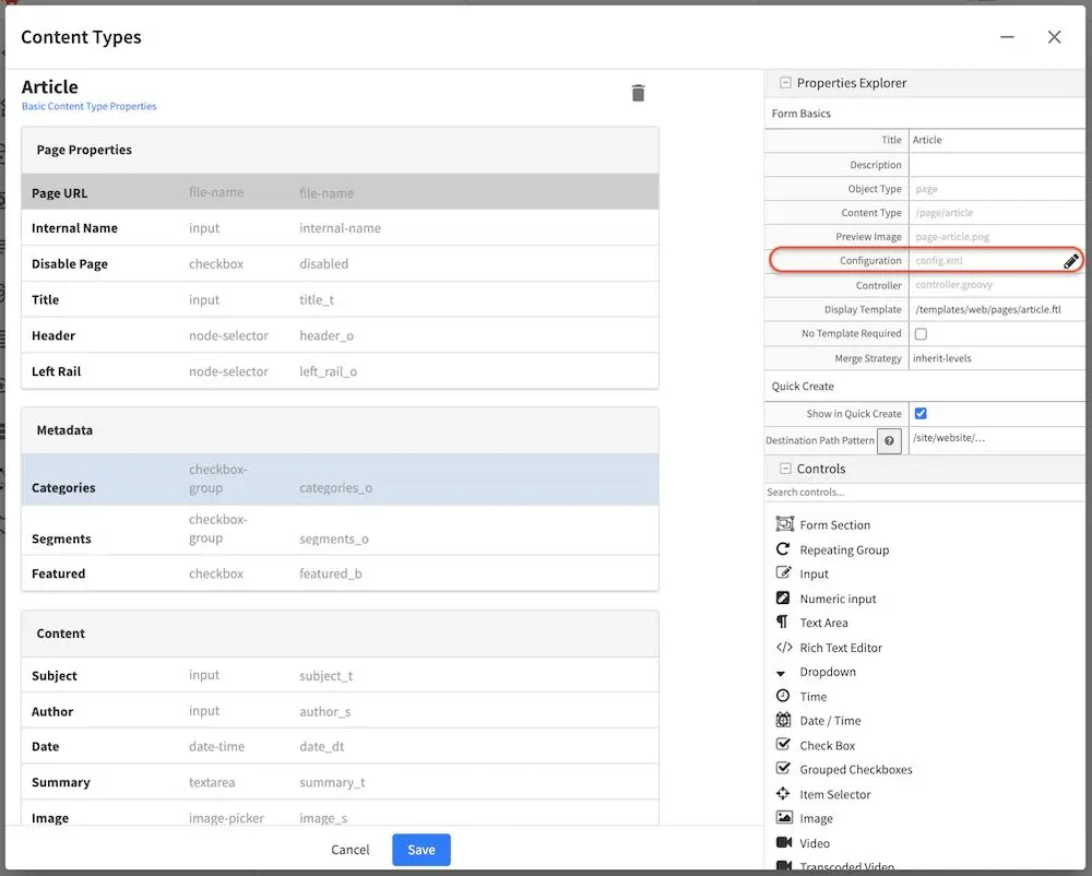
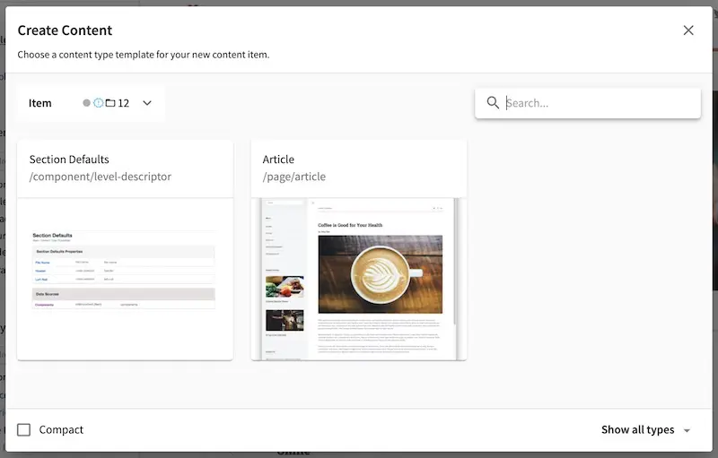
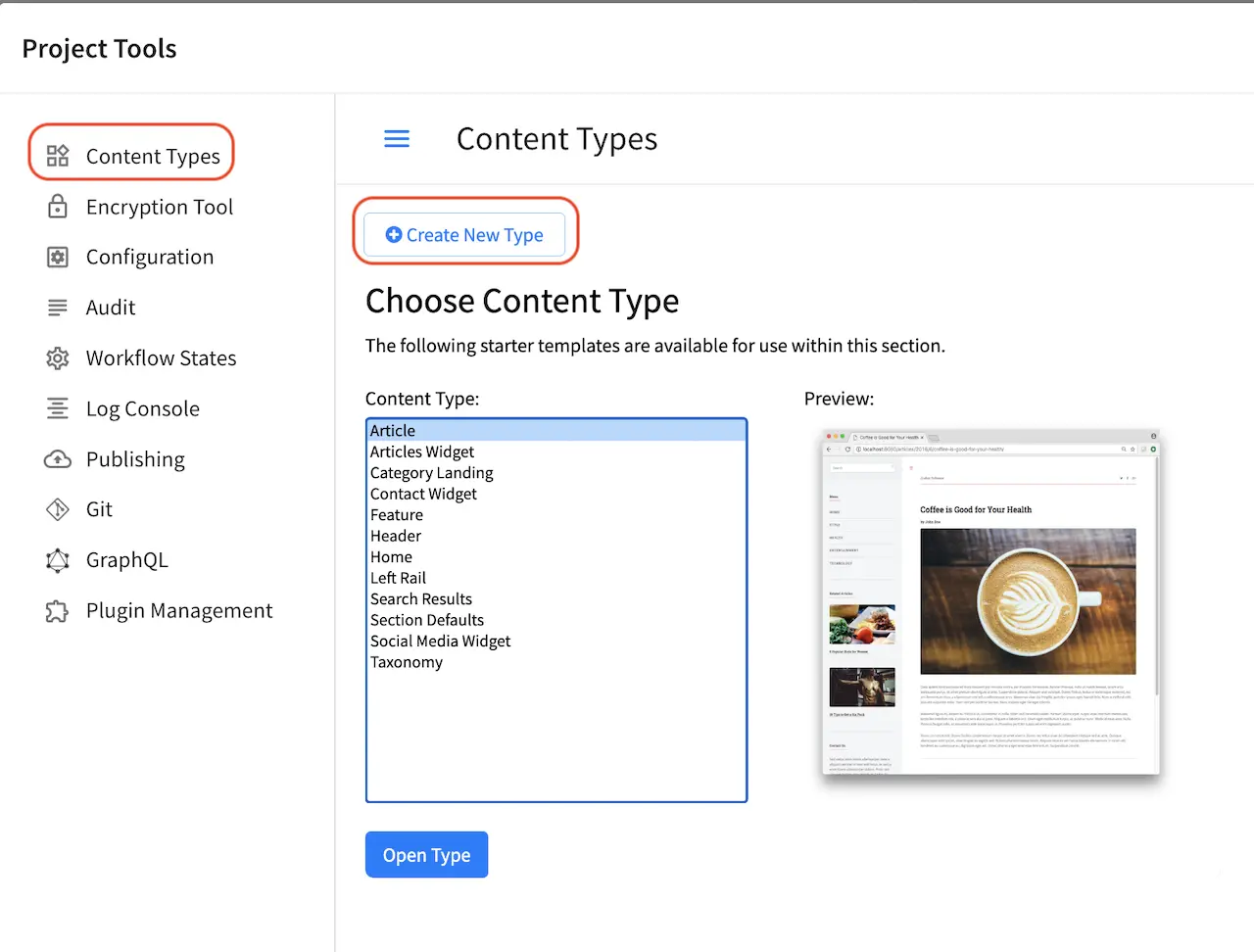
From the Sidebar, click on . Next, click on Content Types then either create a new content type or open an existing content type. In the image below, we have the content type Article open for editing. Go to the Properties Explorer and click on Configuration. A pencil will appear next to the file name config.xml, click on that pencil to edit.
To limit where this particular content type can be created, the tags, <paths><includes><pattern>some_regex_pattern</pattern></includes></paths> are included towards the bottom of the file. Here, we can see that content type Article can be created anywhere under /site/website/articles
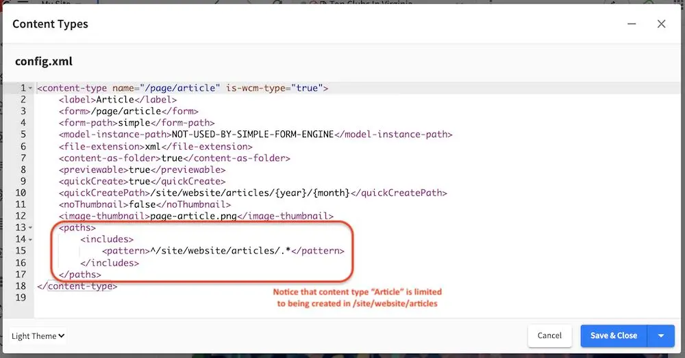
1<paths>
2  <includes>
3    <pattern>^/site/website/articles/.*</pattern>
4  </includes>
5</paths>
To see how the above tags/example works, go to the Sidebar and right click on the Home folder and select New Content. Notice that content type Article is not available from the content types listed.
From the Sidebar again, navigate from the Pages folder to the /Home/articles/2020/12/ folder then right click and select New Content, notice that the content type Article is available from the list.
To see more examples, try creating content types in the other folders in the Sidebar such as the Taxonomy folder, the Components folder and anywhere under the Pages folder.
Cascade on Delete Configuration
Cascade on delete allows the automatic deletion of child items matching a regexp when a content is deleted.
Enabling cascade on delete is configured through the content type Configuration property (config.xml) using the following tags:
1<delete-dependencies>
2  <delete-dependency>
3    <pattern>REG_EXP_HERE</pattern>
4    <remove-empty-folder>false</remove-empty-folder>
5  </delete-dependency>
6</delete-dependencies>
We’ll look at an example of how to enable cascade on delete on the Article content type in the Website_editorial blueprint.
From the Sidebar, click on . Next, click on Content Types. We will select the content type Article for editing. Next, go to the Properties Explorer and click on Configuration. A pencil will appear next to the file name config.xml, click on that pencil to edit.
We’re going to enable cascade on delete for articles (Article content type) containing images under /static-assets/item/images, and we’ll also delete empty folders under /static-assets/item/images by adding the following code in the config.xml file:
1<delete-dependencies>
2  <delete-dependency>
3    <pattern>(^/static-assets/item/images/.*)</pattern>
4    <remove-empty-folder>true</remove-empty-folder>
5  </delete-dependency>
6</delete-dependencies>
To see cascade on delete in action, let’s create a new article (Article content type) under one of the article folders in the Sidebar. Enter data in the required fields and remember to upload from desktop an image in the Image field in the Content section. Click on the Save & Close button.
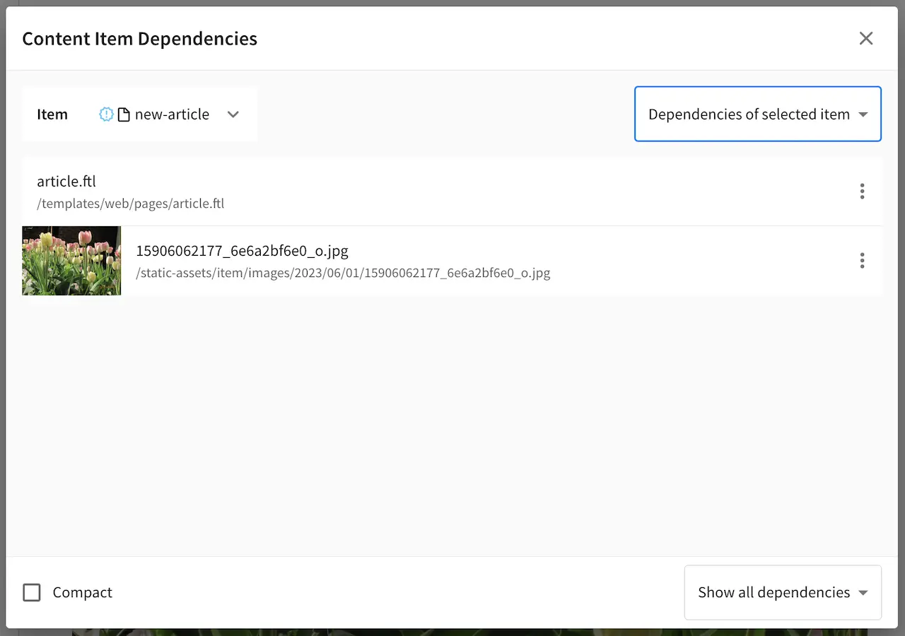
Let’s look at the dependencies of our newly created article, where we expect the image under the static-assets/items/images/2021/01/26 will be deleted when we delete the article since we have configured cascade on delete for content type Article for items under the directory static-assets/item/images:
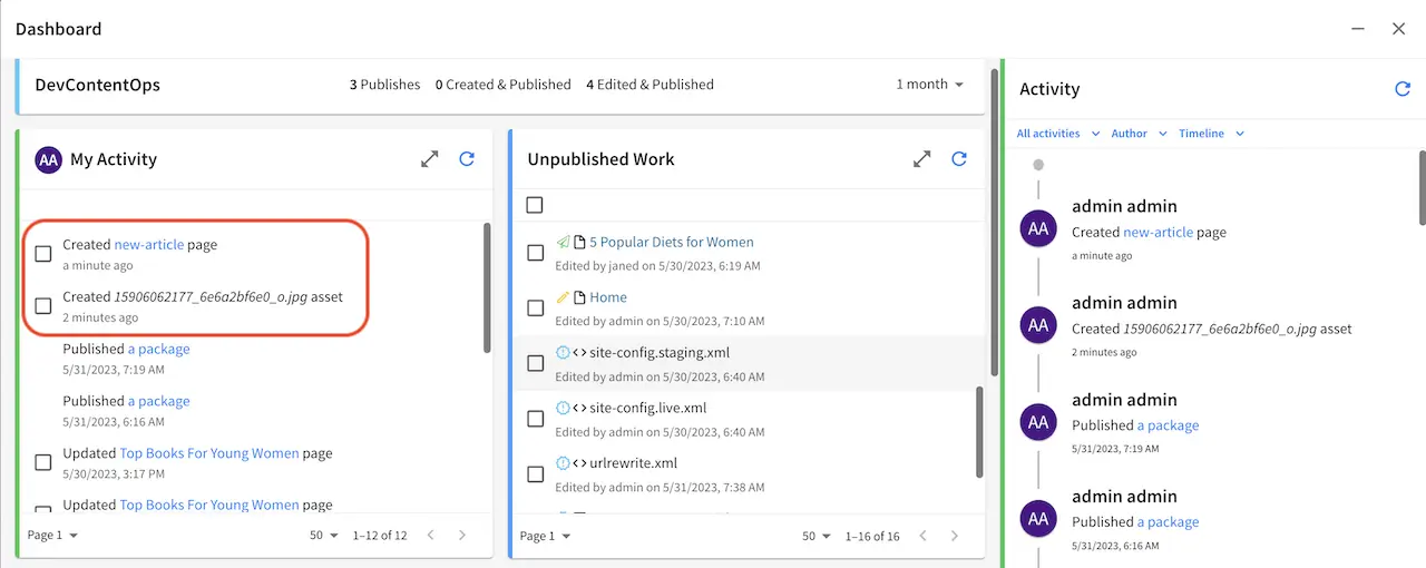
Open the Sidebar and navigate to the newly created article. Right click on the newly created article and select Delete. Open the Dashboard and notice the items listed as deleted in the My Recent Activity widget.
Copy Dependencies Configuration
Copy dependencies allows the automatic copying of child items matching a regexp when a content is copied.
Enabling copy dependencies is configured through the content type Configuration property (config.xml) using the following tags:
1<copy-dependencies>
2  <copy-dependency>
3    <pattern>REG_EXP_HERE</pattern>
4    <target>FOLDER_FOR_COPIES</target>
5  </copy-dependency>
6</copy-dependencies>
We’ll look at an example of how to enable copy dependencies on the Article content type in the website editorial blueprint.
From the Sidebar, click on at the bottom. Next, click on Content Types. We will select the content type Article for editing. Next, go to the Properties Explorer and click on Configuration. A pencil will appear next to the file name config.xml, click on that pencil to edit.
We’re going to enable copy dependencies for articles (Article content type) containing images under /static-assets/images/ and placing the copies in folder /static-assets/images/articles/ by adding the following code in the config.xml file:
1<copy-dependencies>
2  <copy-dependency>
3    <pattern>(^/static-assets/images/.*)</pattern>
4    <target>/static-assets/images/articles/</target>
5  </copy-dependency>
6</copy-dependencies>
Click on Save & Close, then save changes made to the content type by clicking on Save.
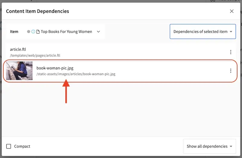
To see copy dependencies in action, let’s copy an article under one of the article folders from the Sidebar. First, we’ll create the folder articles under /static-assets/images. Next, we’ll navigate to articles/2020/12/Top Books For Young Women. Right click on the article and select Copy. Navigate to articles/2020/7, right click on the folder and select Paste.
Let’s look at the dependencies of our copied article, where we expect a copy of the image under the static-assets/images/articles will be located since we have configured cop dependencies for content type Article for items under the directory static-assets/images:
Item Specific Dependencies
Item specific dependencies allows for the automatic copying of child items matching the regex pattern in the studio-config.yaml file when a content is copied. It also allows the automatic deletion of child items matching the regex pattern in the studio-config.yaml file when a content is deleted.
Below is the regex pattern for item specific dependencies:
# Regex pattern for item specific dependencies
studio.configuration.dependency.itemSpecificPatterns: /site/components/page/.*,/static-assets/page/.*,/site/components/item/.*,/static-assets/item/.*
/site/components/page/.* and /static-assets/page/.* are legacy regex pattern for backwards compatibility. Moving forward, we suggest using the following regex patterns for item specific dependencies: /site/components/item/.* and /static-assets/item/.*
Item specific dependencies are configured during content type creation. We’ll look at an example of how content is modeled to take advantage of item specific dependencies, using the Article content type in the website editorial blueprint.
From the Sidebar, click on at the bottom. Next, click on Content Types. We will select the content type Article for editing.
Scroll to the Data Sources section, and click on Upload Images. Notice the value in the Repository Path property, which is the path where to store the new file uploaded from desktop.
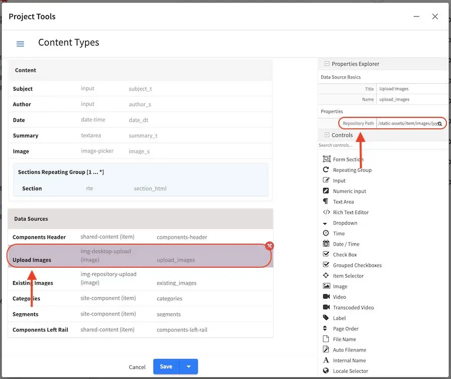
Let’s take a closer look at the value for the Repository Path property. The value listed is:
/static-assets/item/images/{yyyy}/{mm}/{dd}/
where:
{yyyy} inserts the current year when the image is uploaded (4 digit year)
{mm} inserts the current month when the image is uploaded (2-digit month of the year)
{dd} inserts the current day when the image is uploaded (2-digit day of the month)
To take advantage of item specific dependencies for copying and deleting, we will place uploaded items in /static-assets/item/. We added a folder image to better organize our items, since in this location, we will only be storing images. We also used the macros {yyyy}, {mm} and {dd}, again to better organize our image (we can browse by year, or by month, or by date). So, when an image is uploaded from the Desktop say on May 17, 2023, the image will be stored in the following location:
/static-assets/item/images/2023/05/17/
The macros {yyyy}, {mm} and {dd} are available for content modelers to use to better organize their project items. To see other macros available for content modelers, see Macros for Data Sources.
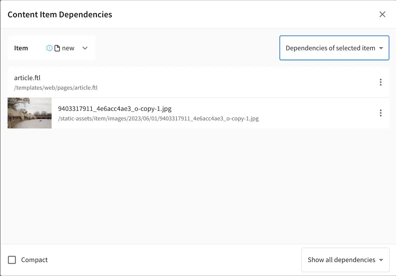
Let’s take a look at item specific dependencies in action for copying and deleting content. Let’s create a new article (Article content type) under one of the article folders in the Sidebar. Enter data in the required fields and remember to upload from desktop an image in the Image field in the Content section. Click on the Save & Close button. Note the location where the image is uploaded.
From the Sidebar, navigate to the newly created article. Right click on the article and select Copy. Navigate to a different folder, right click on the folder and select Paste.
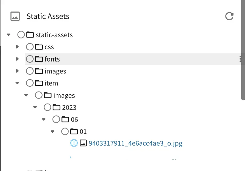
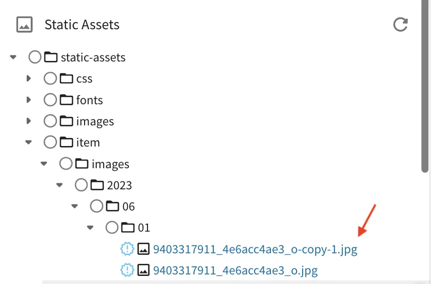
Let’s look at the dependencies of our copied article, where we expect a copy of the image under the /static-assets/item/images/2023/06/01 will be located since we have taken advantage of the item specific dependencies regex pattern of /static-assets/item/*.
Let’s also take a look at the static-assets folder to see the copy of the uploaded image
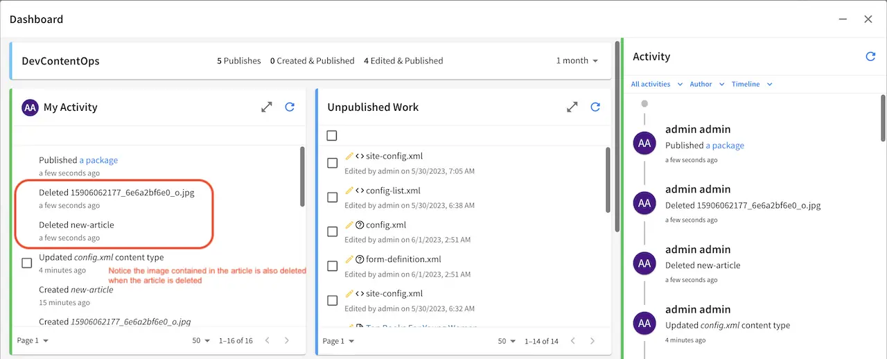
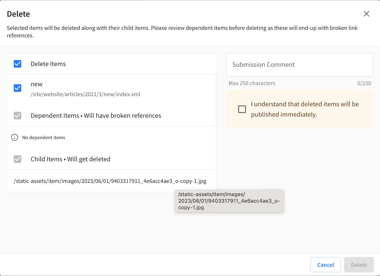
Now let’s take a look at what happens when we delete content with item specific dependencies. From the Sidebar, navigate to the article that we created. Right click on the article and select Delete. Click on the Delete button when the Delete dialog appears. Notice the items that will be deleted when we delete the article.
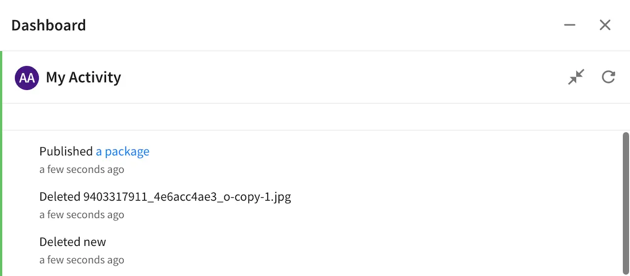
Open the Dashboard and notice the items that are deleted in the My Activity dashlet. We deleted an article, and since the image is located in a path matching the regex pattern for item specific dependencies, the image is deleted along with the article.
Quick Create
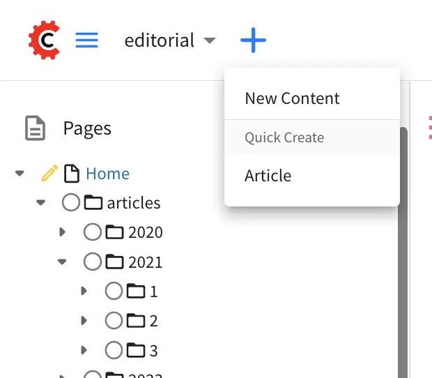
Quick create allows content authors to create content with as few clicks as possible through a button from the context nav for configured content types.

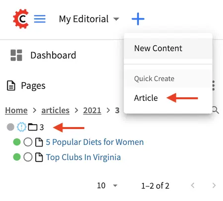
Let’s take a look at an example on how to configure a content type to be available from the quick create button in the context nav for authors using the out of the box blueprint Website Editorial. In the image below, we have a project named My Editorial with the quick create button expanded. Notice that we have one content type available for quick create, the Article content type.
If you look at the site tree as shown above, most of the content (the articles) is organized in a dated folder structure. Adding quick create for the Article content type lets the content author skip having to open the Sidebar, then navigate through the path navigation tree, create the year/month folder if it does not exist yet, then finally create their content.
To setup quick create for a content type, from the Sidebar, click on at the bottom. Next, click on Content Types. We will select the content type Article for editing. Next, go to the Properties Explorer and scroll to the Quick Create section of the properties.
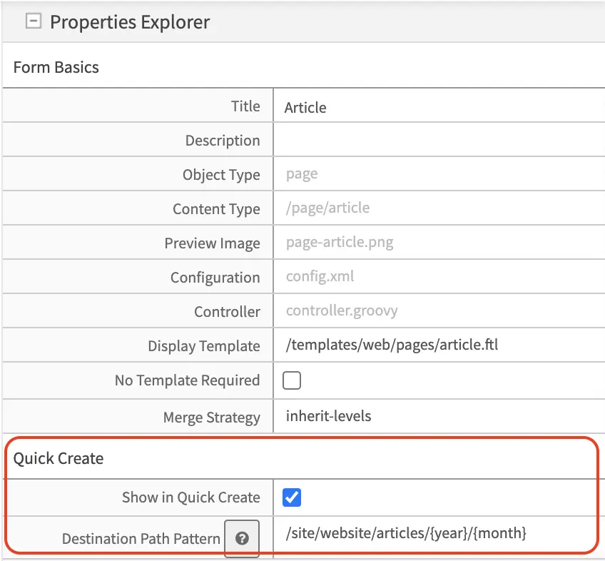
Check the Show in Quick Create property to make the content type available from the quick create button of the Article content type.
In the Destination Path Pattern, fill in the path pattern where the content created from quick create will be stored. For our example, notice that the articles are arranged in the following folder structure:
/articles
  /{year}
    /{month}
We will then put in /site/website/articles/{year}/{month} as the path pattern, which will put the new content into the year and month folder when the content author used quick create.
Below is the site tree after using the quick create button to create a new article titled New article using quick create, where the year and month folders were created for the new article using the value in the Destination Path Pattern property of the content type.
Form Controls
Form Controls are data input controls that, once placed on a form, will capture that input from the content authors and store it in the content object. CrafterCMS ships with a number of out-of-the-box controls and you can also create your own by reading Building Form Engine Control Project Plugins.
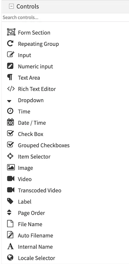
Each Form Control type has it’s own properties and constraints. Some constraints are common, like “Variable Name” and “Required” while others apply only to the type, e.g. Height and Width limitations on the Image Picker control.
Here’s a list of available Form Engine Controls:
Control |
Description |
|---|---|
|
Create a new section in the form, this is to help the content authors by segmenting a form into sections of similar concern. Details are in the Form Section Control page. |
|
Repeating groups are used when the form has one or several controls that repeat to capture the same data as records. For example: a list of images in a carousel, or a list of widgets on a page. Details are in the Repeating Group Control page. |
|
A simple textual input line. Details are in the Input Control page. |
|
A simple numeric input line. Details are in the Numeric Input Control page. |
|
A simple block of plain text. Details are in the Text Area Control page. |
|
A block of HTML. Details are in the Rich Text Editor Control page. |
|
Dropdown list of items to pick from. Details are in the Dropdown Control page. |
|
Date and Time field with a picker. Details are in the Date/Time Control page. |
|
Time field with a picker. Details are in the Time Control page. |
|
True/False checkbox. Details are in the Checkbox Control page. |
|
Several checkboxes (true/false). Details are in the Grouped Checkboxes Control page. |
|
Item selector from a Data Source. Details are in the Item Selector Control page. |
|
Image selector from a Data Source. Details are in the Image Control page. |
|
Video selector from a Data Source. Details are in the Video Control page. |
|
Transcoded Video selector from Video Transcoding Data Source. Details are in the Transcoded Video Control page. |
|
Displays text. Details are in the Label Control page. |
|
Allows changing the page order. Details are in the Page Order Control page. |
|
A simple text filename. Details are in the Filename Control page. |
|
Details are in the Auto Filename Control page. |
|
Details are in the Internal Name Control page. |
|
Details are in the Locale Selector Control page. |


Form Control Variable Names
Every Form Control has a Variable Name property. The Variable Name is used by the form engine to store the content entered by the user in the content model and search index. This same Variable Name is used later by templates and controllers to retrieve the value.
Variable Name Best Practices
Be descriptive. Well thought out Variable Names help with template and controller readability.
Use camel case. Example: “productSummary”.
Use regex constraints on input boxes to enforce additional validation rules
Do not use Reserved names.
Reserved Variable Names
The following variable names are used by CrafterCMS.
Variable Name
|
Description
|
|---|---|
file-name*
|
Used by the File Name and Auto File Name control.
|
internal-name
|
Used by Crafter Studio to label the content object
|
placeInNav
|
Used by the Page Order control.
|
disabled
|
Used to logically remove an object in content delivery.
For more information, see Disabling a Page
|
expired
|
Used to logically remove an object after date
|
expired_dt
|
Used to logically remove an object after date
For more information, see Content Monitoring
|
objectId
|
UUID. Auto assigned by Crafter
|
objectGroupId
|
First part of objectId. Auto assigned by Crafter
|
createdDate
|
create date. Auto assigned by Crafter
|
createdDate_dt
|
Alternate name for create date. Auto assigned by Crafter
|
lastModifiedDate
|
Last modified date. Auto assigned by Crafter
|
lastModifiedDate_dt
|
Alternate name for last modified date. Auto assigned by Crafter
|
content-type
|
Content type name
|
display-template
|
Path to default template for type
|
merge-strategy
|
Crafter Core/Engine “Merge Strategy” for content type
|
id
|
reserved for a unique identifier
|
authorizedRoles
|
Used to restrict pages based on roles
For more information, see Targeting Using Roles and
Emulating authorizedRoles in XB
|
role
|
Contains the role required to access a page
|
mime-type
|
Mime-type name
|
force-https
|
HTTPS connection needs to be forced to access the page
|
navLabel
|
Navigation label
|
redirect-url
|
Redirect URL
|
crafterSite
|
Used to set the site value
See note in REST Content Retrieval APIs for more information
|
localId
|
Name of the field for paths. Used by the deployer
|
rootId
|
Root Id name. Used by the deployer
|
includedDescriptors
|
Included descriptors field name. Used by the deployer
|
crafterPublishedDate
|
The name for the publish date field. Used by the deployer
|
disableFlattening
|
Used to indicate if XML flattening should be disabled when
indexing XML. Used by the deployer
|
content
|
Used by the deployer
|
contentType
|
Name of field for mimeType. Used by the deployer
|
width
|
Used by the deployer
|
height
|
Used by the deployer
|
contentLength
|
Name of field for file size. Used by the deployer
|
lastEditedOn
|
Name of field for last edit date. Used by the deployer
|
internalName
|
Name of field for internal name. Used by the deployer
|
* Note on file names
CrafterCMS supports the following characters in file and folder names:
Alphanumeric, ,_,-,(,)
as a regex:
[a-zA-Z0-9-_ ()]+
It’s important to point out that Crafter Studio enforces this regex in its UI. However, if you’re working outside of Studio (in your IDE, for example) and you violate these rules, problems may arise downstream, so it’s best to stick the allowed characters.
Variable Names and Search Indexing
CrafterCMS indexes your content in the search index using your content model variable name as the field name.
To facilitate indexing, the following suffix should be appended to variable names depending on the variable data type:
Type
|
Field
Suffix
|
Multivalue
Suffix
(repeating
groups)
|
Description
|
|---|---|---|---|
integer
|
_i
|
_is
|
a 32 bit signed integer
|
string
|
_s
|
_ss
|
String (UTF-8 encoded string or Unicode). A string
value is indexed as a single unit.
|
long
|
_l
|
_ls
|
a 64 bit signed integer
|
text
|
_t
|
_txt
|
Multiple words or tokens
|
boolean
|
_b
|
_bs
|
true or false
|
float
|
_f
|
_fs
|
IEEE 32 bit floating point number
|
double
|
_d
|
_ds
|
IEEE 64 bit floating point number
|
date
|
_dt
|
_dts
|
A date in ISO 8601 date format
|
time
|
_to
|
_tos
|
A time in
HH:mm:ss format (the value will beset to date 1/1/1970 automatically)
|
text with
html tags
|
_html
|
Model fields require their respective data type postfix as listed above. The UI autofills the Name/ Variable Name field and adds postfixes as you’re typing in the Title field.
When setting up reserved variable names for your model, remember to remove the postfix auto-added by the UI since the variable name needs to be exactly the same as listed above.
Remember to also remove the postfix auto-added by the UI when using key or value for your variable names being setup as key-value pairs in a content type, such as the Taxonomy content type used in the Website Editorial blueprint.
Please note that indexed text fields are case insensitive when performing a search, while string fields are case sensitive. Also, queries using string fields will only match full values besides being case sensitive.
If performing a case insensitive search on a string field is desired, CrafterCMS provides a way by enabling tokenization of the field in the content type. To enable tokenization of a string field in Studio, put a check in the checkbox labeled Tokenize for Indexing in the properties section of the content type field. Below is the Article content type in a project created using the Website Editorial blueprint, showing the field Author with the Tokenize for Indexing option:
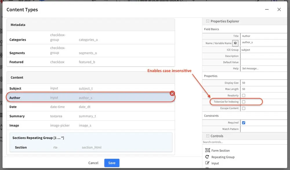
It should also be noted that when the tokenize option is enabled, a second field will be created with the _t postfix. This second field with the _t postfix should be used in queries to be case insensitive and match tokens. In our example above, the field author_t should be used in queries instead of author_s to be case insensitive and match tokens.
Let’s take a look at an example of queries performed on a string field with tokenize enabled and compare the results of using the field with the _s postfix and the second field created when we enabled tokenize with the _t postfix. We’ll use the Author field shown above with Tokenize for Indexing enabled. Here are the results of the queries using the author_s and author_t fields:
Query |
Matches author_s? |
Matches author_t? |
|---|---|---|
Jane |
No |
Yes |
jane |
No |
Yes |
Jane Doe |
Yes |
Yes |
jane doe |
No |
Yes |
Jane doe |
No |
Yes |
Another thing to note is since CrafterCMS stores content as XML files, certain content fields which contain special characters must be escaped. By default, CrafterCMS will escape content fields of types:
HTML (_html)
Text (_t)
String (_s)
Multi-valued string (_smv, _mvs)
Internal-name (internal-name)
This default configuration can be modified by editing the element <cdata-escaped-field-patterns> in the configuration file Project Configuration from the Project Tools -> Configuration
1<!--
2  Specifies the regular expression patterns to match content type field
3  names that require CDATA escaping.
4-->
5<cdata-escaped-field-patterns>
6  <pattern>(_html|_t|_s|_smv|mvs)$</pattern>
7  <pattern>internal-name</pattern>
8</cdata-escaped-field-patterns>
Data Sources
Data Sources are pickers that help pull in content from internal or external storage/systems. For example, data source include: desktop video uploader, desktop image uploader, and so on. CrafterCMS ships with a number of out-of-the-box data sources and you can also create your own by reading Building Form Engine Data Source Project Plugins.
Data Sources allows the content model designer to decide where different assets uploaded via different controls go (for instance icons, images, RTE related assets, etc.). It has it’s own properties, like “Repository Path”, which specifies the path where assets are stored, which help keep the system consistent over time. The storage destination designed in the model dictates how those assets are handled during a duplicate event (duplicate the asset or duplicate the reference to the asset).
There are a couple of data source that also dictates how components are handled during duplicate/copy events. The Shared Content data source will duplicate/copy the reference to a component during a duplicate/copy event and is used for components that need to be shared across pages or components. For components that belong exclusively to a content object, use the Embedded Content data source.
The shared-content data sources also provides an option to allow users to search for existing items (Enable Search Existing property) in addition to browsing. This provides users ease of managing lots of items/assets.
Data sources are usually used in conjunction with a control in the content type, for example, the Item Selector Control is used for selecting files to be uploaded when bound with the File Uploaded from Desktop Data Source data source.
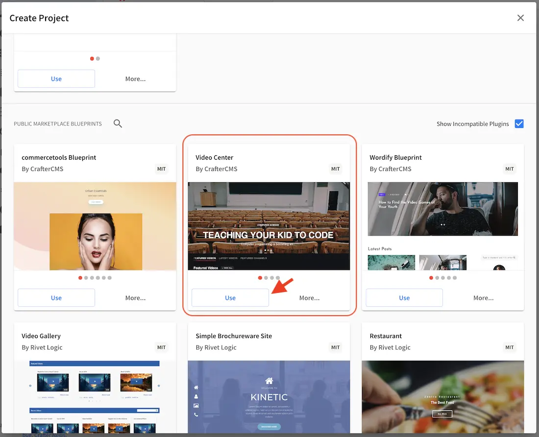
Let’s take a look at a shared content data source in a project created using the Video Center blueprint from the Marketplace.
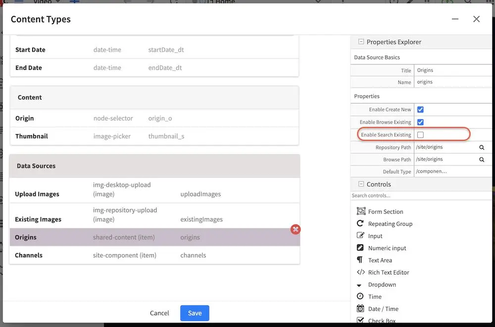
Open the Sidebar then click on . Click on Content Types and select Stream, then click on the Open Type button. Scroll down to the Data Sources section, then click on Origins, a shared content data source. Notice how a Item Selector Control control is used for selecting shared content Origin. In the Properties Explorer on the right side, put a check mark on Enable Search Existing property so users can search for existing items.
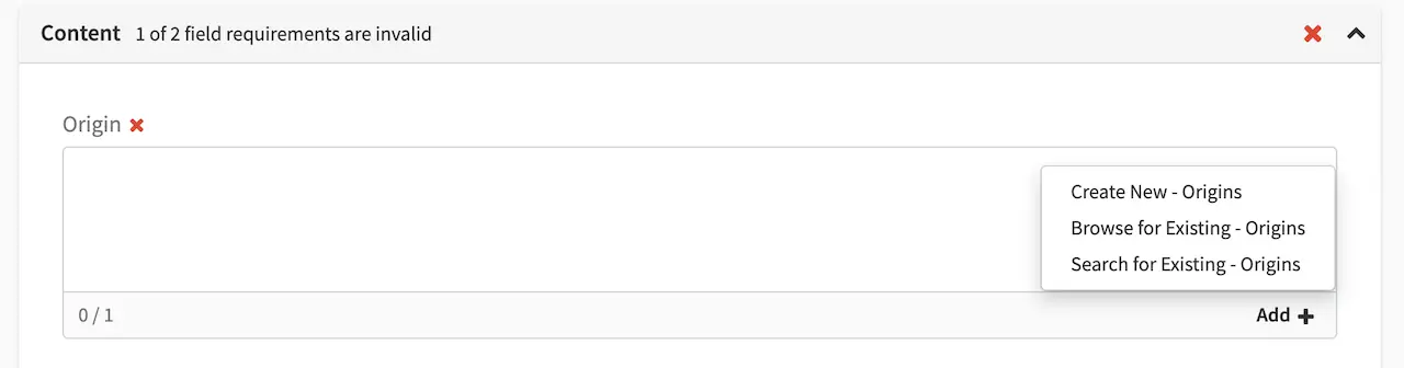
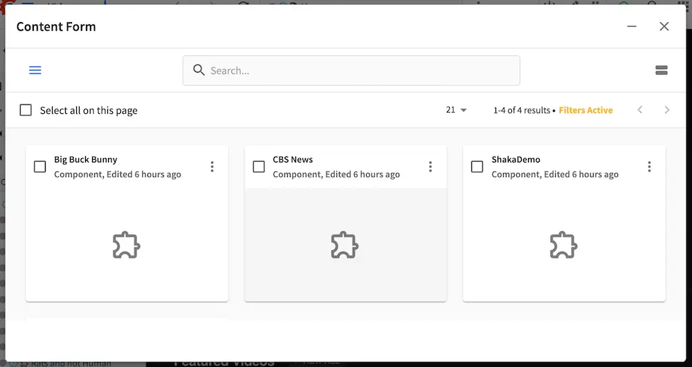
To see the property we setup in action, open the Sidebar, then navigate to /streams. Right click on any of the items, say, AlphaGo, then click on Edit. Scroll down to the Content section of the form. In the Origin field, select the item next to it (ShakaDemo) then click on the x button to remove it. We’ll now add a new one, by clicking on the Add button, then select Search for Existing - Origins.
A search dialog will open displaying in a grid view, items the user can search through, select, filter, etc. As we can see, the search option makes it easier for users to pick items instead of scrolling through all the available items, especially for say projects with hundreds or even thousands of items/assets.
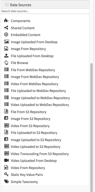
Form Engine Data Sources (please use the scrollbar to see more data sources)


Macros for Data Sources
There are a number of macros available for the content model designer to use in data sources. These macros are used when uploading assets to better organize project items, usually in the Repository Path property of the data source for uploading. Here are the available macros:
Macro
|
Description
|
|---|---|
{objectId}
|
Inserts a GUID
|
{objectGroupId}
|
Inserts the first 4 characters of a GUID
|
{objectGroupId2}
|
Inserts the first 2 characters of a GUID
|
{year}
|
Inserts the current year (4 digit year)
|
{month}
|
Inserts the current month (2-digit month of the year)
|
{parentPath}
|
Inserts the parent path of the component/page containing the upload controls
|
{parentPath[index]}
|
Inserts the sub element of a parent path using an index, of the component/page
containing the upload controls
|
{yyyy}
|
Inserts the current year (4 digit year)
|
{mm}
|
Inserts the current month (2-digit month of the year)
|
{dd}
|
Inserts the current day (2-digit day of the month)
|
Data Sources macro: parentPath
Let’s take a look at an example of using the {parentPath} data source macro. We’ll use a project created using
the website editorial blueprint for our example. We’ll be editing the Article content type to add a data source that
will use {parentPath} macro.
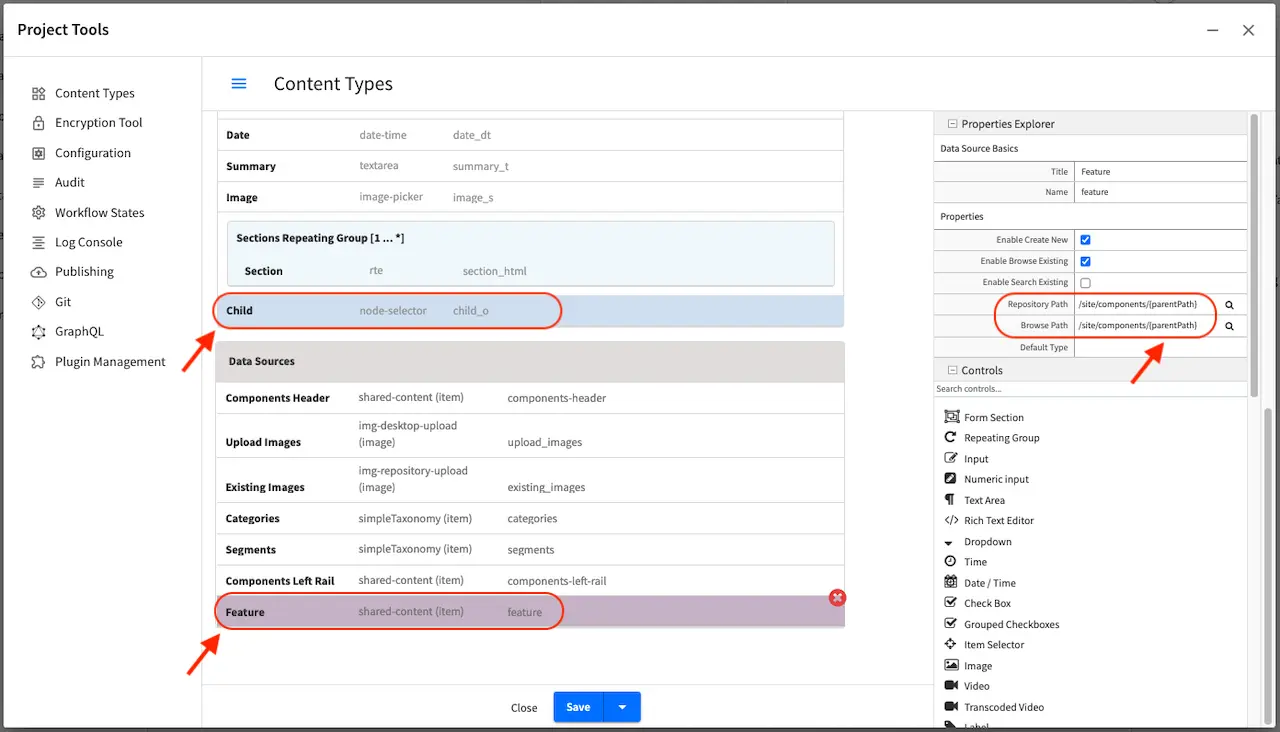
Open the Sidebar then click on . Click on Content Types -> Article. Scroll to the
Data Sources section of the form and drag a Shared Content data source into the section. Fill in the Title
and Name fields, then in the Repository Path and Browser Path input /site/components/{parentPath}.
In our example in the image below, the name of the data source is feature. Next, we need to add a control that will
use the data source we just configured. Scroll to the Content section of the form and drag an Item Selector
control into the section. Fill in the Title field, Child for our our example, then in the Item Manager field,
put a check next to Feature, the data source we set up earlier. Save your changes to the content type.
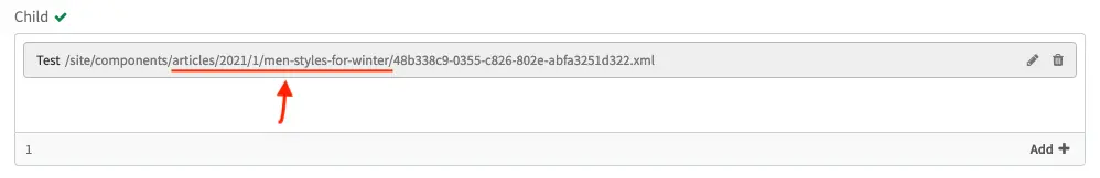
We’ll now use the control and data source we set up and see how the {parentPath} macro works. Recall that we setup
the data source Repository Path to /site/components/{parentPath}. From the project preview, edit one of the articles,
say the article Men Styles For Winter under /articles/2021/1/men-styles-for-winter. Scroll down to the Content
section of the form to the field Child. Click on Add + then select Create New - Feature. Fill in the required
fields then save your changes. Note that {parentPath} is /articles/2021/1/men-styles-for-winter. The newly
created component is now stored in the /site/components/articles/2021/1/men-styles-for-winter folder.
Data Sources macro: parentPath[index]
The parentPath[index] macro provides resolution support for sub elements of a parent path in Crafter Studio.
It pulls a single sub / of the parent path with the following syntax {parentpath[index]}
Here are some examples:
If the parentPath is /en/mypage, then to get the sub element en, use 0 as the index in the macro like so {parentpath[0]}
If the parentPath is /products/household/cleaning then to get the sub element household, use 1 as the index in the macro like so {parentpath[1]}
Note
For both the parentPath and parentPath[index] macros, the path starts without /site/website and /site/components.
For example, if in the repository the parent is a page, and the page URL in the repository is /site/website/en/about-us/index.xml, then the parentPath is /en/about-us/index.xml.
If in the repository the parent is a component, and the component URL in the repository is /site/components/en/products/myproduct.xml, then the parentPath is /en/products/myproduct.xml.
The website_editorial blueprint contains more examples of how the some of the macros listed above are used
when modeling your content, found in the content type Article.
The section Item Specific Dependencies above also details the use of some of the macros in the website_editorial blueprint, content type Article.
Form Canvas
The canvas is where the form actually gets built. The building process is performed by simply dragging the controls from the Form Controls over to the canvas, rearranging the controls in the order you’d like to present to the content authors, and configuring the controls individually.
Controls on the canvas are configured by clicking on the control, and then editing the control’s configuration in the Properties Explorer, see item #3 in Form Builder Basics. Different controls have different configuration, so please review the individual form control configuration listed in Form Controls.
Two controls have a special significance to the form canvas: Form Section Control and Repeating Group Control. Form Section Control creates a form section that can be expanded and collapsed and holds within it other controls. This is typically used to group together controls that cover a similar concern and help provide the content authors with a clear and organized form when editing in form mode. Like the Form Section Control, Repeating Group Control is also a container that holds other controls, but the purpose is to allow a set of controls to repeat as configured. This is typically used to allow content authors to enter a set of meta-data and repeat it as many times as desired and permitted by configuration.
The canvas allows the form-based content capture only, and is used by content authors when they’re in that mode. In-Context Editing will leverage the form components, but not the canvas when authors are in that mode. Learn more about In-Context Editing configuration for projects Experience Builder (XB) .
Content Type View Templates
View templates control how the model is rendered as HTML. Crafter uses FreeMarker as the templating engine, and provide the full model defined by the model in the previous section. Every element in the model is accessible to the view template via a simple API ${contentModel.VARIABLE_NAME} where variable name is the Name / Variable Name definition in the Form Control. View templates are primarily written in HTML, backed by CSS with API calls weaved within to pull content from the primary CrafterCMS model or additional model (via APIs, please read Groovy/Java API for that topic).
An example view template
 1<#import "/templates/system/common/crafter.ftl" as crafter />
 2
 3<!DOCTYPE html>
 4<html lang="en">
 5  <head>
 6    <!-- Basic Page Need
 7    ================================================== -->
 8    <meta charset="utf-8">
 9    <title>${contentModel.browser_title}</title>
10    <meta name="description" content="${contentModel.meta_description}">
11    <meta name="keywords" content="${contentModel.meta_keywords}">
12    <@crafter.head/>
13  </head>
14  <body>
15    <@crafter.body_top/>
16    <div class="body" <@studio.iceAttr iceGroup="body"/>>
17      ${contentModel.body_html}
18    </div>
19
20    <#if (contentModel.analytics_script)??>${contentModel.analytics_script}</#if>
21
22    <@crafter.body_bottom/>
23  </body>
24</html>
The simple example renders a simple HTML page with a very basic model. Let’s review the model first:
Model Element
|
Control
|
Purpose
|
browser_title
|
Input
|
Provide a browser title for the page
|
meta_keywords
|
Input
|
SEO keywords associated with the page
|
body_html
|
Rich Text
Editor
|
The page’s main HTML body (in this case, it’s
just a static HTML block).
|
analytics_script
|
Text Area
|
Analytics’s Engine JavaScript
|
The FreeMarker language is supported. For detailed Freemarker documentation, please visit: http://freemarker.org
Page and Component Controller (Page and Component Scripts) Definition
Crafter page and components can have their own controller scripts too, that are executed before the page or component is rendered, and that can contribute to the model of the template. Learn more about page and script controllers in Page and Component Controllers.
Creating Content Type Examples
Page Content Type Example
Page content types are top level container types that lets you define the layout/structure and functionality of content/components. To create a new page content type, click on from the Sidebar
Click on Content Types, then select Create New Type
Enter a Display Label and content type name for your new page content type, then select Page as Type and then click on the Create button
We’ll now start to construct the layout of the page. A content type has three ingredients: the model, the view and the controller.
Model
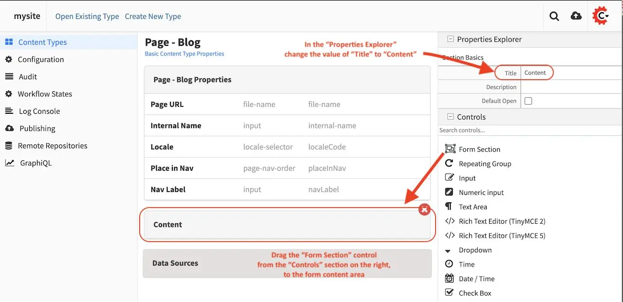
We’ll start building the model first, which is the form that Authors will be using to enter content into. We’ll add a form section called Content to the form and name it accordingly.
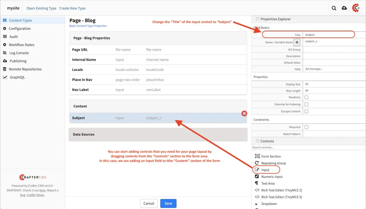
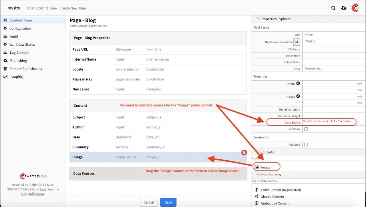
We’ll add a few more things to our model by dragging controls and data sources to the form. We’re creating a page template for a blog entry, so at a minimum, we’ll add some input fields for the title and author names, a date/time field, an image picker and it’s corresponding data sources and a rich text editor inside a repeating group control so Authors can add as many sections as they want.
Here we’re adding an image picker to the form. Notice that we’ll need to add data sources for the image picker to get images from. There are at least two sources that the image picker can get images from. One is from images uploaded from the desktop, the other is for existing images listed in the Static Assets folder in the Sidebar.
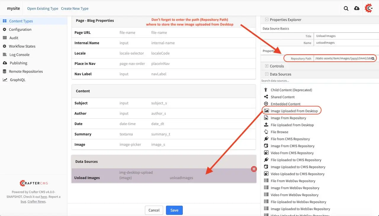
We’re now going to add a data source for our image picker, by dragging the Image Uploaded from Desktop from the Data Sources list on the right to the form in the section Data Sources. Don’t forget to enter the path where to store the new image uploaded from desktop in the Repository Path field under the Properties Explorer
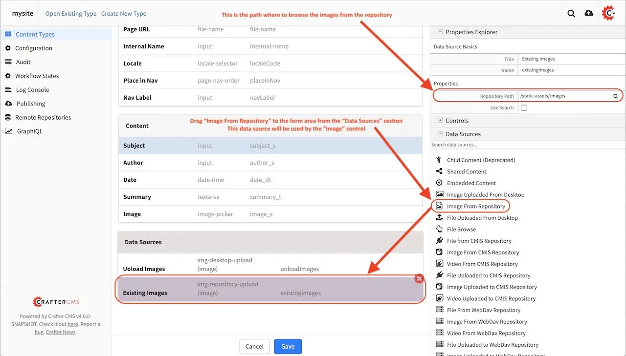
We’ll also add the data source Image From Repository by dragging it to the Data Sources section in the form. Don’t forget to add the path where to browse existing images from the repository
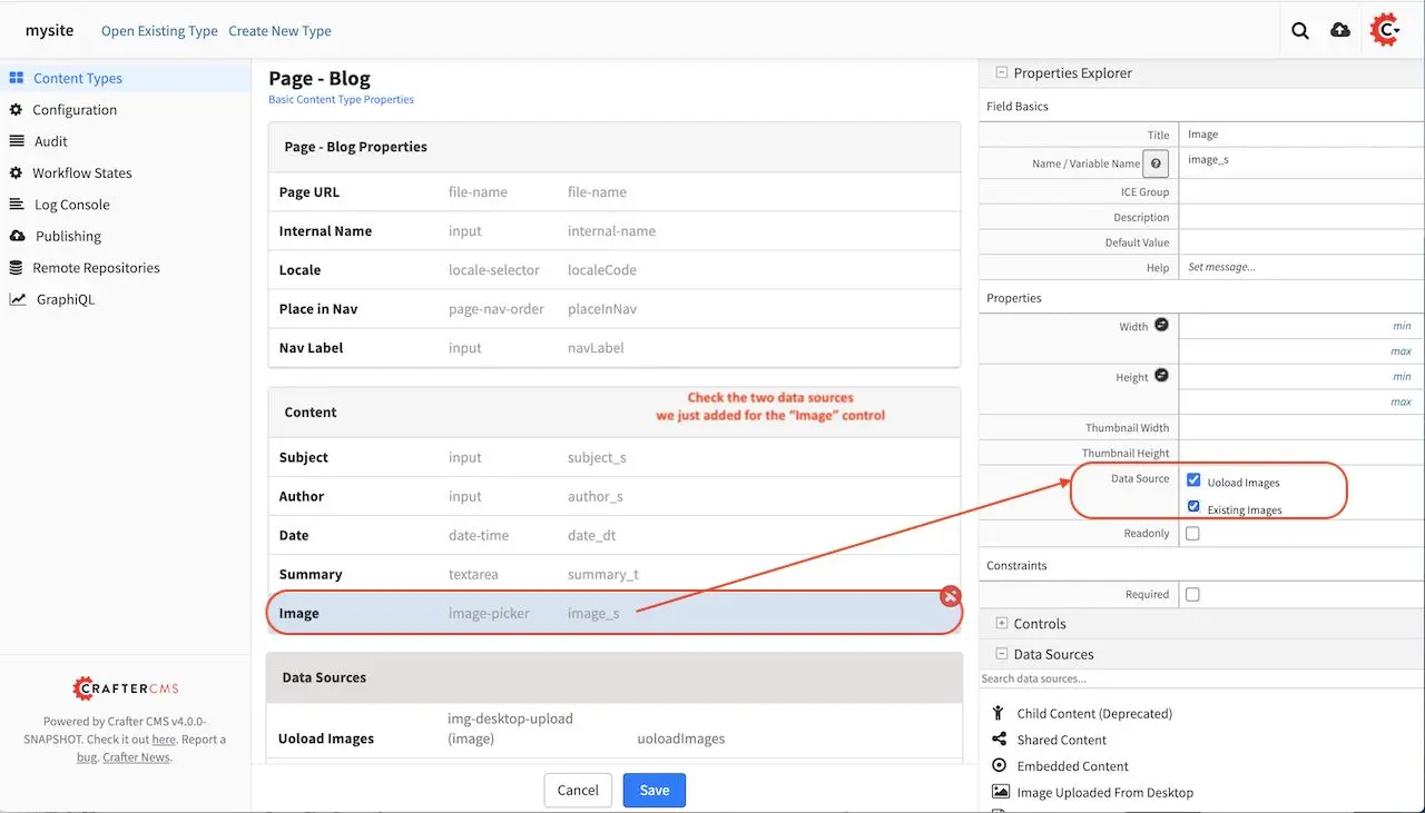
We’ll go back to the Image Picker control on the form to make sure the two data sources we added are checked as sources for the Image Picker
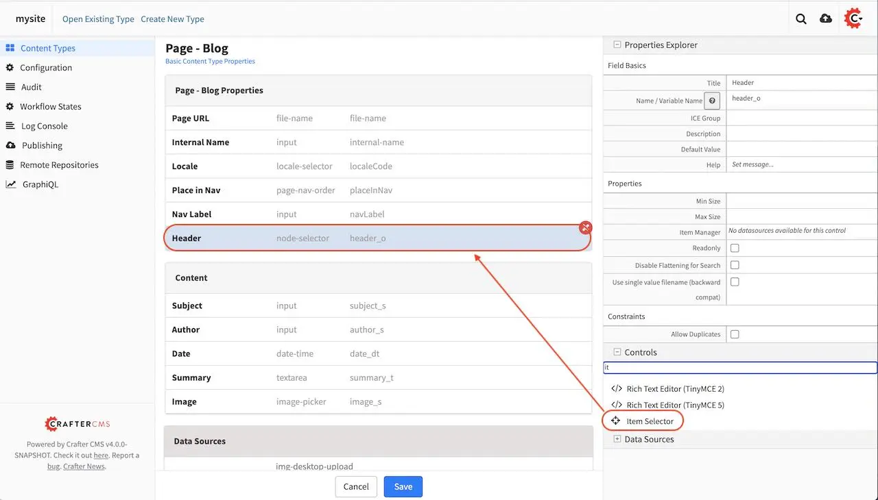
We’ll be adding a header component and a left-rail component inherited from the home page. To add a component to the form, drag the Item Selector control to the form in the Page - Blog Properties section. We’ll be adding two components to the form, one for the Header and one for the Left-rail
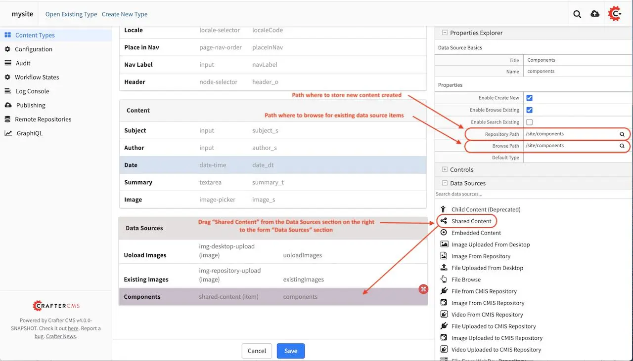
We’ll need to add a data source for the two Item Selectors we just added to the form by dragging Shared Content to the Data Sources section to the form and naming it Components. Don’t forget to add the path where to store new content created under the Repository Path field in the Properties Explorer.
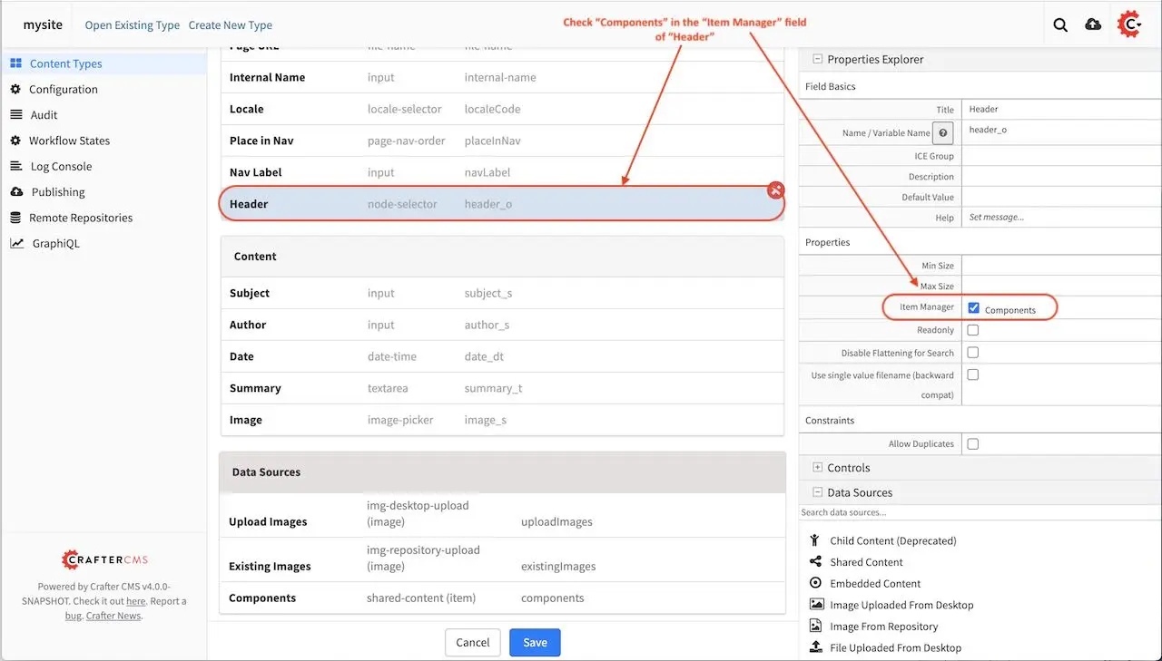
We’re going back to the Item Selectors we added to the form and check Components as data source for our control
Next we’ll add a Repeating Group control to the form, with a minimum of 1 occurrence, which can be specified in the Properties Explorer section, in the Minimum Occurrences field
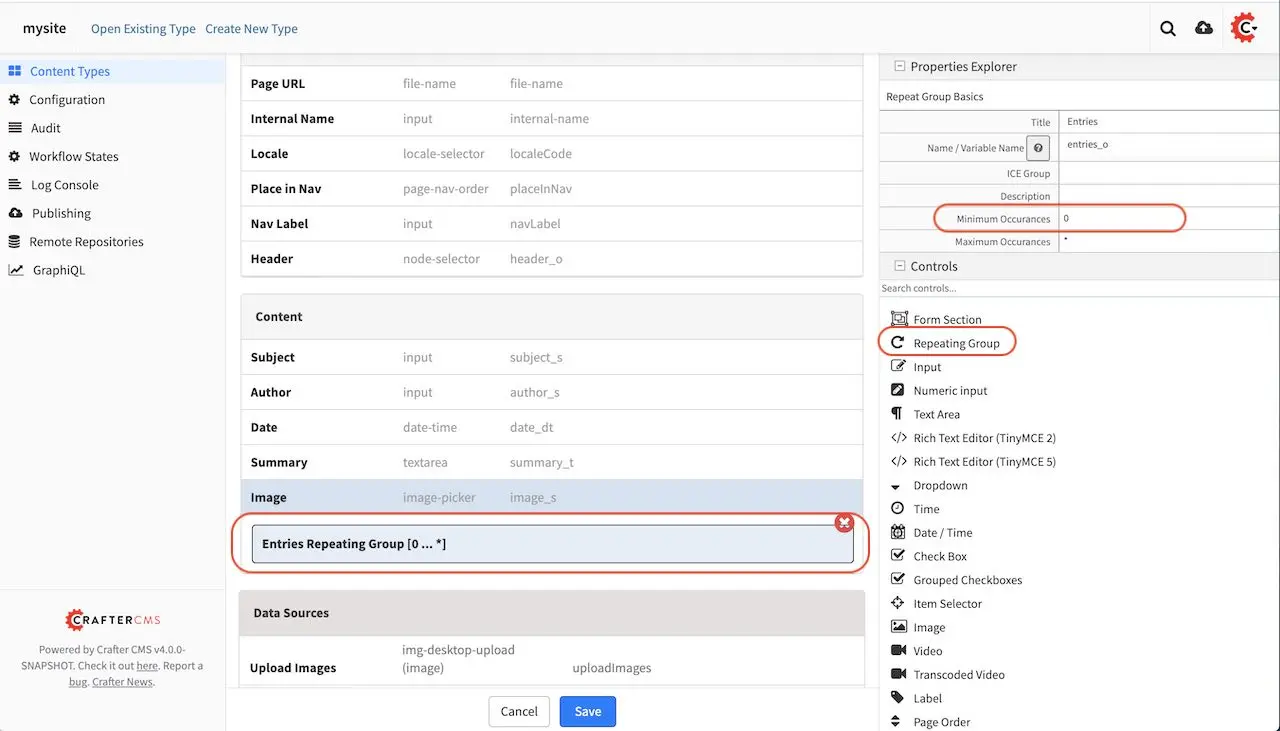
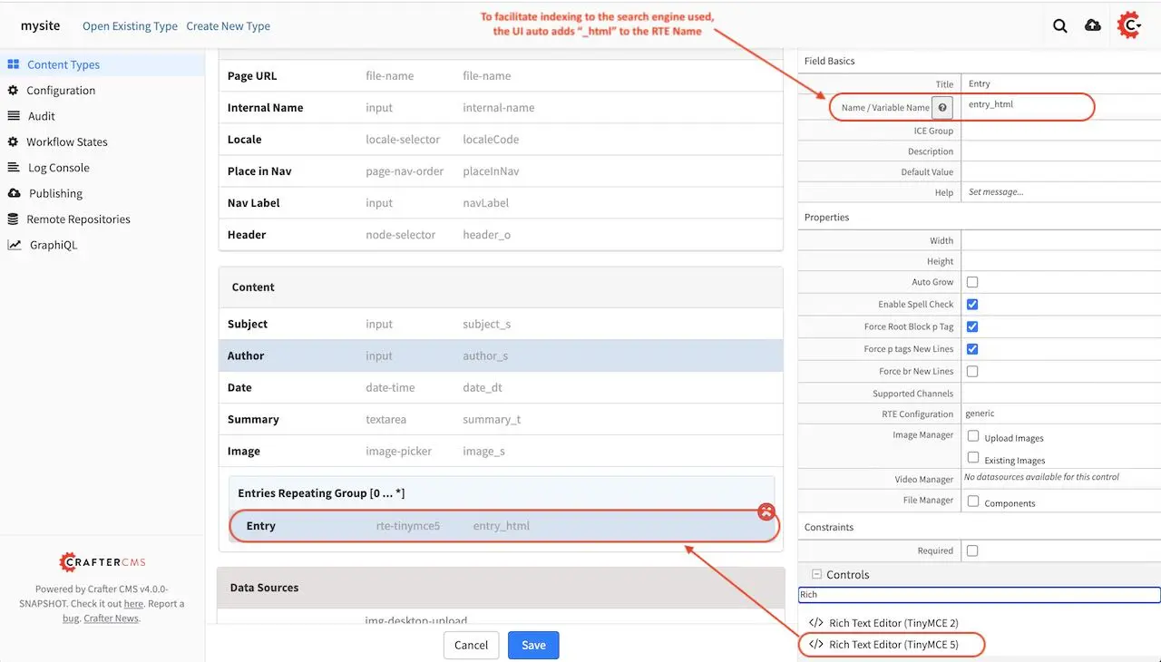
In the Repeating Group control, we will add an RTE (Rich Text Editor). In order for the content to be searchable, it needs to be indexed. To facilitate indexing, the suffix _html should be appended to the variable name given to the RTE. In this case, the RTE’s variable name is entry_html. For more information on variable names and search indexing , please see the section Form Control Variable Names
The model for our template is done. You can add some other controls by dragging and dropping controls from the Controls section to the form. To learn more about all the controls available, please see Form Controls. To learn more about the data sources available, please see Data Sources.
View
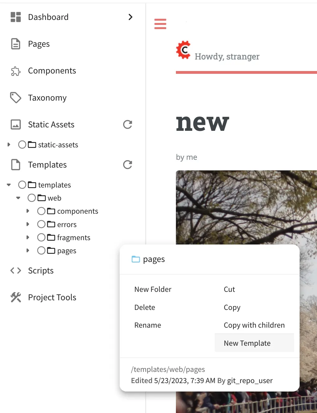
We’ll now build the view for our template, which is the freemarker template file that renders the content, typically to HTML markup. There are two ways to create the freemarker template file for our template. One way is to open the Sidebar menu in Studio, then navigate to the Templates folder, depending on how your project is setup, you may want to navigate to the subfolder in your Templates folder where you want to create the freemarker template file. Once you are in the desired subfolder, right click on that folder then select Create Template
The other way of creating your freemarker template, is to go to the Properties Explorer in the Content Type model, then click on the Display Template field, a magnifying glass and a pencil will appear on the field. To create a template, click on the pencil.
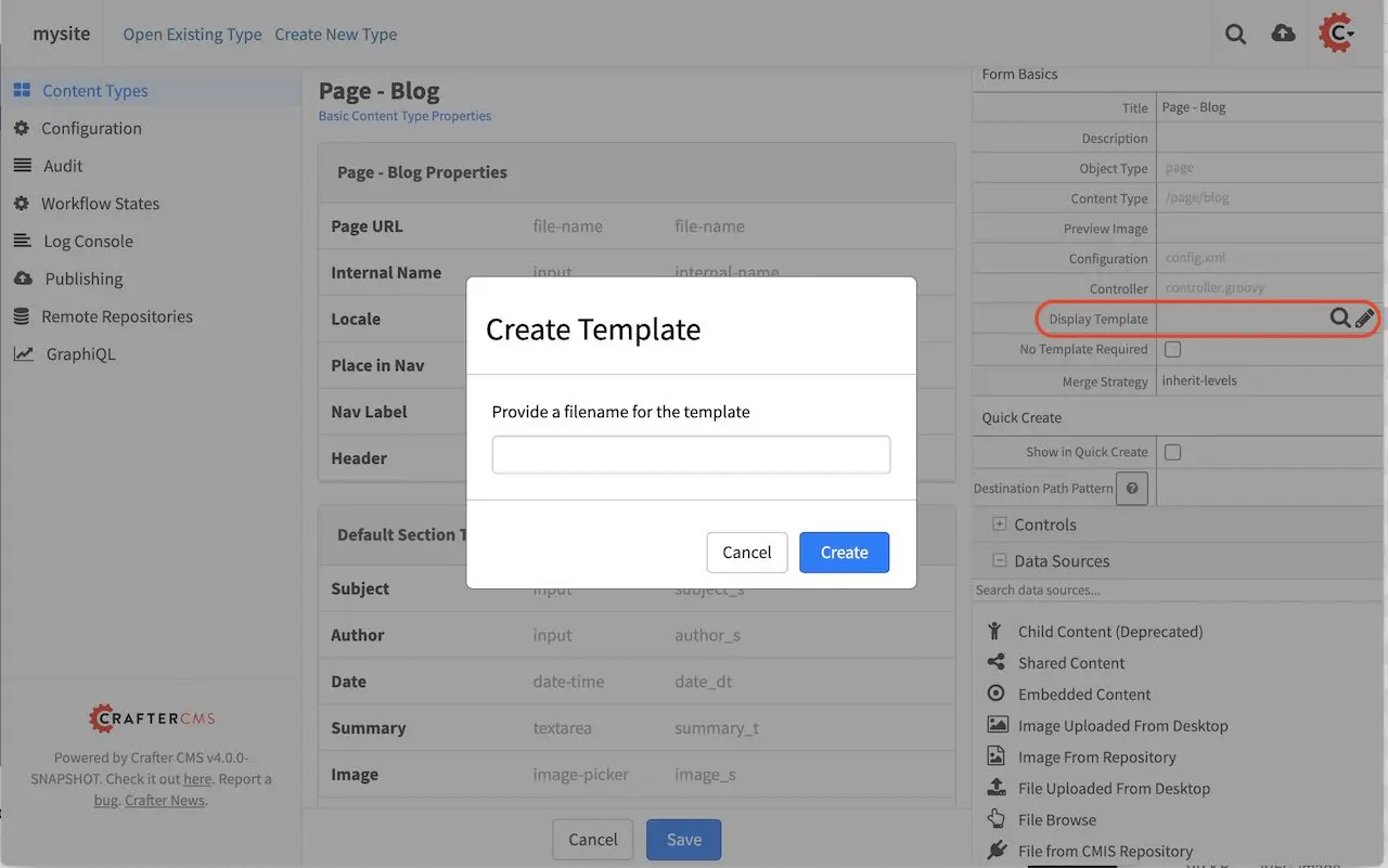
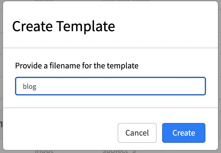
Either way of starting to create your new ftl template, a Create Template dialog will appear. It will then ask you for a filename for the freemarker template you’re creating, then click on the Create button.
A dialog will appear with a blank template.
At the top right of the dialog, you can use some Template code examples from a drop down list with the caption Insert Code. Here’s the list of available template code examples.
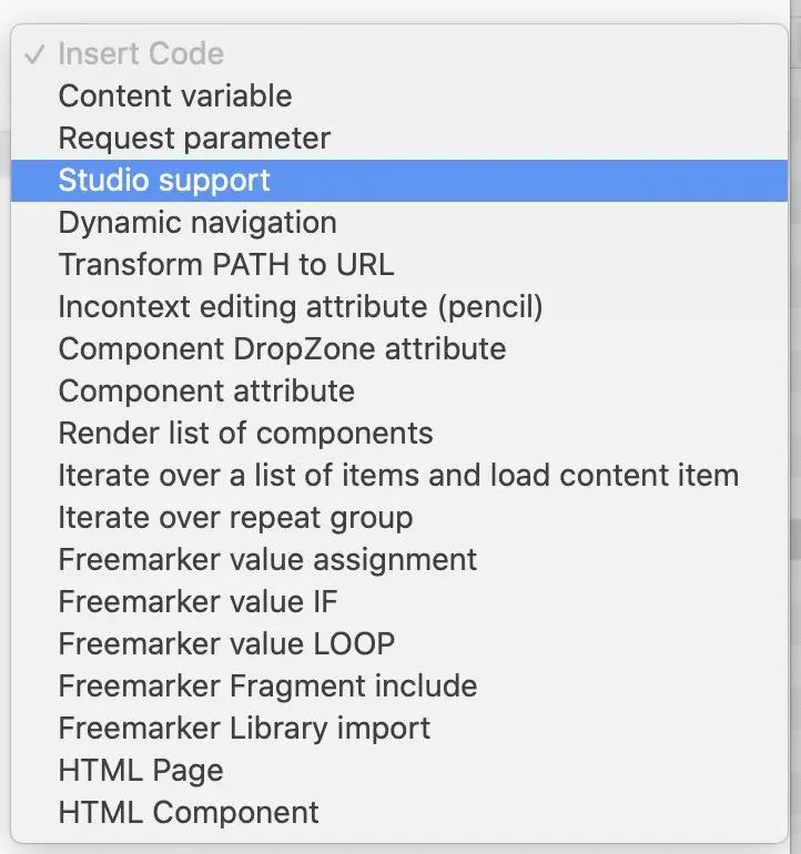
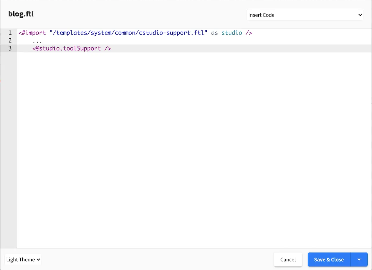
For the template we are creating, we will select Studio support from the drop down list to enable authoring support.
We will now start filling in the template of how we want the content captured in the model is rendered to html in this case. In the image below, we render the header component and the other fields in the Content section of our model. Please note how fields in the model are rendered through the FTL template. To learn more, please see the section FreeMarker (Templating) API
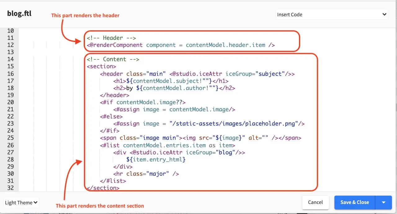
<!-- Header -->
    <@renderComponent component = contentModel.header.item />
 1<!-- Content -->
 2  <section>
 3    <header class="main" <@studio.iceAttr iceGroup="subject"/>>
 4      <h1>${contentModel.subject!""}</h1>
 5      <h2>by ${contentModel.author!""}</h2>
 6    </header>
 7    <#if contentModel.image??>
 8      <#assign image = contentModel.image/>
 9    <#else>
10      <#assign image = "/static-assets/images/placeholder.png"/>
11    </#if>
12    <span class="image main"><img src="${image}" alt="" /></span>
13    <#list contentModel.entries.item as item>
14      <div <@studio.iceAttr iceGroup="blog"/>>
15        ${item.entry_html}
16      </div>
17      <hr class="major" />
18    </#list>
19  </section>
Controller
A controller is not necessary for a content type. To show how to create a controller for our new content type, we will create a custom controller. In the preceding section, we created a new content type (template) Page - Blog. We will now add a couple of featured articles at the bottom of the page depending on the active segment set in targeting. To be able to display articles depending on the active segment set, we will need to get a list of articles tagged for the active segment. This can be done by adding a script that gets executed to get the list of articles tagged for the segment selected before the page is rendered.
Open the Sidebar menu and navigate to the Scripts folder. Click on the Scripts folder then scripts. Right click on the folder pages, then select Create Controller
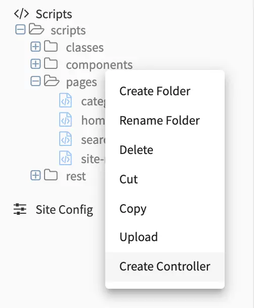
Enter a name for the controller, then click on the Create button. Since we are creating this controller for our Page-Blog template, we will name the script blog.groovy. Putting the script under scripts->pages and naming it after the page content type, binds the script to our page.
We can now start adding the script to get a list of articles depending on the active segment.
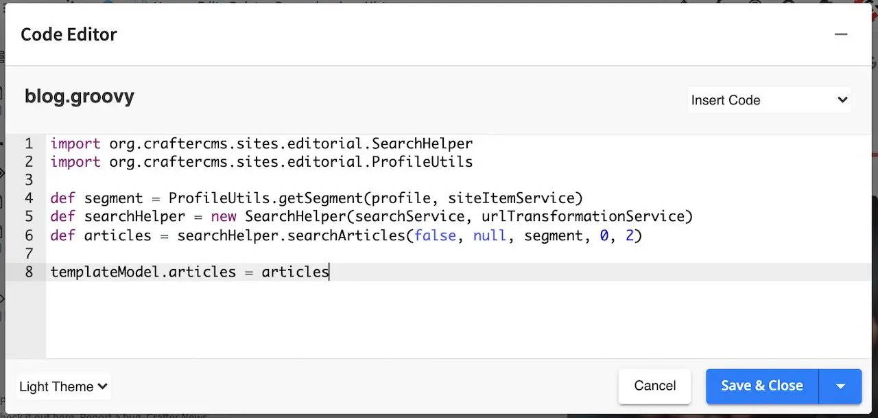
1import org.craftercms.sites.editorial.SearchHelper
2import org.craftercms.sites.editorial.ProfileUtils
3
4def segment = ProfileUtils.getSegment(profile, siteItemService)
5def searchHelper = new SearchHelper(searchClient, urlTransformationService)
6def articles = searchHelper.searchArticles(false, null, segment, 0, 2)
7
8templateModel.articles = articles
There are two ways to bind a script/controller to a page/component. The first way, as we have seen is to put the script under Scripts->Pages or Scripts->Components, and name the script after the page or component type. We’ll show the other way how to bind a script to a page/component in the next section Component Content Type Example
To find out more about page and component scripts, please see Page and Component Controllers.
Now that we have our controller, we just need to add code to the freemarker template (view) to display the list of articles returned by the script.
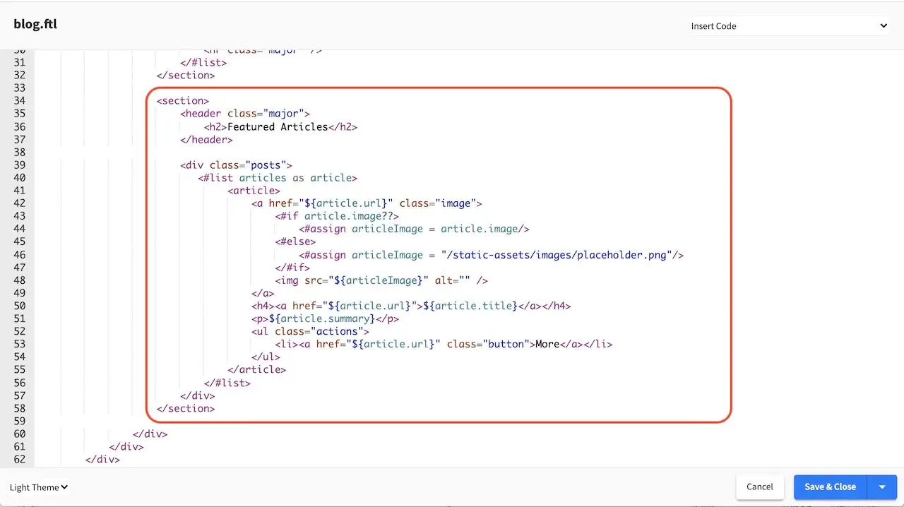
 1<section>
 2  <header class="major">
 3    <h2>Featured Articles</h2>
 4  </header>
 5
 6  <div class="posts">
 7    <#list articles as article>
 8      <article>
 9        <a href="${article.url}" class="image">
10          <#if article.image??>
11            <#assign articleImage = article.image/>
12          <#else>
13            <#assign articleImage = "/static-assets/images/placeholder.png"/>
14          </#if>
15          <img src="${articleImage}" alt="" />
16        </a>
17        <h4><a href="${article.url}">${article.title}</a></h4>
18        <p>${article.summary}</p>
19        <ul class="actions">
20          <li><a href="${article.url}" class="button">More</a></li>
21        </ul>
22      </article>
23    </#list>
24  </div>
25</section>
As you can see from the controller we just added, the controller is used to customize your page by enabling you to run a script before the page is rendered. To find out more about groovy APIs in CrafterCMS, please see the section Page and Component Controllers.
Component Content Type Example
Component content type templates are very similar to page content type templates, as mentioned in Content Modeling, the only difference between components and pages is that components cannot render by itself, it needs a container to render into. In this section, we will look at the component content type, Component - Articles Widget found in the Website_Editorial blueprint that shows you how to create a component content type that can be rendered in the sidebar.
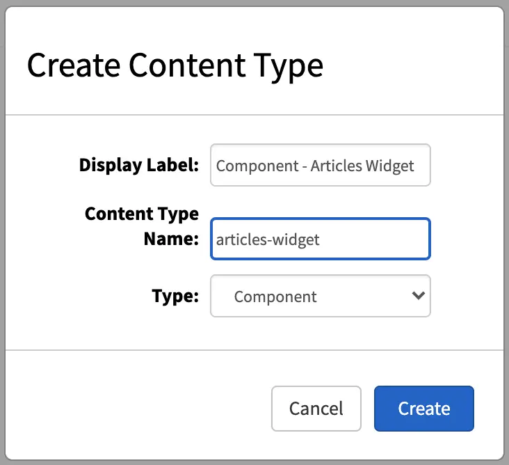
To create a new component content type, click on in the Sidebar. Click on Content Types, then select Create New Type. Enter a Display Label and content type name for your new template, then select Component as Type and then click on the Create button.
We’ll now show you how to construct the layout of our component. Just like a Page content type, a Component content type has three ingredients: the model, the view and the controller.
Model
The dialog that opens after clicking on the Create button is the form that is presented to authors to enter content into. The controls available are on the right side of the dialog, in the Controls section. Simply drag the desired control to the form section to add.
Let’s take a look at the model for the articles-widget component content type. The default dialog after clicking on the Create button contains only the Component ID and Internal Name field. From the image below, we have a few input controls added, one for the Title, one for Max Articles, a check box for Disable Component and an item selector for Controllers.
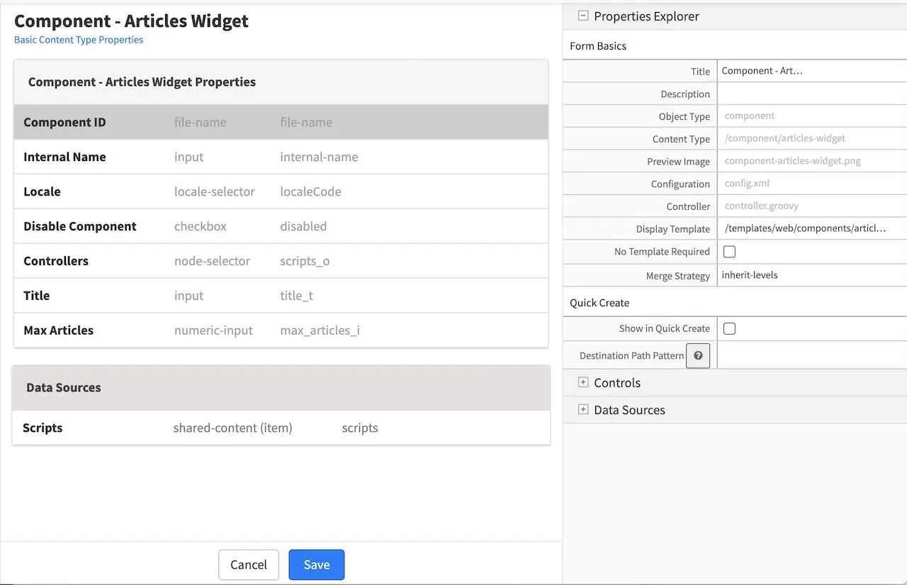
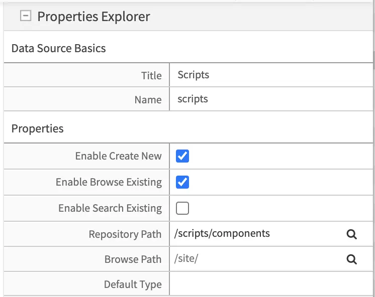
In the Data Sources section of the form, we see a shared content for Scripts, with the Repository Path property set to /scripts/components
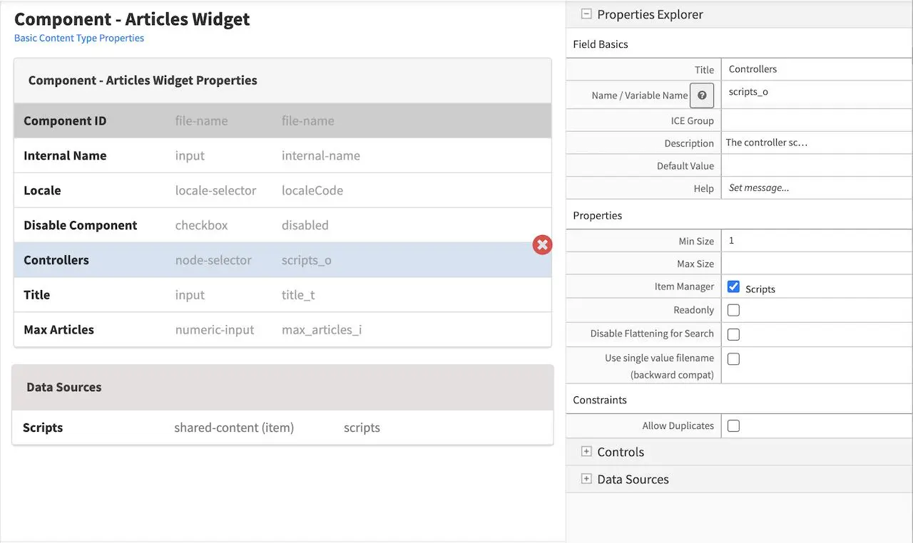
We’ll take a look at the property Controllers and notice that the data source Scripts is bound to the item selector Controllers by a check mark to Scripts for the Item Manager under the Properties Explorer of the Controller item selector control
That’s the model for the component content type Articles - Widget. Remember that you can add some other controls by dragging and dropping controls from the Controls section to the form. To learn more about all the controls available, please see Form Controls. To learn more about the data sources available, please see Data Sources.
View
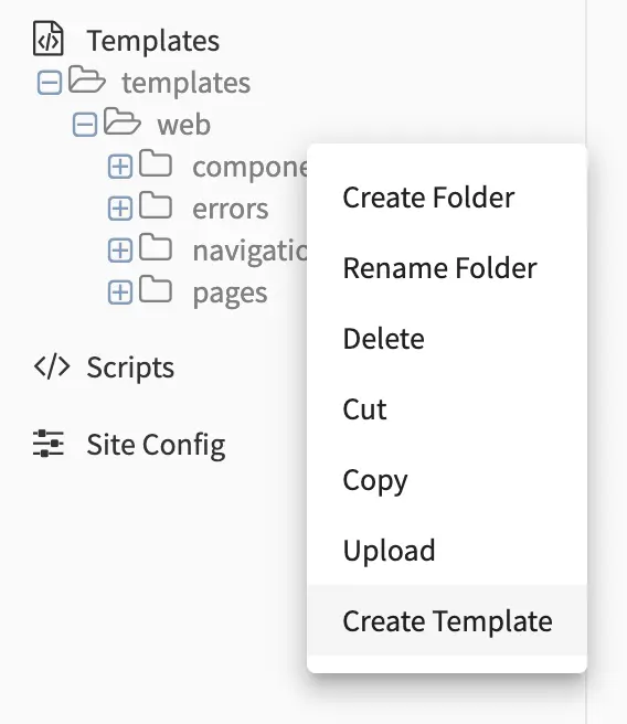
We’ll now look at the view for our template, which is the freemarker template file that renders the content, typically to HTML markup. There are two ways to create the freemarker template file for our template. One way is to open the Sidebar menu in Studio, then navigate to the Templates folder, depending on how your project is setup, you may want to navigate to the subfolder in your Templates folder where you want to create the freemarker template file. Once you are in the desired subfolder, right click on that folder then select Create Template. In our example here, we navigated to Templates->templates->components, then right click on the components folder then select Create Template
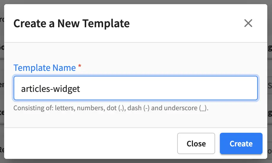
You’ll then be shown a dialog where you can give the view template a name, then click on Create and a dialog will open where you can enter how you want to display the content.
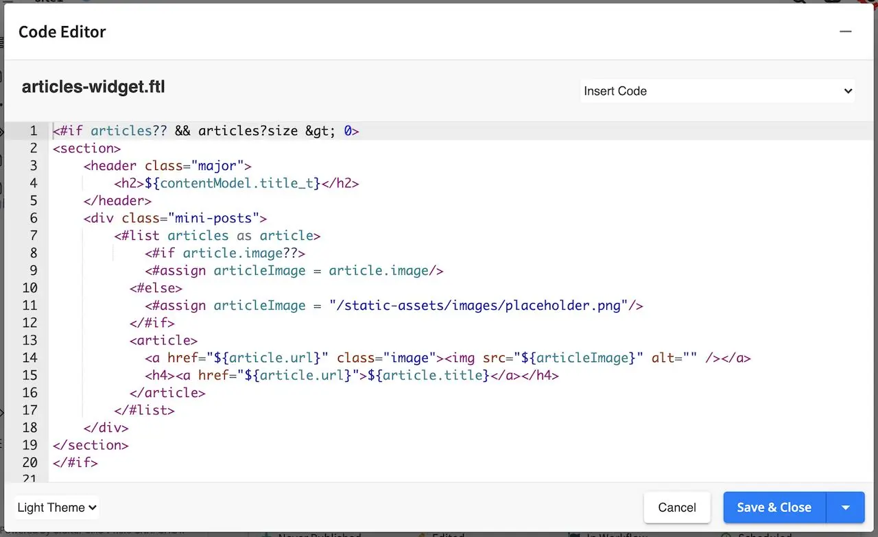
Here we’ll take a look at the view template for the component content type named articles-widget.ftl
Let’s take a look on how to bind the view template to the model described earlier by clicking on the Display Template under the Properties Explorer in your model.
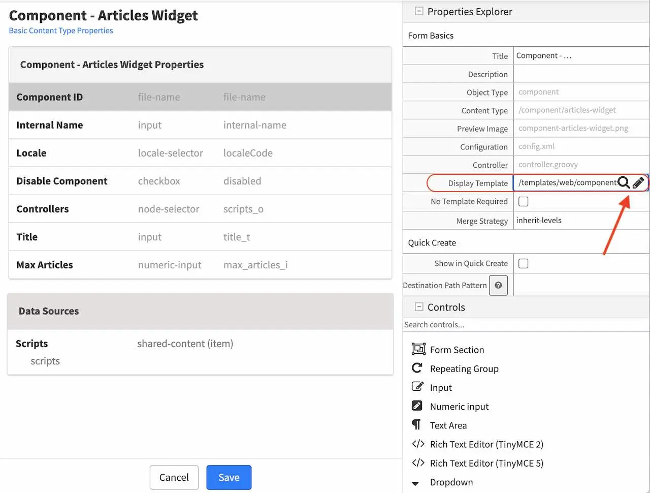
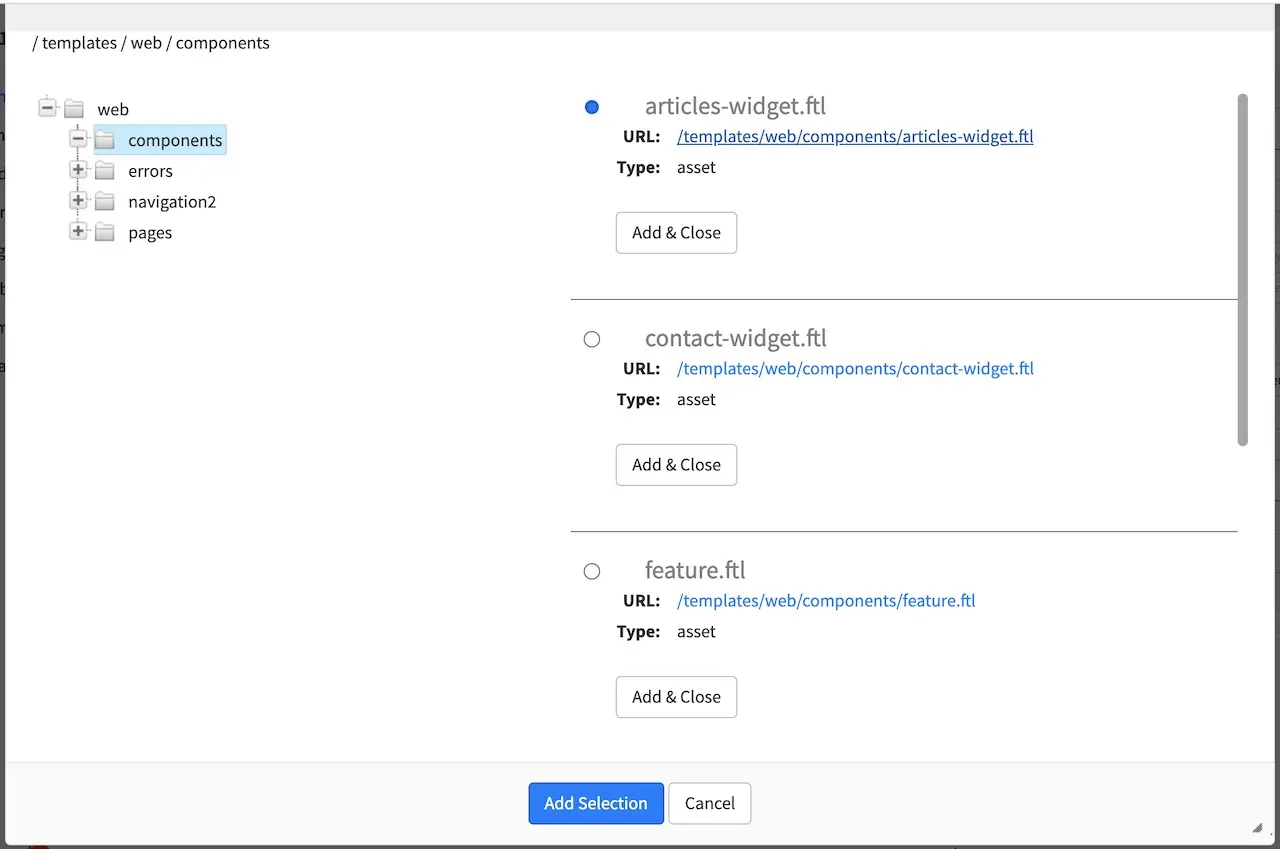
We will now select the view template we just created by clicking on the magnifying glass and selecting your desired template from the list. For our example, we would select articles-widget.ftl from the list.
Our view template is now done. Next we’ll see how to create a controller for our component and bind it to the articles-widget component content type template.
Controller
We will look at a controller that allows us to display the latest article entries in the sidebar of our project.
There are two ways to bind a script/controller to a page/component. The first way, as we have seen in the previous section Page Content Type Example is to put the script under Scripts->Pages or Scripts->Components, and name the script after the page or component type. We’ll show the other way how to bind a script to a page/component in this section, by adding an item selector to the model with a corresponding data source Shared Content named scripts. When we were looking at the model for our content type template (articles-widget), you may have noticed that there is an item selector named Controllers with a corresponding data source shared content named Scripts, we are now going to look at a script that can be used by the item selector of our content type.
To create a new controller, open the Sidebar menu and navigate to the Scripts folder. Click on the Scripts folder then scripts. Right click on the folder components, then select Create Controller
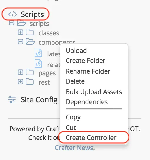
Enter a name for the controller, then click on the Create button. For our latest articles example, this is how it would look like when giving your controller a name:
A dialog will then open where you can start entering your script. Let’s take a look at the script to get a list of the latest articles
1import org.craftercms.sites.editorial.SearchHelper
2import org.craftercms.sites.editorial.ProfileUtils
3
4def segment = ProfileUtils.getSegment(profile, siteItemService)
5def searchHelper = new SearchHelper(searchClient, urlTransformationService)
6def articles = searchHelper.searchArticles(false, null, segment, 0, 2)
7
8templateModel.articles = articles
After creating your controller, you would then need to create a component that will use the script just created. Let’s take a look at the component named Latest Articles Widget under the Components folder in the Sidebar which uses the script we looked at earlier. Preview your project or click on the Dashboard. Click on the Sidebar and navigate to Components -> components -> articles-widget. To create a new component, right click on the folder, then select New Content, which will open the form containing the model we looked at earlier for articles-widget:
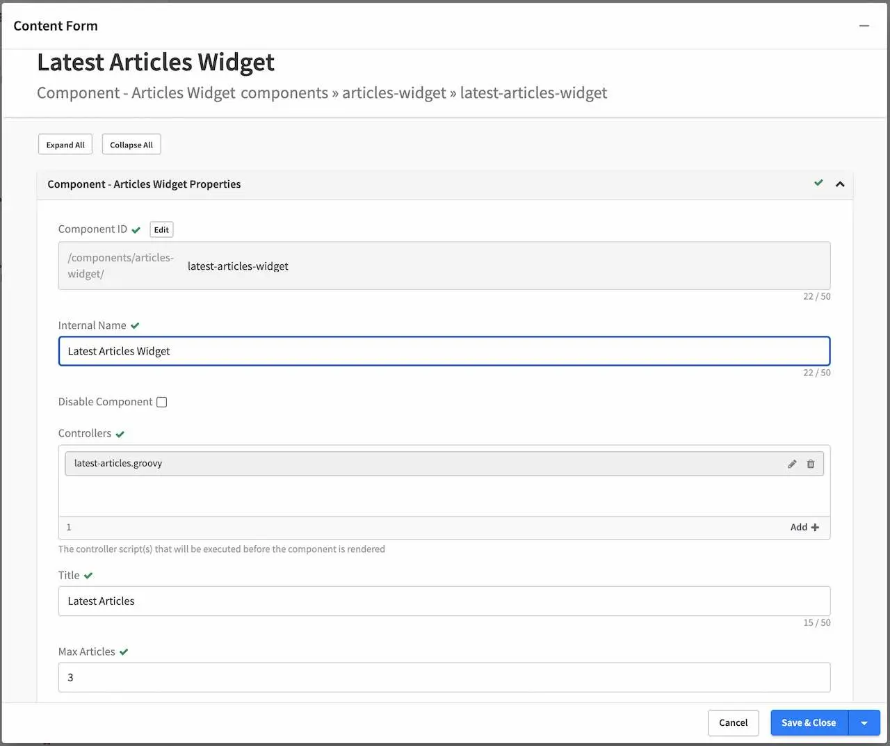
As we can see from the figure above, the script we created is bound to the new articles-widget component we created. To bind a script to your component, in the Controllers field, click on the Add button, then select Browse for Existing - Scripts, which would then give you a list of existing scripts:
The component is now ready to be used in the Sidebar.