
Author
Authors create, edit and submit content for experiences. CrafterCMS’s Crafter Studio provides the author an easy to use authoring system for the development and optimization of content-rich experiences.
The project administrator and the developer sets things up before an author begins contributing content for the experience being built. This section contains information on the authoring environment and how authors manages content.
CrafterCMS is a web content and experience management solution that allows organizations to build and manage rich online experiences on the web, mobile, social, and all digital online channels.
Author Screens
As mentioned earlier, Crafter Studio provides authors the tools for creating/managing content in experiences. In this section we’ll take a look at various screens in Crafter Studio an author may encounter.
Logging In
- To log in to Crafter Studio:
Enter the following in the URL of your browser: http://SERVERNAMEHERE:PORT/studio
Enter your user name
Enter your password
Click “Log In”
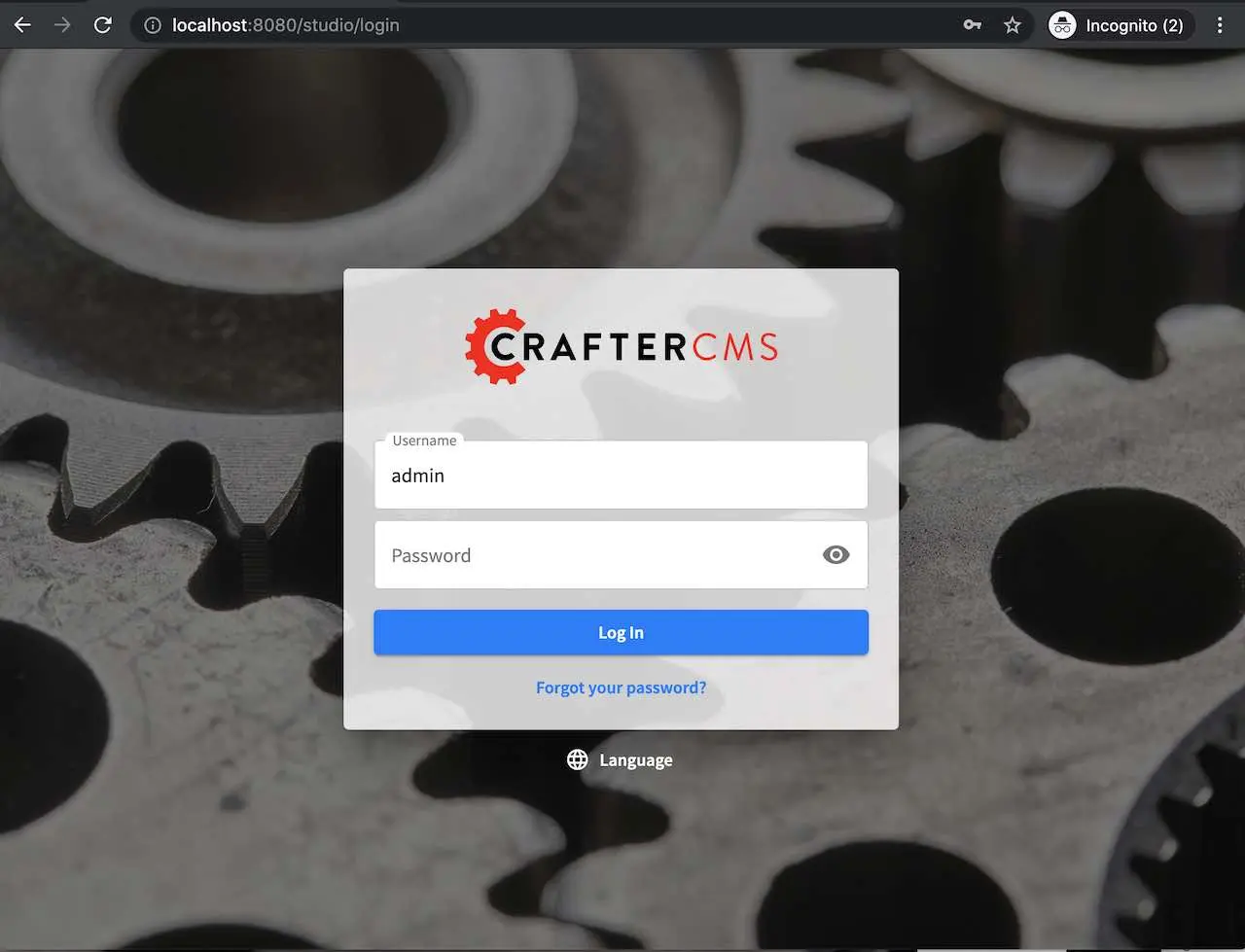
Note: You can change the language used for the Studio UI by clicking on
Languageon the log in screen.
Roles
After logging in, depending on what access rights have been setup for your user account, you can have one of the following roles:
Content Author An Author has access to create, edit and submit content within a project.
Content Publisher A Publisher has access to create, edit, submit and approve content within a project.
Content Reviewer A Reviewer has access to approve or reject content within a project.
There are three additional roles in CrafterCMS that are out of scope of this article: Project Administrator, Developer and System Administrator.
Note
Only the System Administrator can create new projects, users, groups, and assign roles to users.
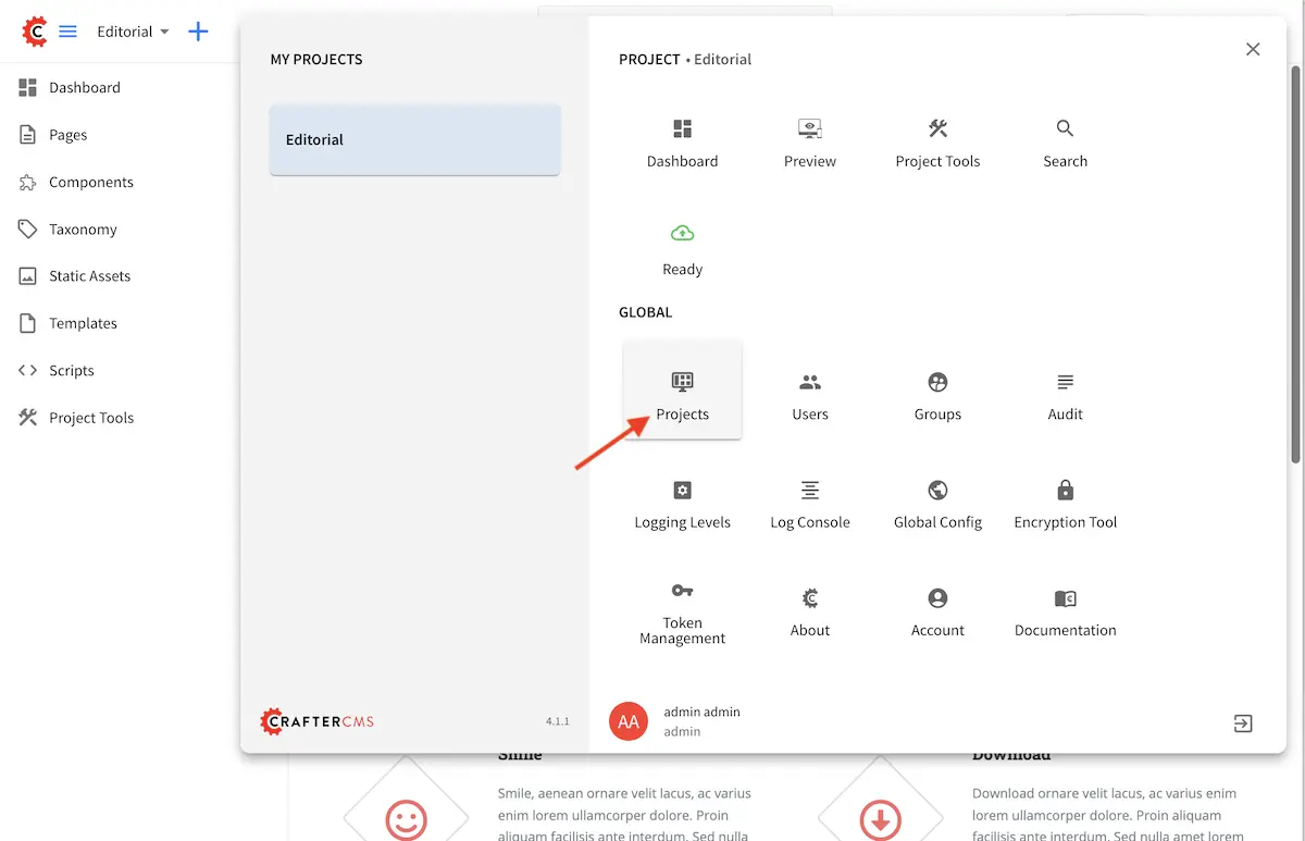
Projects
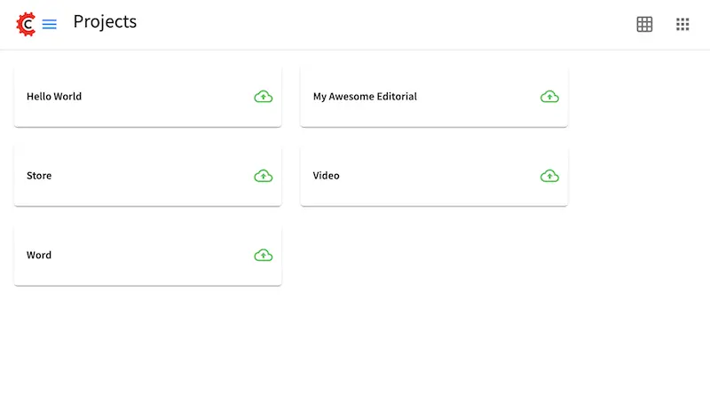
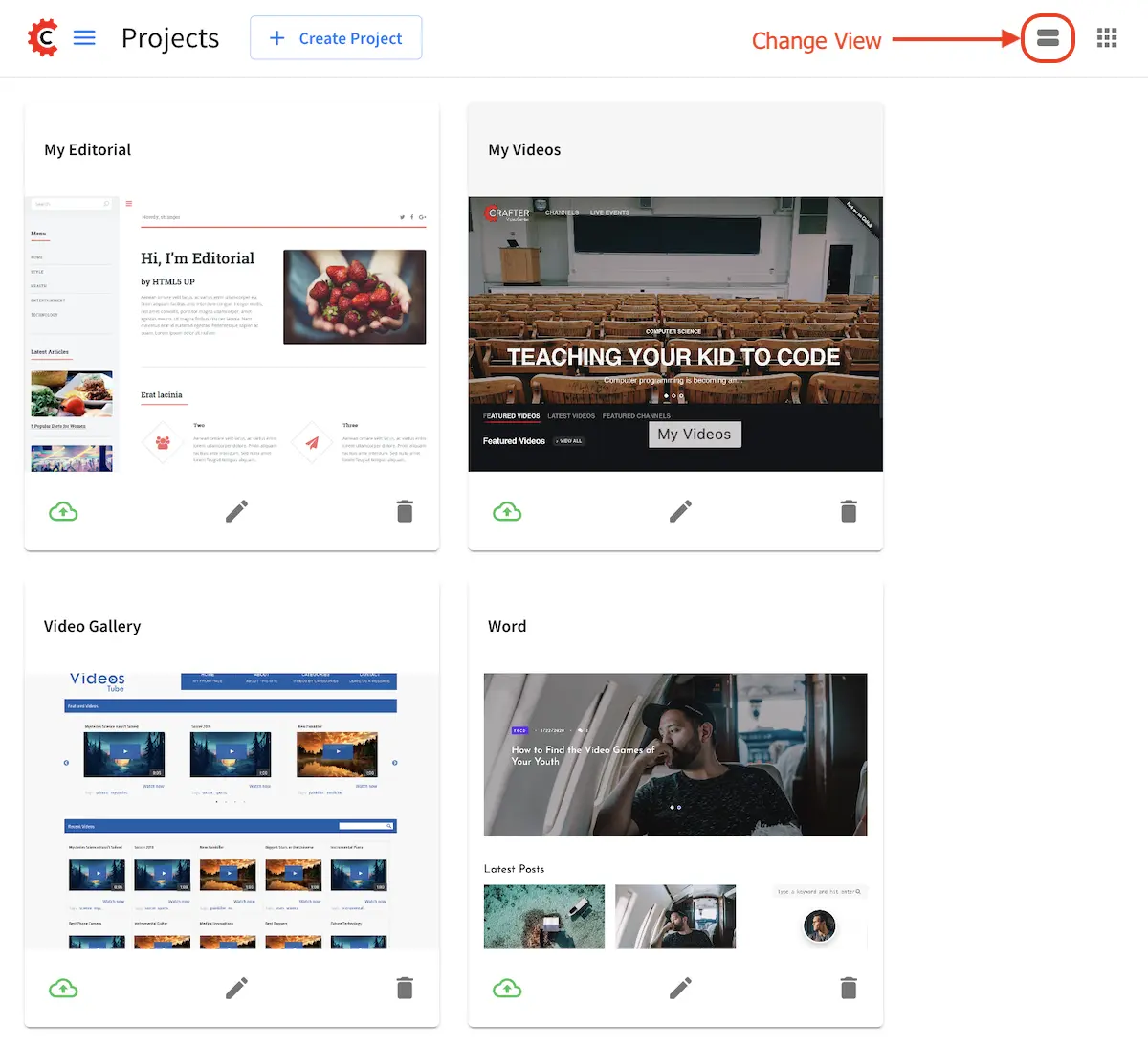
Projects is the first screen you will encounter after logging in to Crafter Studio. This screen lists all of the projects you have been granted permission to. From this screen you can navigate to any project. Your projects can be viewed either in a list or in a grid.
Here’s the Projects screen with the projects in a list:
Here’s the Projects screen with the projects in a grid:
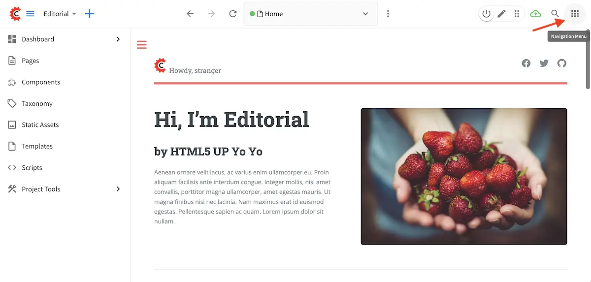
You can get back to the Projects screen by clicking on the Navigation Menu icon at the top right corner,
then click on “Projects” on the top left of the Global section
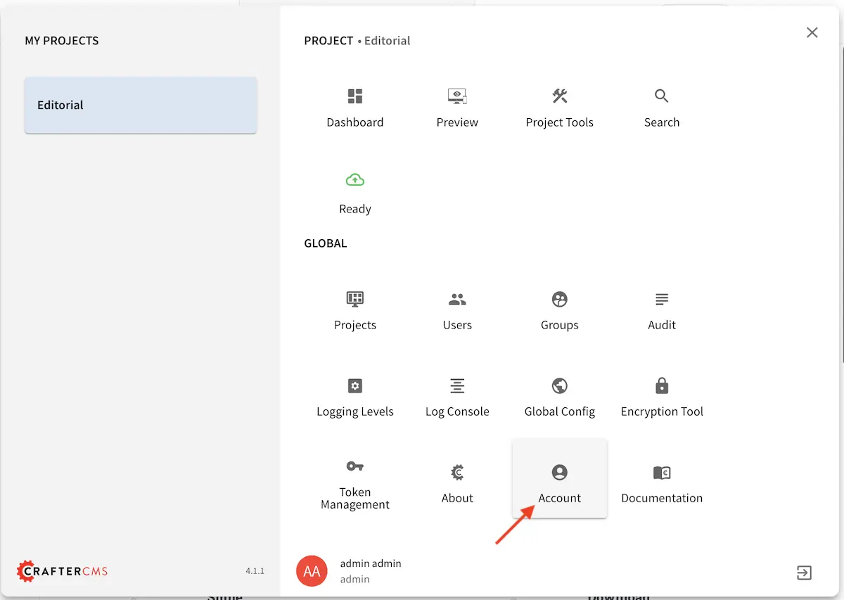
Account Management
Account Management is where you go to change your personal Crafter Studio settings like language or to change your password or to clear your Studio UI preferences from the browser cache.
To get to Account Management:
Click on the
Navigation Menuicon at the top right cornerClick on Account under Global
Here’s the Account screen:
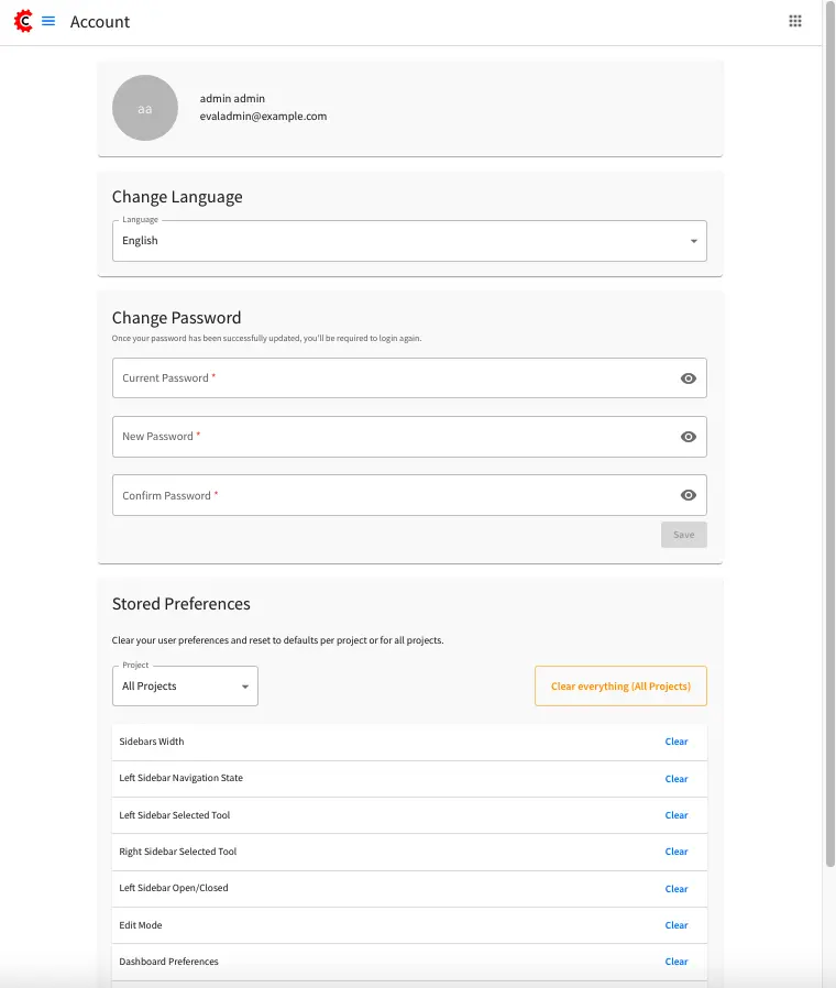
From the screen above,
You can change the language of Crafter Studio.
You can also change your password. For more information, see Changing Your Password.
You can clear your stored Crafter Studio UI user preferences and reset them to defaults per project or all the projects
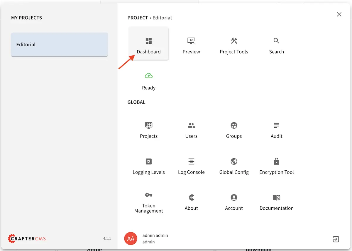
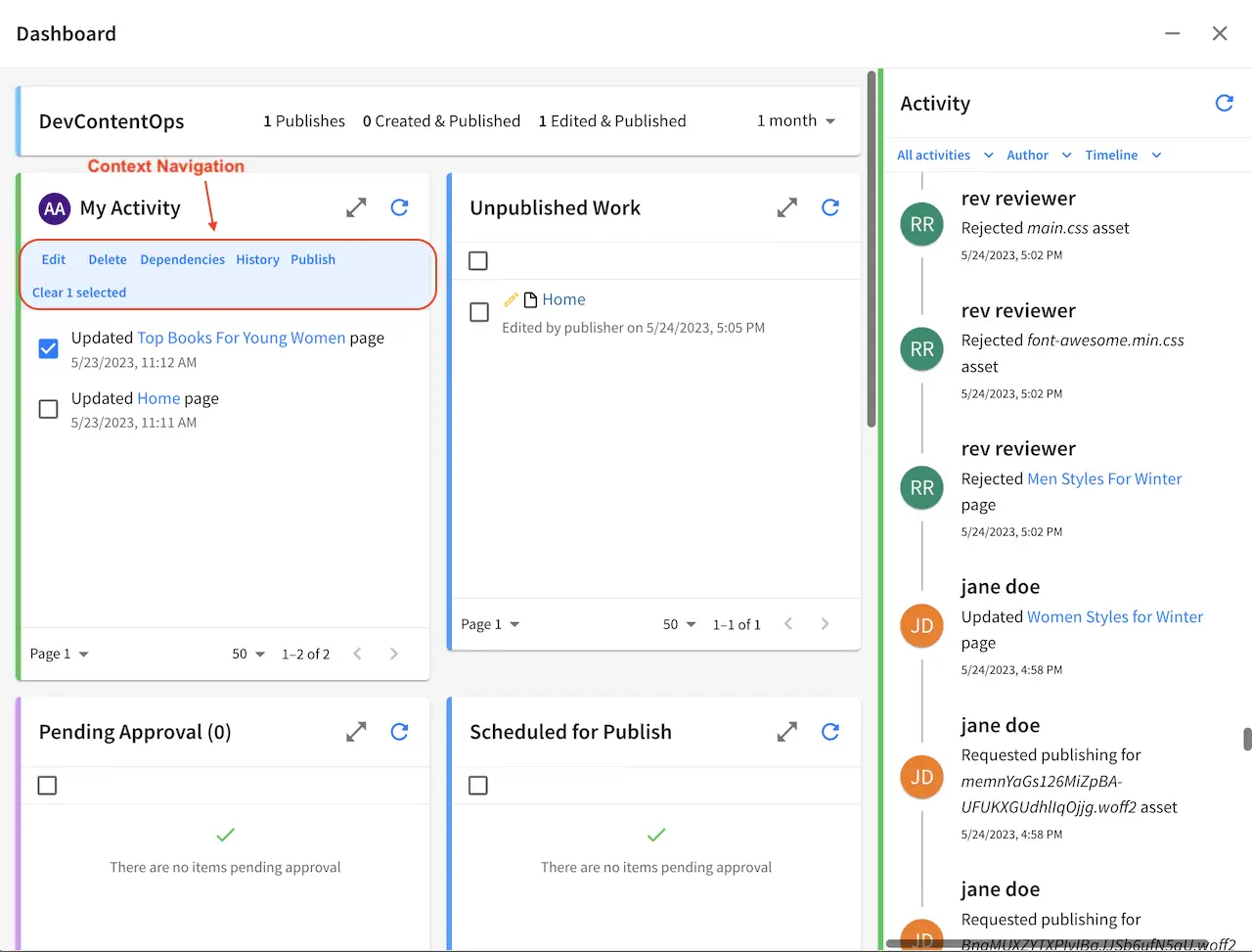
Project Dashboard
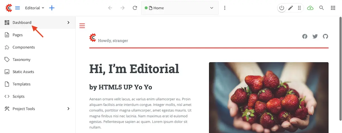
Each project has a Project Dashboard. To view a project’s dashboard, click on Dashboard at the top of the Sidebar, or click on the Navigation Menu icon at the top right corner of the screen.
Access the Dashboard from the Sidebar
Access the Dashboard from the Navigation Menu
This screen is an overview of the workflow for that given project. The project dashboard has different dashlet actions available depending on your role.
Each dashlet has a header and the following:
Expand Collapse control Each dashlet can be expanded to be display more items in the dashlet and minimized to return it to its tile position in the dashboard.
Refresh control Each dashlet has a refresh control to refresh the items displayed.
Dashlet title and count Some dashlets include a count at the end of the name for the number of items in the dashlet
Page number dropdown Allows author to navigate to a certain page by selecting a page number from the dropdown
Show count Dashlets allow the author to decide how many items they want to see in the dashlet
Page forward and back Allows the author to navigate back and forth between available pages
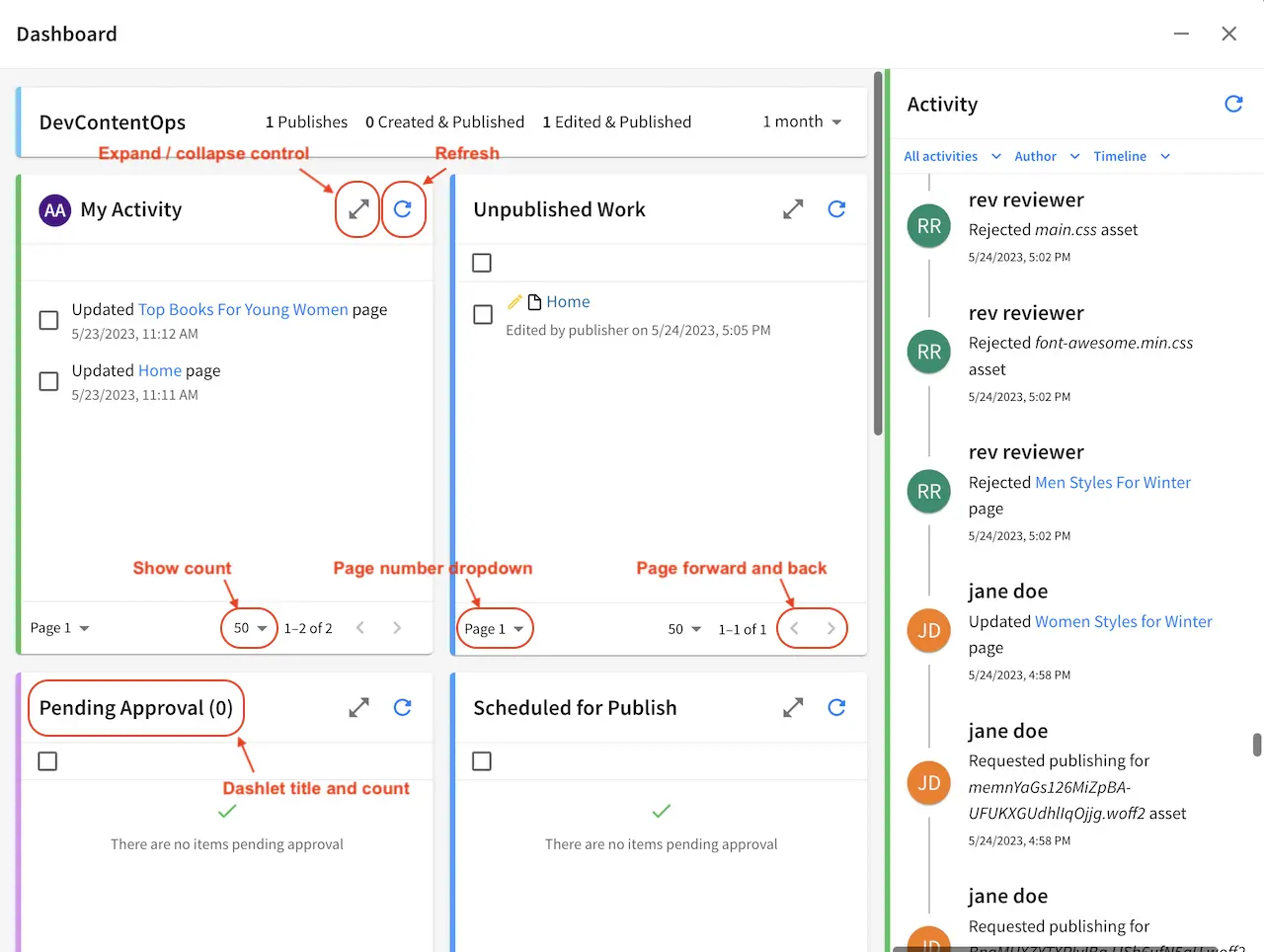
For the dashboard shown above, here are the dashlets listed:
- Activity
Shows all items recently modified by all users
Viewable by all users
- Pending Approval
Shows all items currently in workflow
Viewable only to admins and publishers
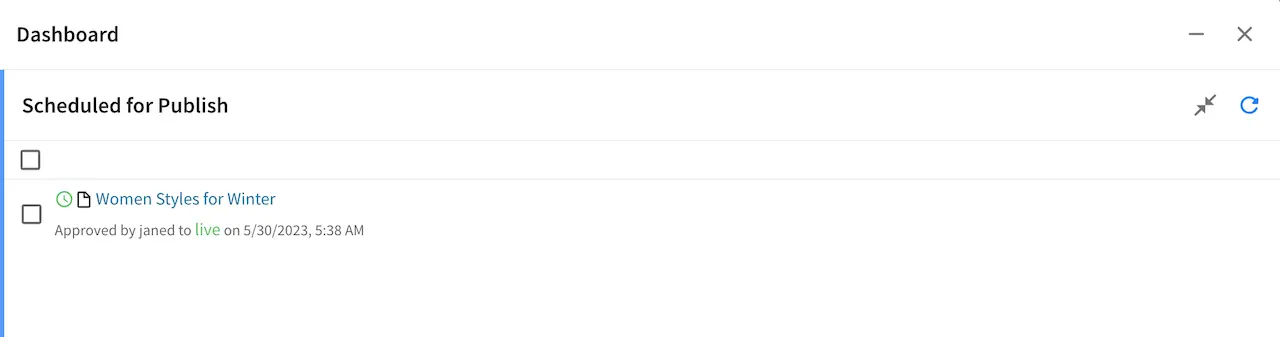
- Scheduled for Publish
Shows all items approved for a specific scheduled deployment date
Viewable only to admins and publishers
- Recently Published
Shows all items that have been previously deployed
Viewable only to admins and publishers
- My Activity
Shows all items recently modified by the current user
Viewable by all users
- Unpublished Work
Shows all unpublished items modified by the current user
Viewable by all users
- Expiring
Shows all items that are expired or about to expire
Viewable by all users
- Icon Guide
The Icon guide is simply a legend to help authors and content managers with the iconography on the system. While it can be very complex to sum up the state and nature of content in a glance, Crafter Studio attempts to achieve a high level visual summary for each object icons. You will see these icons throughout the application whenever an object is presented to the user. The icon always shows the Current state of the object.
Describes the meaning of icons within Crafter Studio
Viewable by all users
The Icon guide breaks down icons in to their elements. You have two basic elements which can be combined to form a specific icon: the item type and the worfkflow indicator.
Item Types
Item types are high level archetypes of content objects within the system. These types and the iconography associated with them provide a basic classification of the type of object at a glance.
: A page is exactly what you would expect, it’s a URI addressable object that represents a web page or resource.
: A component is an object that is generally not URI addressable on the project. Examples are objects like Banners, Touts, Sidebar content etc. Components are usually re-usable assets that can be assigned and shared across many pages.
: A taxonomy is an object the same as a component used for classifying items.
Below is a list of all the other item types available:
Workflow States
Workflow States help authors and content managers understand at a glance what is going on with the content at a high level. Is it Live? Is it work in progress? Is it currently checked out? In some sort of approval process?
: The content has never been pushed live. This helps authors quickly identify which objects that are in progress are already live and which ones are entirely new.
: Edited means that the item has been edited since it was made live. Items move to edited as soon as they are created or when they are edited.
: Items which carry the red trash can icon but are not editable and previewable are deleted. You will only see these items in dashboards which show historical data
: A locked item is currently in the process of being edited by another author.
: Item is currently being handled by the system
:
: Any item which carries the airplane icon is in some sort of workflow
:
: Item has a launch schedule associated with it
: Item is currently being published
: You will find that some objects have a red circle with a slash in the middle, this means that the object is not deleted but it should not be displayed on the project. It’s essentially a logical delete. Imagine a scenario where you need to take an object down immediately because of an inaccuracy while you make corrections. Disable is perfect for this and several other scenarios.
Publishing Status/Target
: Item has been published to the
stagingpublishing target
: Item has been published to the
livepublishing targetSelecting a dashboard item
Items in some dashlets have the ability to be selected. Selecting an item allows the user to interact with the selected items via the context navigation
Items in the dashboard have icons which shows the type and current workflow status of the item
Preview
Every project has a preview. This allows users to see, edit and test the project in a safe authoring sandbox prior to publishing changes.
Preview is a fully functional project but in a safe-to-edit environment
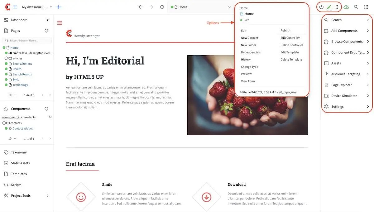
The top center shows workflow status and options (three dots) for the current page
Author can change the type of preview from one channel to another
Author can turn on in-context and drag and drop editing features
Author can change the targeting attributes used to view the project
Author can view the publish status of the project
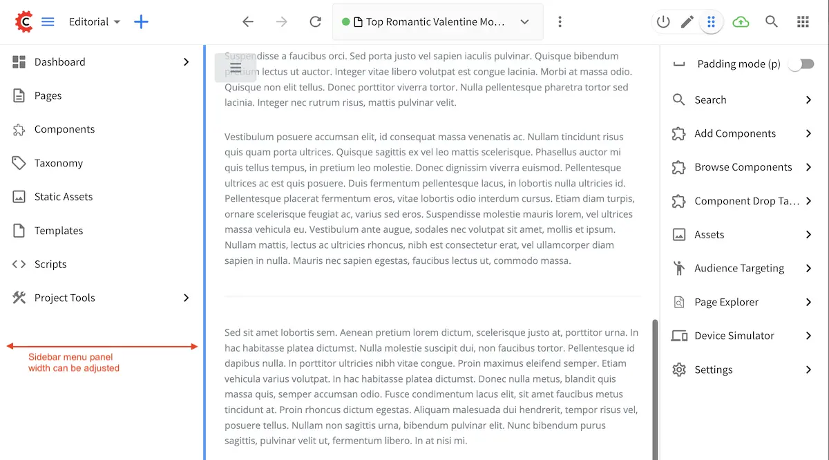
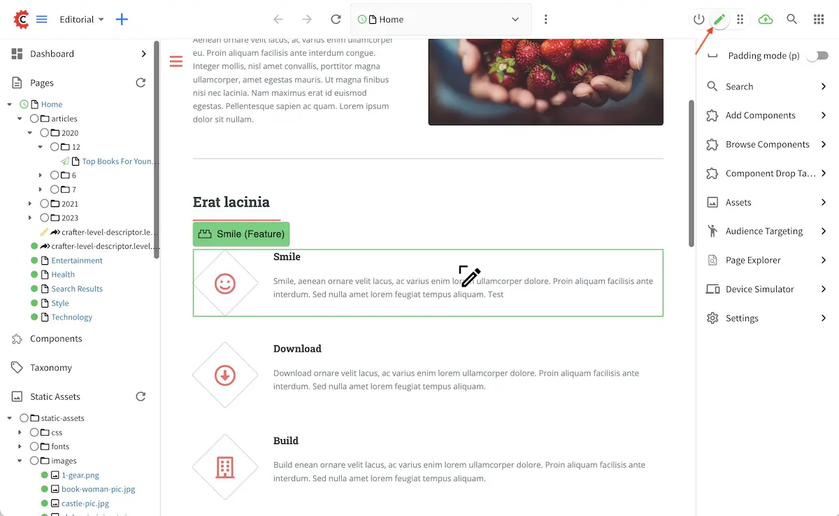
Experience Builder Panel
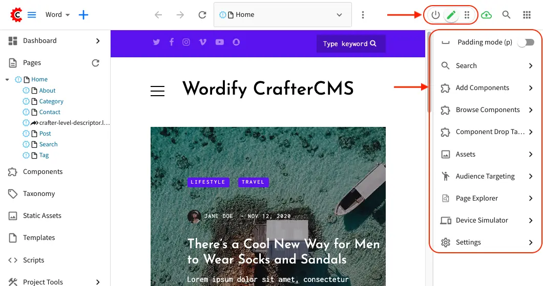
When in preview mode your context navigation will show an additional control beside the publishing status.
The
Edit ModeandMove modeicons turns on the Experience Builder panel which allows you to use in-context editing and various tools for creating your page in a panel on the rightSearchallows you to search for items such as components, images, etc. in your projectComponentsallows you to create a component and also lists all available components in your project which can then be dragged and dropped into your pageBrowse Componentsallows you to browse for components which can then be dragged and dropped into your pageComponent Drop Targetsallows you to select a content type, which then shows you the drag and drop area for that content typeAssetsallows you to search/list assets such as images in the projectAudience Targetingallows you to view and set targeting attributes for the project.Page Explorerallows you to browse/list pages in the projectDevice Simulatorallows you to change the type of preview from one device to another e.g. phone to tabletSettingsallows you to turns on/off in-context editing and setup highlighting of drop zones
Common Navigation Elements
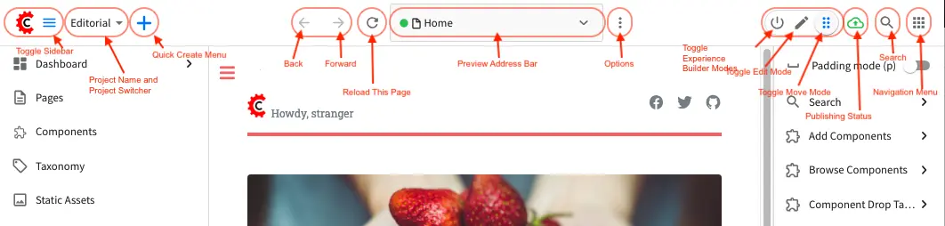
Toolbar
The Toolbar is a fixed element at the top of the page and cannot be scrolled off the page. The toolbar provides contextual workflow and other options relative to the page you are looking at, content you have selected or tool you are using.
The basic elements of the Contextual Navigation bar are:
Branded Logo Button: Toggles the sidebar on/off.
Project Name and Project switcher: Displays the project’s name and lets you switch the project being previewed through a dropdown
Quick Create: A shortcut for content authors to create configured content without having to navigate through the project tree.
Preview Address Bar: An area reserved for navigation buttons (back, forward and reload page), the address of the current page being previewed, and an options link whose content will change based off of the current page view and user role. This can also help authors search for content in the project and preview it quickly.
Edit Mode Switch: Toggles the in-context editing and Experience Builder panel on/off
Publish Status: Allows the user to view the project’s publish status.
Search: Allows the user to search for items in the project
Navigation Menu: Takes the user to a panel with
GlobalandProjectoptions containing various links such as Dashboard, About, Help, etc.
Sidebar
The sidebar opens a menu that allows access to the following:
Dashboard: An overview of the workflow for that given project. See above for more information
Project Explorer: Allows navigation to all pages, components and documents in the system
Project Tools (available depending on your role): Contains project administration tools such as Plugin Management, Encryption Tool, etc. See here for more information
The menu/panel width can be resized freely by the user and will remember where you set the length and width on your browser
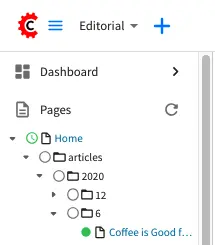
Project Explorer
Users can have multiple navigation paths / path tree open at the same time e.g. templates, pages, etc.
Each item listed has item state and publish target icons next to them
Root folders allow a user to drill in to a hierarchy of content. If the item is previewable it will also be clickable.
Clicking on an item will take the author to a preview of the item.
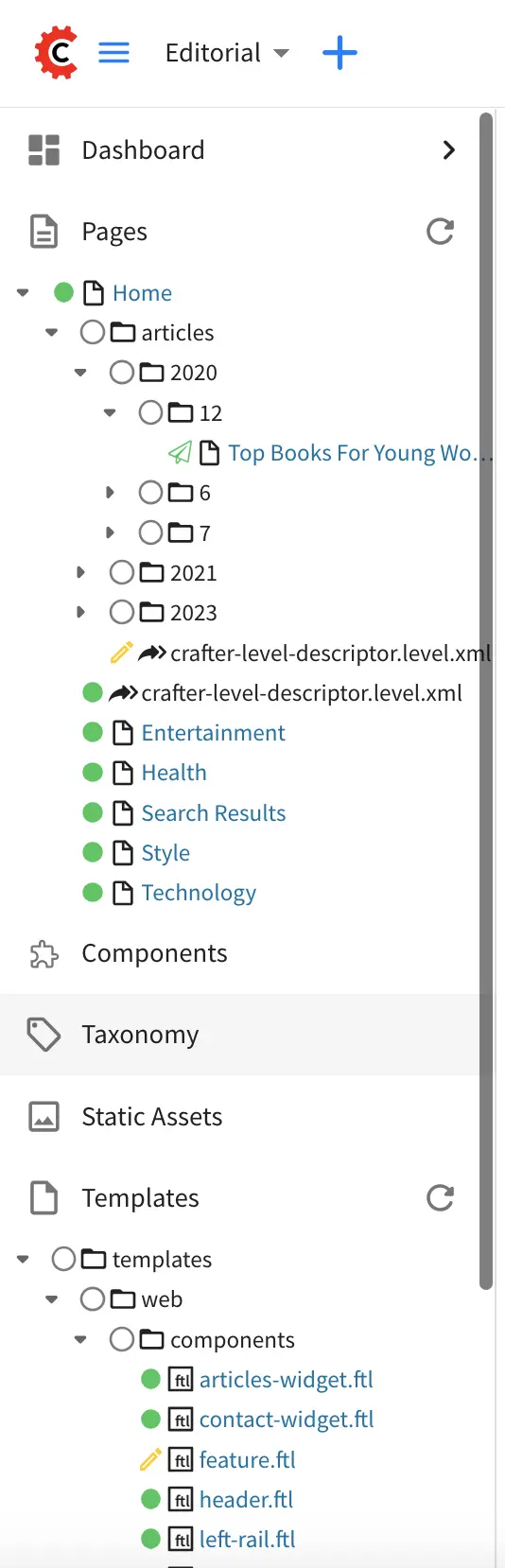
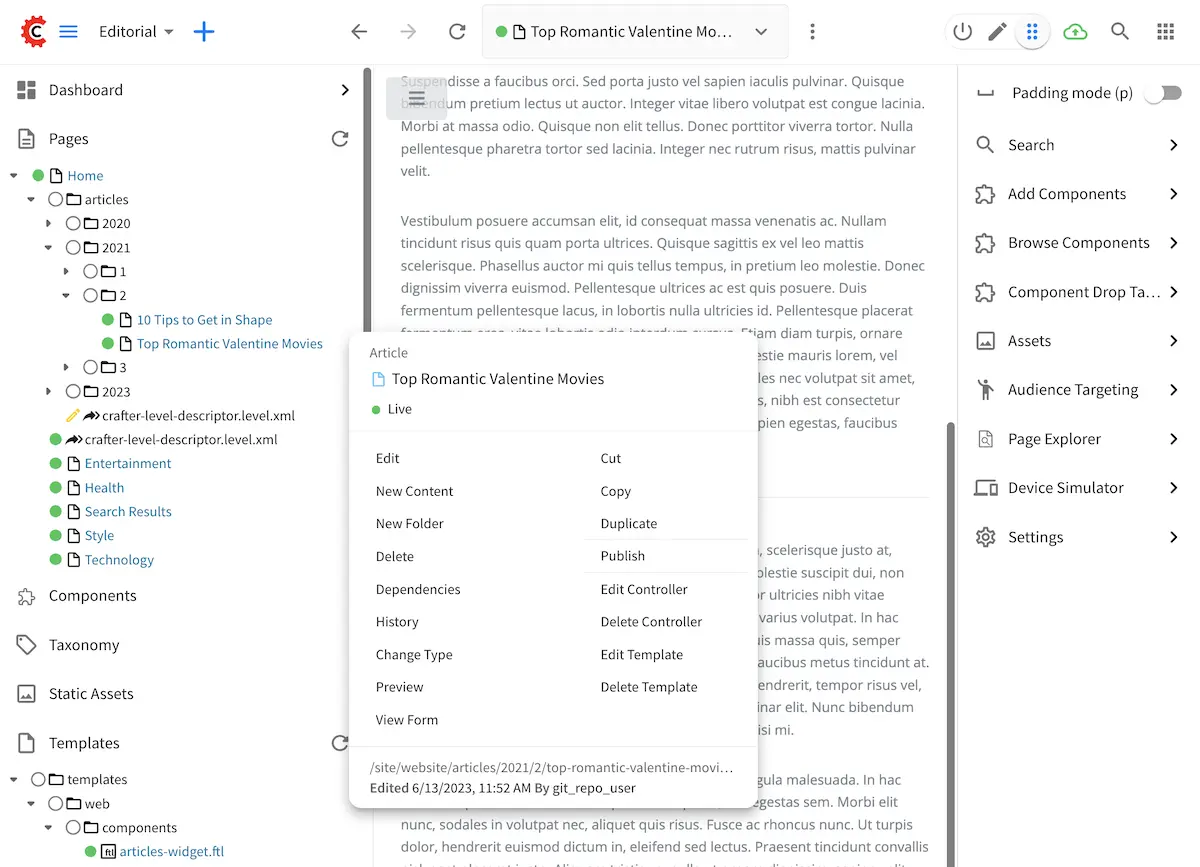
Clicking the More menu (three dots) next to each item or right-clicking on an item provides the user options whose content will change based off of the item selected and user role.
Author Experience Builder (XB)
CrafterCMS’s Experience Builder (XB) enables authors with in-context editing (ICE) for all the model fields defined in the content types of pages and components.
In this section, we describe how authors can use the Experience Builder for adding/editing content. But first, let’s explore the screens of the Experience Builder.
Experience Builder Screens
When in-context editing is turned on (Edit mode pencil is green or Move mode two vertical ellipsis
is blue at the top), it puts the page in construction mode. When you hover your mouse around regions of
the page that have been wired for in-context editing, a pencil will show up instead of the mouse cursor.
This pencil allows you to edit the content of the wired region, including the current page’s template and controller depending on your user account permissions
To turn off in-context editing, click on the Switch off editing off switch icon at the top, which will
then turn the Edit mode/Move mode icon to gray.
Convenient keyboard shortcuts are also provided, press ? to see the list of commands.
Search
The Search tool allows you to search for components and static assets in the project then display the results from which the user can drag and drop into the current page being viewed if there are configured drop targets in it
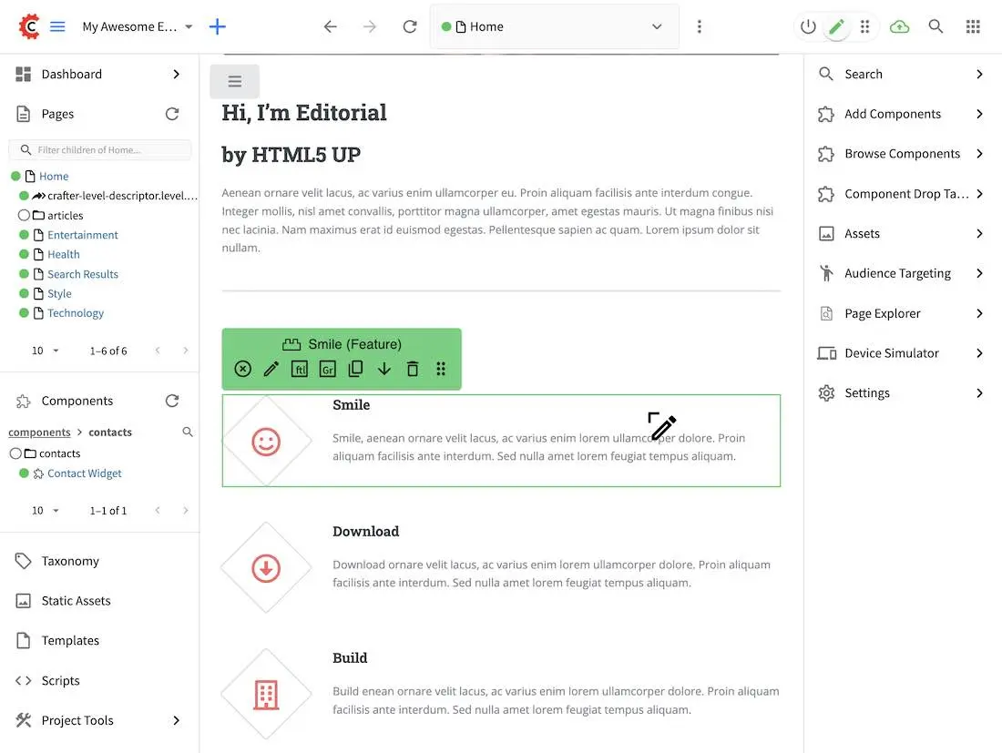
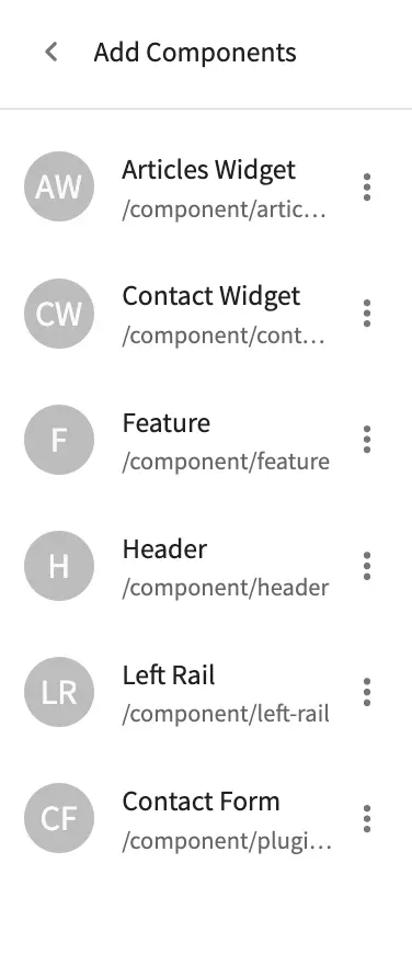
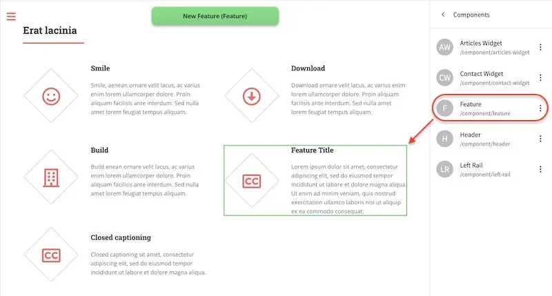
Add Components
The Add Components tool allows you to create new components by dragging components from the panel and
on to the screen to configured drop targets. A new component with default values will then be visible and
ready for editing when a new component is dropped on the screen.

You may drag around a component from one position to a different position by enabling the Move mode
(by clicking the Move mode icon at the top right, or by using the keyboard shortcut).
Crafter Studio administrators can configure what components are available in this panel.
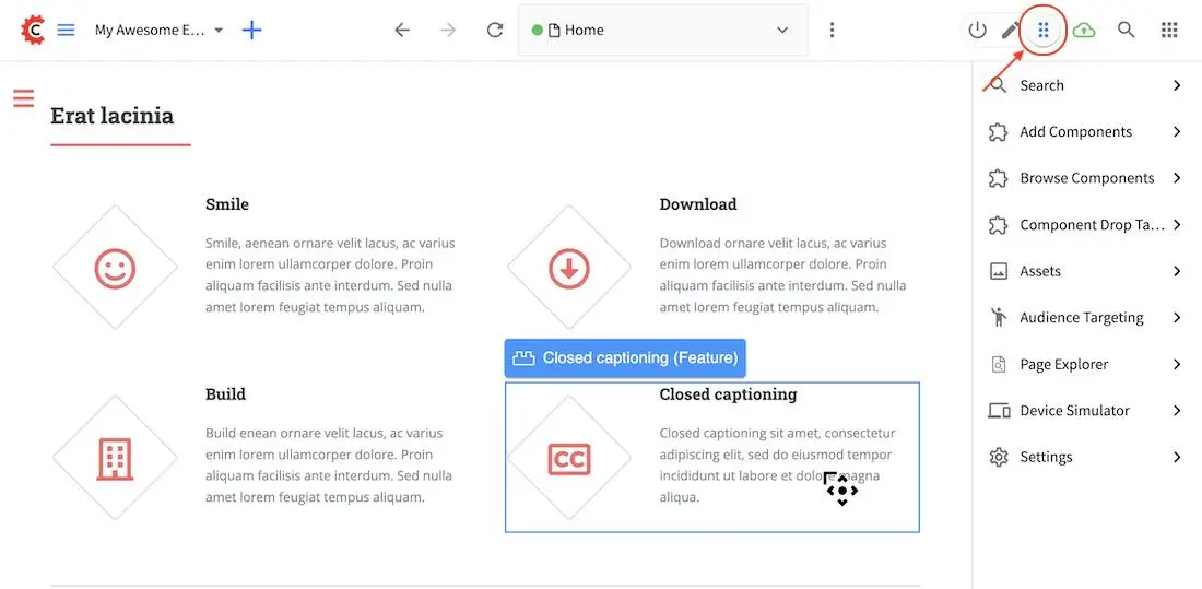
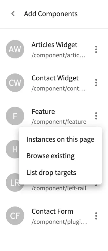
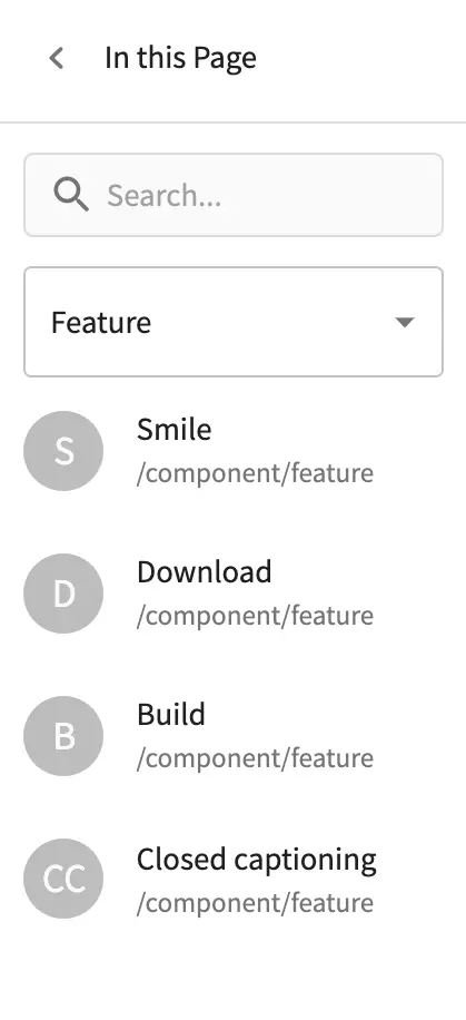
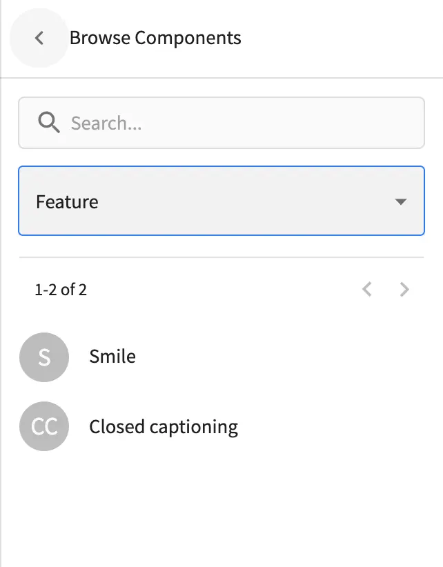
Browse Components
The Browse Components tool allows you to search / select a content type in the project then display the existing components for that content type that can be dragged and dropped into the current page being viewed if there are configured drop targets in it
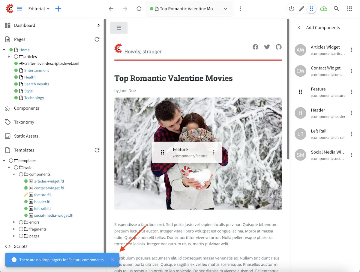
When you drag a component into the page being previewed and there are no drop zones configured in the page, you will see a snack bar like below:
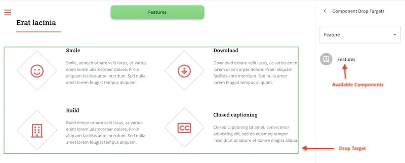
Component Drop Targets
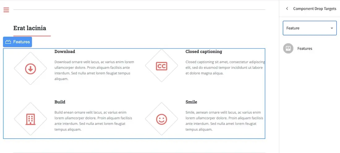
The Component Drop Targets tool allows you to select a content type in the project then display the configured drop target for that content type on the current page being previewed
Assets
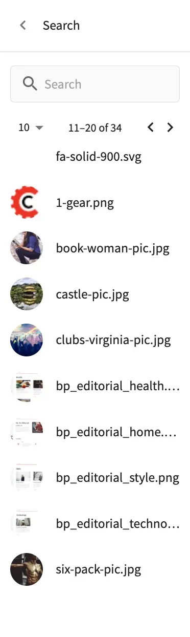
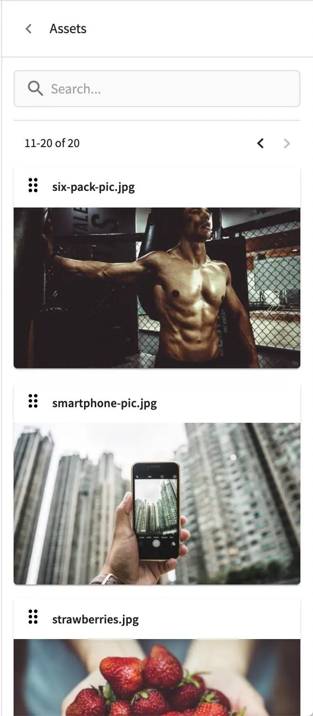
The Assets tool allows you to search/list assets such as images that can be dragged into configured drop targets in the project
Audience Targeting
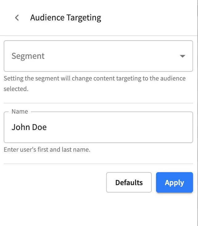
The Audience Targeting tool allows you to view and set targeting attributes for the project
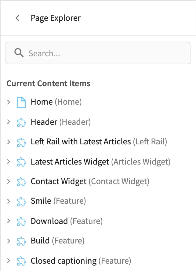
Page Explorer
The Page Explorer tool allows you to browse/list content items such as pages, components and level descriptors in the project and make edits to them by clicking on the three dots next to the content item that appears when you hover your mouse on it
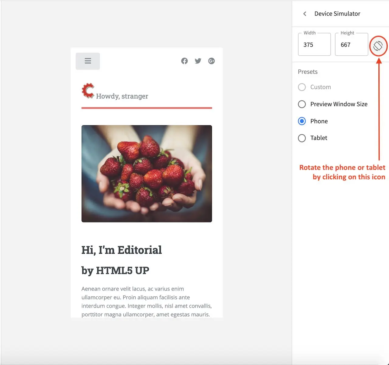
Device Simulator
The Device Simulator tool allows an author to review the current page in the context of all devices supported by the project.
The phone and tablet can be rotated through the use of the rotation control next to the width and height input boxes.
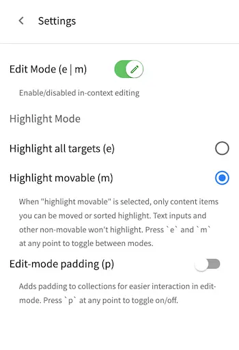
Settings
The Settings tool allows you to switch on/off the Edit Mode (in-context editing) and setup
highlighting of drop targets
Using Experience Builder
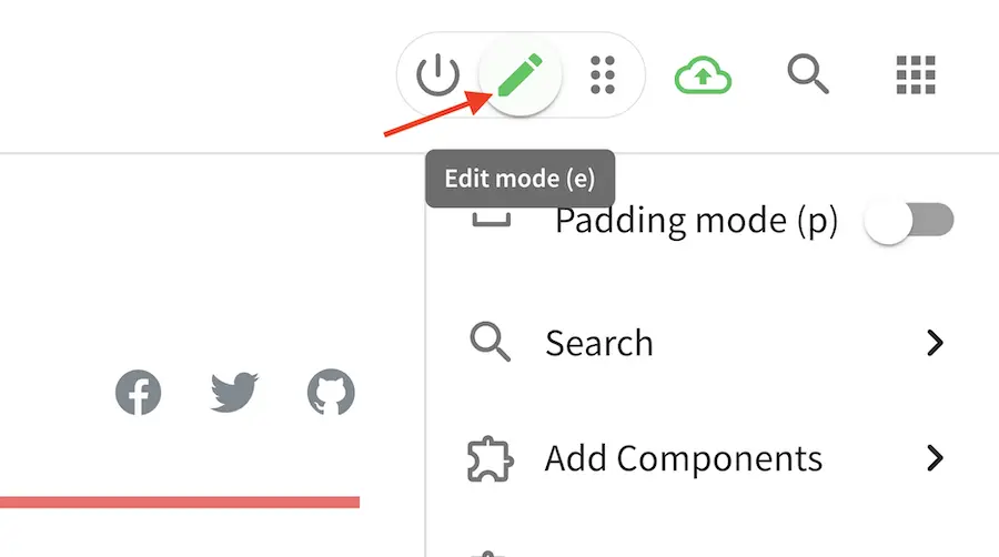
To turn on Experience Builder, simply click on the pencil (Edit mode), which will turn green when enabled,
or the two sets of three vertical dots (Move Mode), which will turn blue when enabled, at the top right of
Studio. Enabling Edit mode or Move mode turns on the Experience builder panel on the right
side of the screen.
Edit Mode
Edit Mode allows editing the content directly in its preview for configured sections of the project.
It also provides short-cut menus to open specific pieces of the content form, and the experience builder
panel on the right side of Studio.
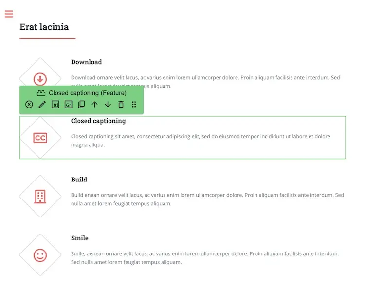
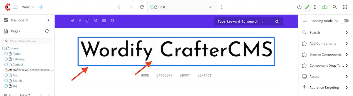
To edit content directly in its preview, simply hover your mouse on sections that have been wired for editing content directly and a pencil will show up instead of the mouse cursor. For editing text sections, double click on the section and a cursor should then appear allowing you to edit it directly. Notice too that the editable section will be inside a blue box like below:
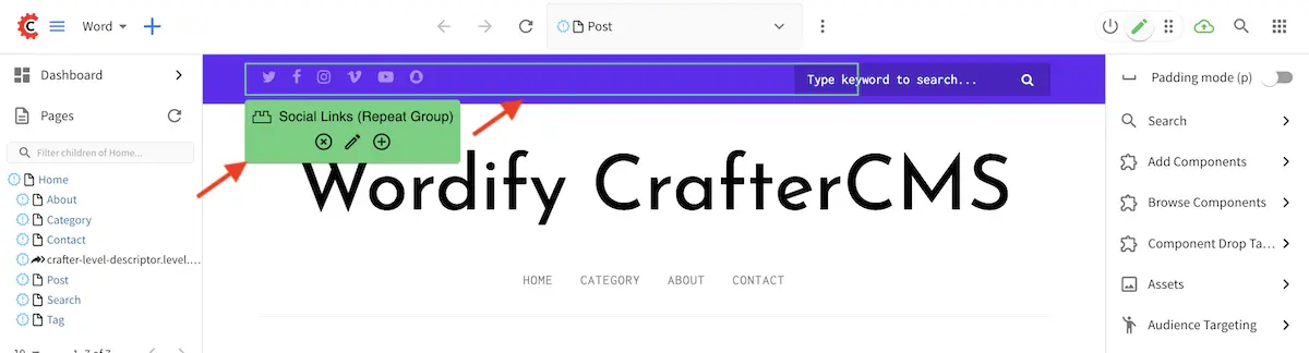
For editable non-text sections, clicking on it will give the user options to edit, cancel, etc. and also highlight the section in a green box
Move Mode
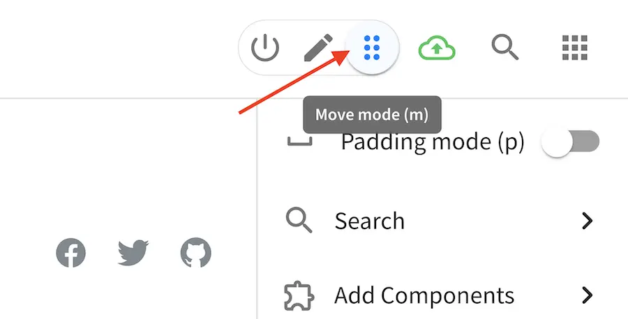
Move Mode allows you to drag around a items from one position to a different position and also
provides short-cut menus to open specific pieces of the content form, and the experience builder
panel on the right side of Studio, just like the Edit Mode.
To move items around, move your mouse over to the item/section you want to move until a blue box appears around it. Click and hold your mouse then drag the item to desired position. A red line will appear on possible positions to drag your item to, and a trash bin in case you want to remove your item.
Using the Experience Builder Panel
Let’s take a look at an example of editing a post using the experience builder (XB) panel in a project
created using the Wordify blueprint from the Marketplace.
We’ll change the picture in the Bio section of one of the posts. Let’s preview the post
How to Find the Video Games of Your Youth. Turn on the XB panel by clicking on the pencil icon
(Edit mode) at the top right. The pencil should turn green and the XB panel visible on the right
hand side.
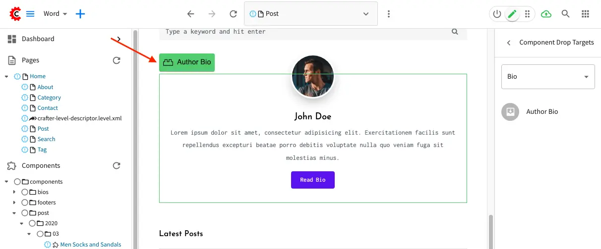
We’ll highlight the Author Bio area in post to figure out which image we want to change. In the
XB panel, click on Component Drop Targets. Select Bio from the dropdown. Notice you’ll see
Author Bio listed as one of the drop targets. Scroll down the page and you should find an area
highlighted in a green box. This is the area where we want to change the image
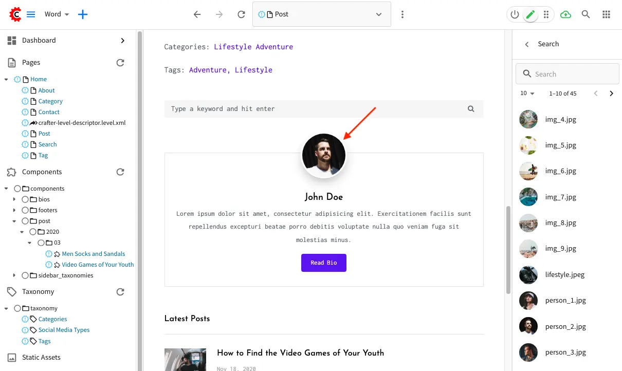
Let’s now change the image for author John Doe. In the XB panel, click on Search. We can
scroll through the items listed there to look for a new image for John Doe, or, we can also type
image in the search box to narrow down items we’re scrolling through to just images in the project.
We’ll pick the image person_2.jpg to replace the current Profile Pic in the Bio section.
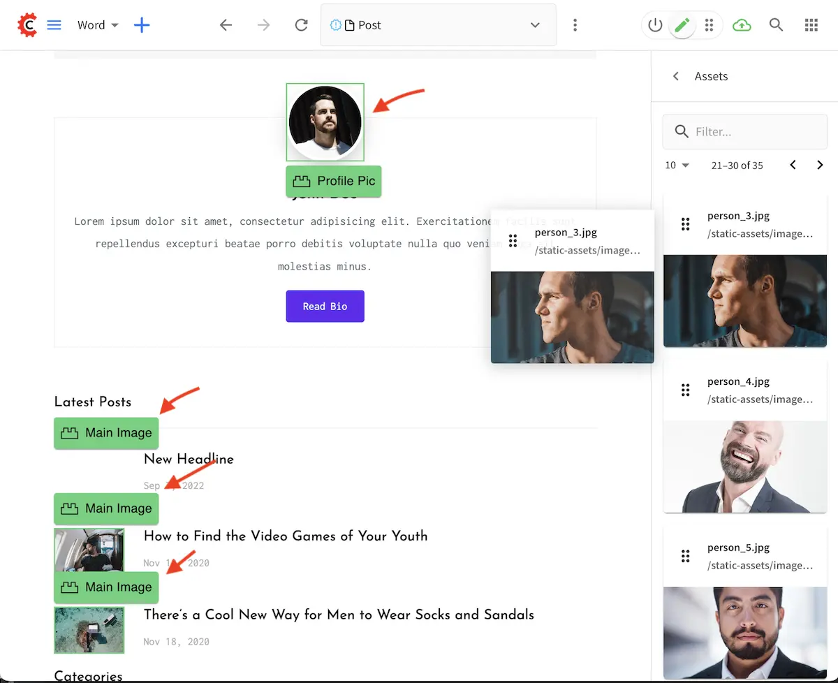
To replace the image, simply drag person_2.jpg image from the XB panel to the profile pic on the
page. The Bio section should now have a new image.
Another way to browse for images to replace the Bio picture is by browsing items under Assets in
the XB panel. Scroll through the items, then when you find a suitable image, simply drag it on to the
page to the image section you want to replace. Notice that as you’re dragging an image from the XB panel,
some other sections may be highlighted in a green box. This indicates that an image may be dropped
into that area.
Working with Pages
This section describes how content authors can create and use pages to manage content. Templates are used for page layouts in CrafterCMS. A developer usually creates the templates that authors can then use to manage content.
Adding a Page
There are a couple of ways to add a page in your project.
Via the Sidebar
To add a page, open the Sidebar panel, then click on Pages. Navigate to the level and location within the path navigation tree where you want to create the content, then click on the three dots next to the parent item and select New Content
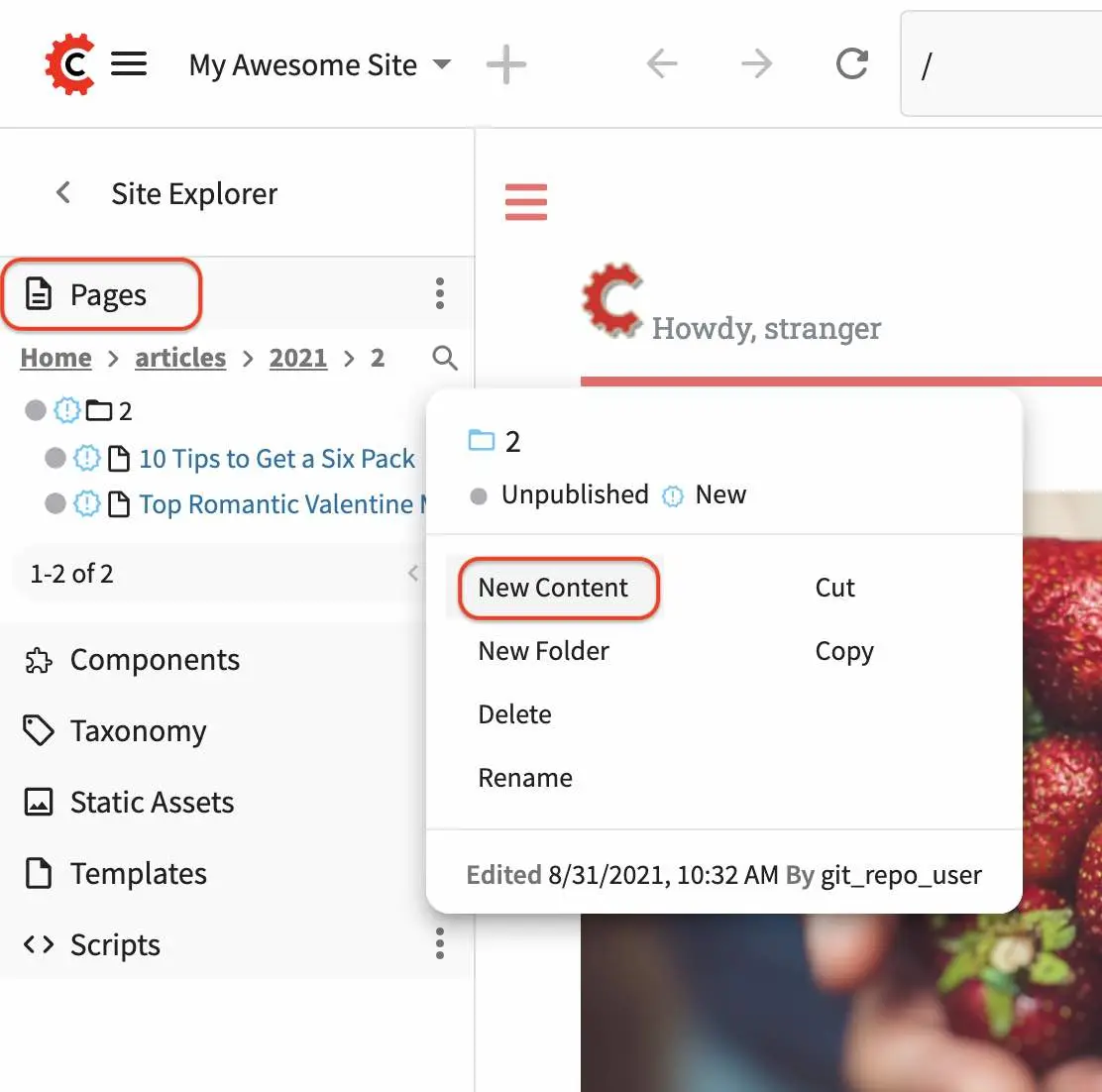
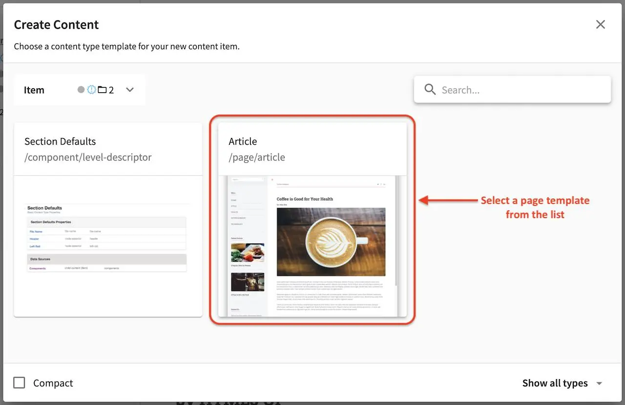
You will then be prompted to choose a content type. Select a starter page template from the list shown. If you need a template that’s not available or want to modify the template, ask a developer to add/modify the template that you want.
A form will open containing the template selected. You can now start adding content. Required fields have a red ‘x’ after the field label. The number of required fields within each section is displayed in the Section bar for that section.
When data is entered into a field, the red ‘x’ will change to a green checkmark and the section bar will update with the new status.
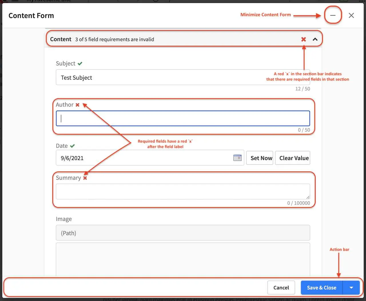
An action bar is available at the bottom of the screen that cannot be scrolled away. This bar allows users to Save as Draft, Save & Minimize, Save & Preview, Save & Close or Cancel.
Save as Draft will save the content entered on the form and leave the New Page/Editing dialog open
Save & Minimize will save the content entered on the form, then minimize the form
Save & Preview will save the content entered on the form then close the form and load the preview screen with the newly saved data
Save & Close will save the content then close the form.
Cancel will close the form without making any changes and will warn users if there are unsaved changes.
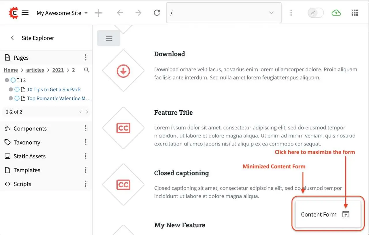
To minimize the form, click on the - at the top of the Content Form right next to the x.
When a form is minimized, it will appear at the bottom right of the screen with an arrow pointing
up next to it. To maximize the form, simply click on that arrow pointing up.
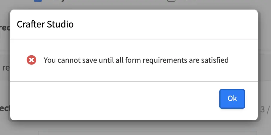
An error form will appear when you try to Save and Close without filling out all the required fields.
Via Quick Create
Here we’ll take a look at how to add a page via quick create. Quick create allows you to create content with as few clicks as possible.
We’ll use a project created using the Website Editorial blueprint, which has the Article content type (a page content type) configured for quick create.
To add a new page, simply click on the Quick Create icon (+) on the top left of the screen.
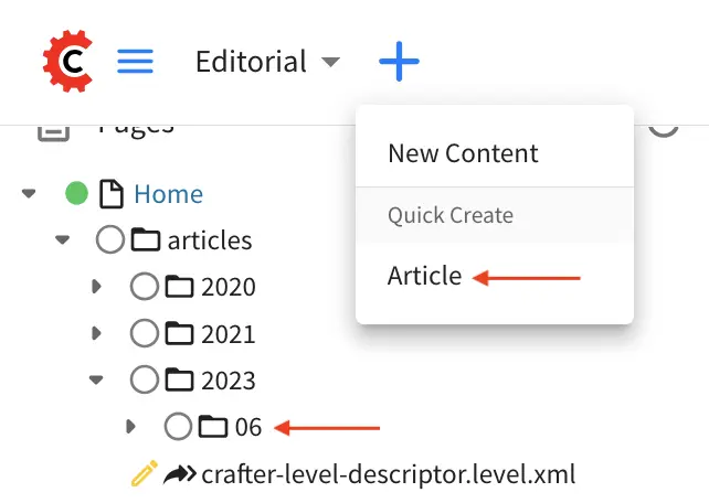
This will create a new page under /articles/{year}/{month} and open a form for the author to fill in content. The form that opens is the same as the form described in the previous section.
Editing a Page
There are multiple ways to edit a page.
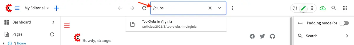
In the context nav, got to the address bar and search for the page you’d like to edit by entering some keywords.
In the Sidebar panel click on Pages. Navigate to the level and location within the path navigation tree where you want to edit the content and click on it to preview the page. Toggle
Edit Modeto on (pencil icon at the top right corner) to turn on in-context editing and the experience builder panel, if it’s not turned on yet. Move your mouse over to the area you would like the edit. As you’re moving the mouse around the page, notice that the cursor changes to a pencil on editable sections. Click anywhere editable on the page to start editing.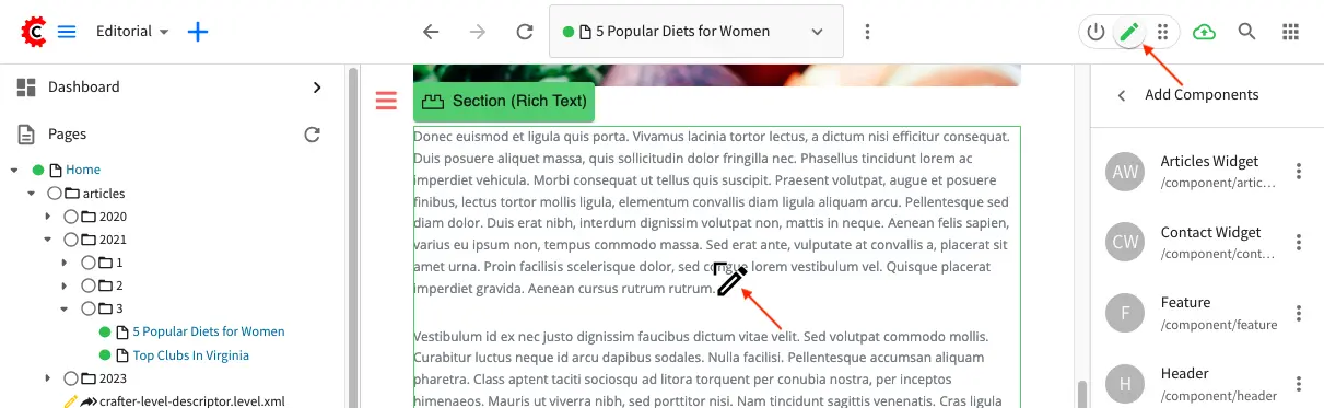
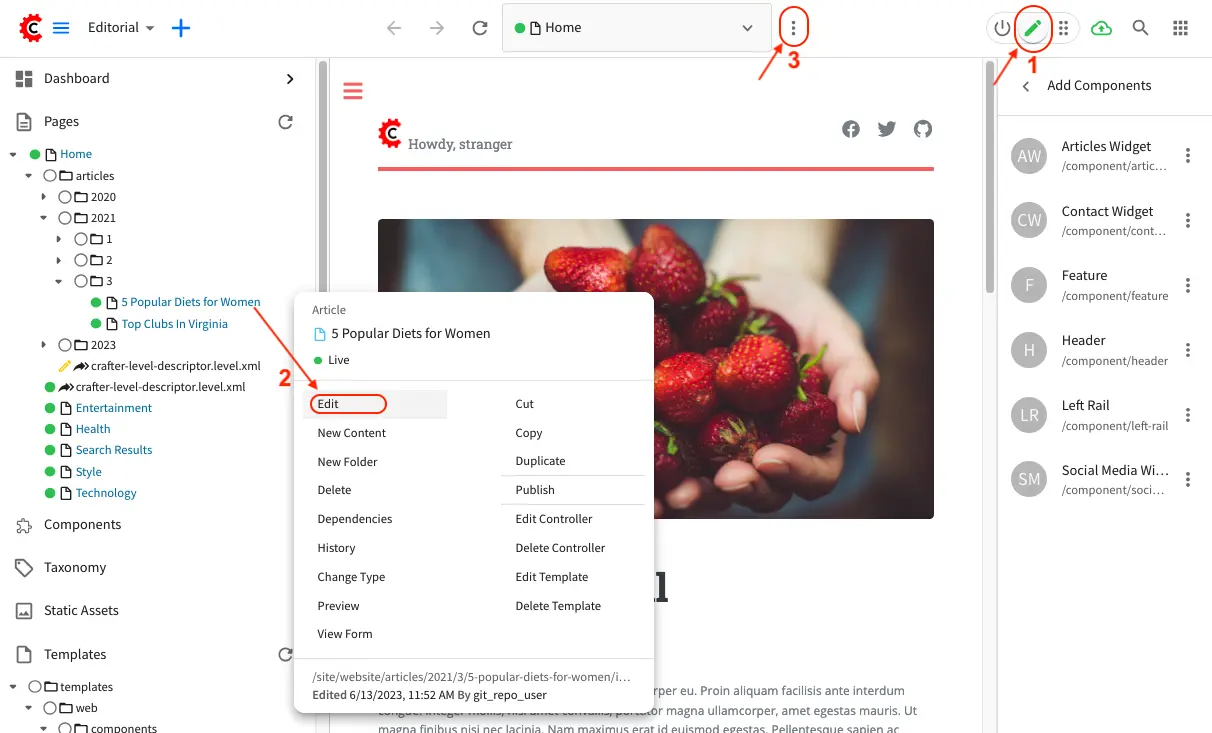
In the Sidebar panel click on Pages. Navigate to the level and location within the path navigation tree where you want to edit the content, then click on the three dots on the right and select Edit. A form containing the page content you want to edit will open.
In the Sidebar panel click on Pages. Navigate to the level and location within the path navigation tree where you want to edit the content and click on it to preview the page. Click the three dots next to the address url on the toolbar found at the top of your screen. Click on
Edit. A form containing the page content you want to edit will open.
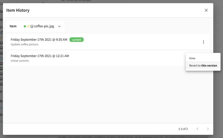
Versioning
CrafterCMS tracks all changes to pages/contents/static assets in your project.
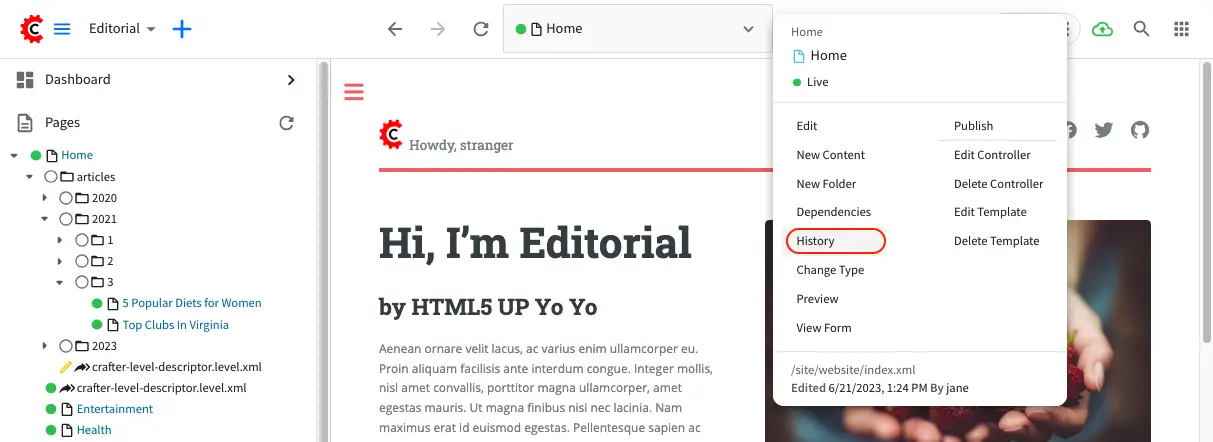
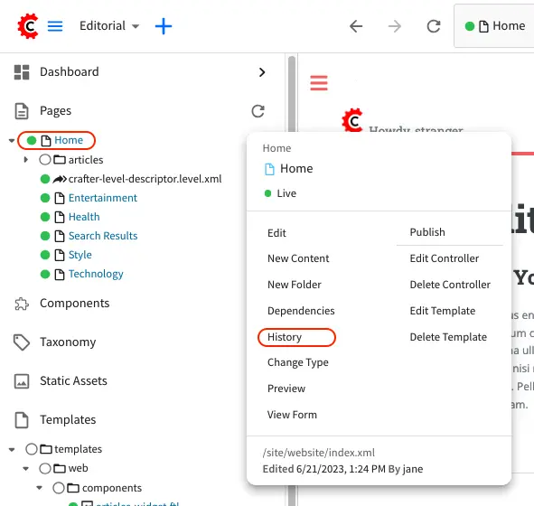
All page changes/versions can be viewed, compared with other versions and reverted to an older version. There are a couple of ways to view the History of your desired page. Navigate to the page you want to view the history of from the project navigation tree.
After selecting the page you want, click on Options (the three dots next to the address url at the
top of your browser) then select History.
Another way to view the history of a page is by clicking on the three dots next to the page you want on the Sidebar
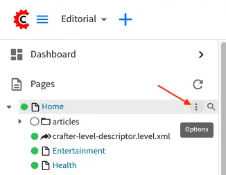
and then selecting History
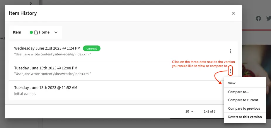
Version History
There are a number of things that you can do in the Version History dialog. On the right hand side of the dialog, for each entry/version on the list, there are a number of actions that you can perform on the version you selected, accessible by clicking on the three dots next to it.
Actions
|
Description
|
|---|---|
View
|
View details of the selected version of the page such
as the creation date, last modified date, page content
|
Compare to …
|
Compares the selected version to the version selected
by the user
|
Compare to current
|
Compares the selected version to the current version
of the page
|
Compare to previous
|
Compares the selected version to the previous version
of the page in the list
|
Revert to this version
|
Reverts the page content to selected version
|
Form based editing
Forms are one of the means by which content is captured in Crafter Studio. A form generally maps to or represents a type of object in the system for example a certain kind of page - like a section page or a banner or video.
Form controls are the building blocks of forms. It lets you get content into the system. These form controls are able to capture content either when editing via a form dialog or through the experience builder (XB) in Preview mode.
Let’s look at some common elements of a form and examine some of the controls that we use to get content in to the system.
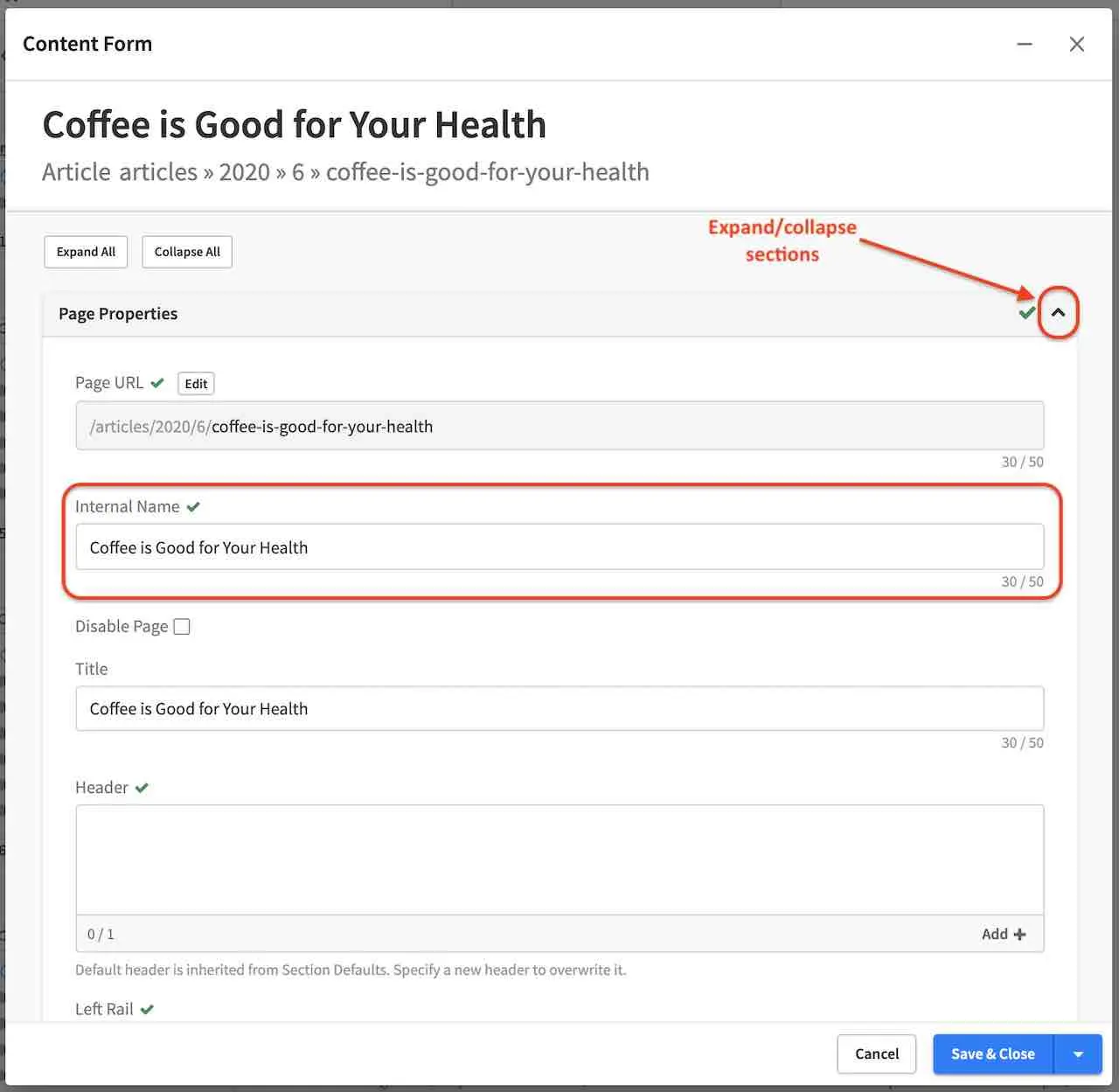
When a new page is created or a page is edited, the form interface for these functions will open in a new dialog. A user can Expand or Collapse all of the sections on the page using the “Expand All” or “Collapse All” links at the top of the page. Clicking the +/- control on the Section Label will toggle the expanded or collapsed state for each section.
The number of required fields within each section is displayed in the Section bar for that section.
An icon in front of the Section Label will display a red ‘x’ (when required fields are not complete), or a green check mark (when all required fields are complete) to denote status.
Every required field will have a red ‘x’ icon after it’s Field Label.
When data is entered into a field the red ‘x’ will change to a green check mark and the section bar will update with the new status. An action bar is available at the bottom of the screen that cannot be scrolled away. This bar allows users to Save, Save & Minimize, Save & Preview, Save & Close or Cancel and minimize/maximize the form.
Save as Draft will save the content entered on the form and leave the New Page/Editing dialog open
Save & Minimize will save the content entered on the form, then minimize the form
Save & Preview will save the content entered on the form then close the form and load the preview screen with the newly saved data
Save & Close will save the content then close the form.
Cancel will close the form without making any changes and will warn users if there are unsaved changes.
To minimize the form, click on the - at the top of the Content Form right next to the x.
The fields within each section are completely modular and can be applied to any given page as needed. This modularity allows us to craft edit pages for any new screens as they arise without the need for specific UI work on the edit screen.
Editing Controls
Here are some controls that authors may encounter while editing content:
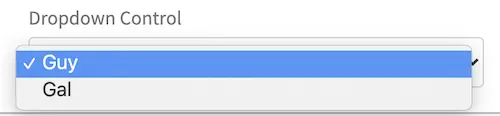
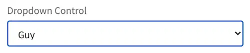
Dropdowns - Allows the user to select an item from the list. When not selecting an item from the dropdown, the selected item is shown on the box.
Text areas - Allows the user to enter text up to the character limit indicated at the bottom of the text area input box.
Checkbox - Allows the user to make a choice, depending on what was setup.
Group checkboxes - Allows users to select one or more items in a group
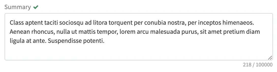
Input boxes - Simple text input control allows users to input text up to the character limit indicated next to the input box. The character limit specifies both the MAXLENGTH and SIZE attributes for the field. The character counter will count up as the user types into the field.
Date/Time pickers - The Date and Time input can allow entry of both Date and Time, only Date or only Time, depending on what was setup.
Rich text editors - What You See Is What You Get (WYSIWYG) editor that allows authors to arrange and style content without needing to know HTML. Below is a more detailed description on working in the RTE.
Repeating Group - Group of controls (1 or more controls) that can be duplicated multiple times by clicking on Add Another. If there are two or more instances, “Move Up” and “Move Down” links will be available which will move the group up or down in relation to the other group instances.
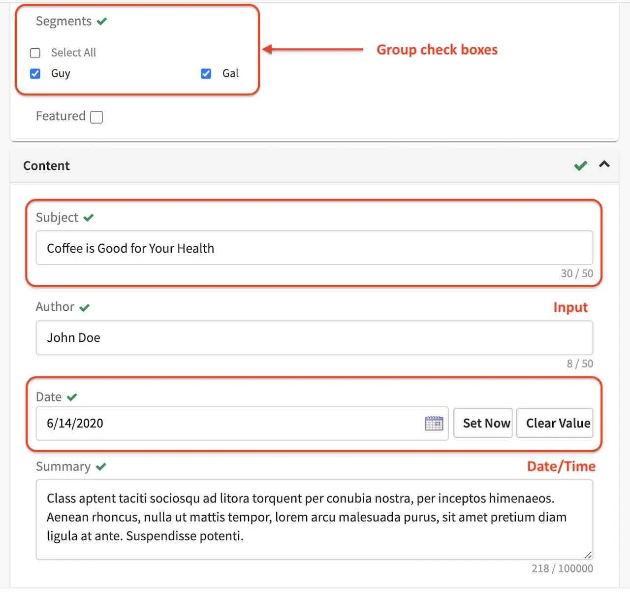
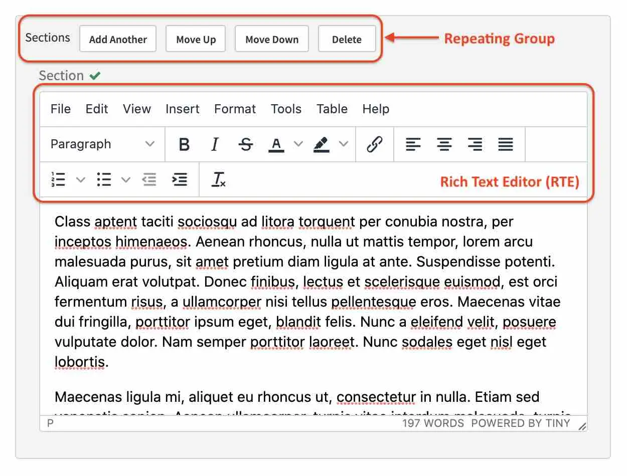
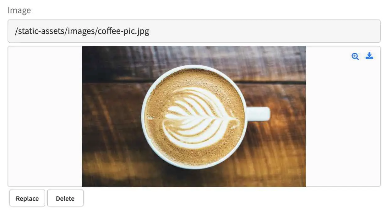
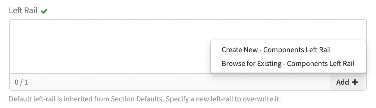
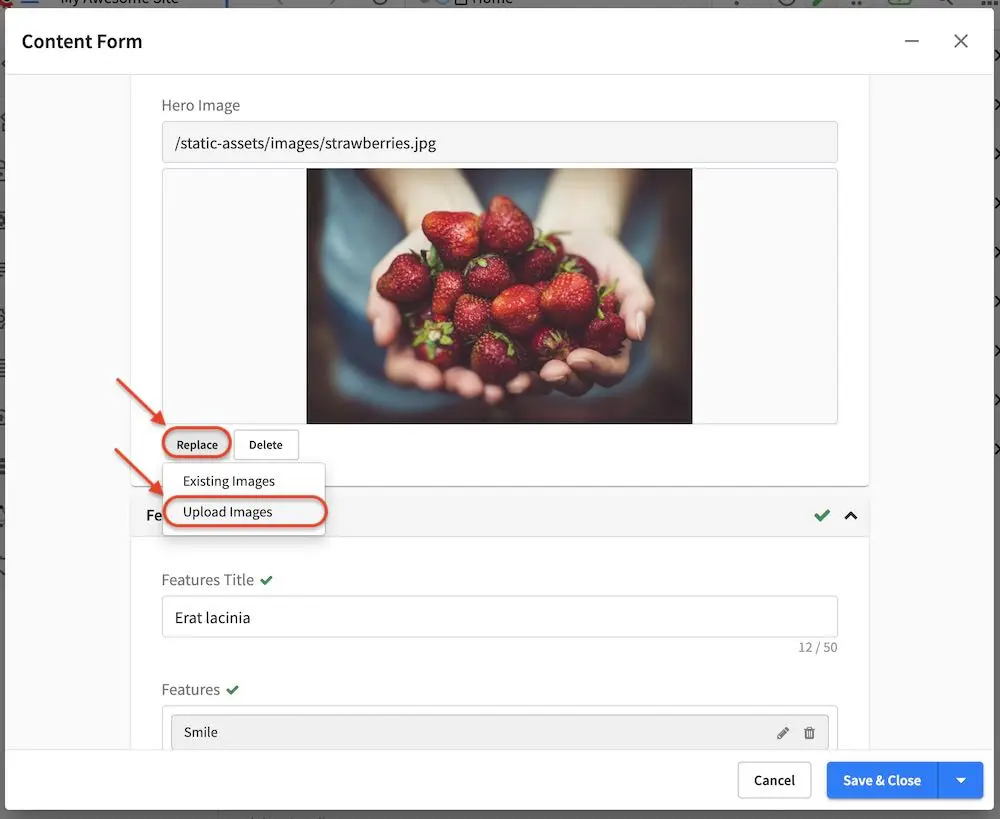
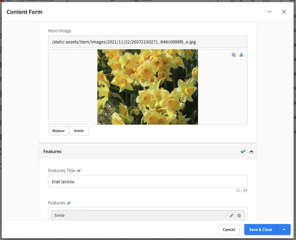
Image pickers - Allows the user to select an image from whatever source is allowed, such as Upload Image or Existing Image (asset uploaded to the system). To select an image, click on Add (when there’s no image selected yet) or Replace to change the selected image
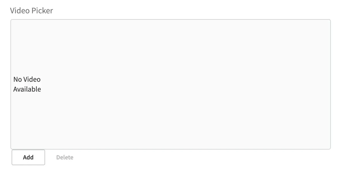
Video pickers - Allows the user to select a video from whatever source is allowed, such as Upload Video (video to be uploaded) or Existing Video (asset uploaded to the system). To select a video, click on Add (when there’s no video selected yet) or Replace to change the selected video.
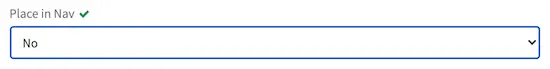
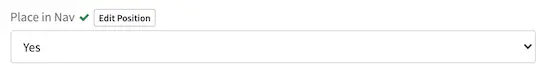
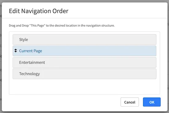
Page Order - Allows the user to change the position of the page in the navigation structure. To change the position of the page, select Yes, an Edit Position button will appear. Click on the Edit Position button, a form will appear that lets the user drag and drop the position of the page the user is editing, called Current Page. The first time navigation is turned on for the page, the Current Page will always default to the top position.
Item Selector - Allows the user to select an item from configured sources. Clicking the Add button opens a menu that lets the user pick from the list. Clicking on Add & Close or Add Selection adds the selected item to the selector list
File name - Allows the user to enter a name for the file. Whitespaces are replaced by a dash automatically and a maximum length for the name is specified next to the filename input box.
Placing Content Components
Drag and drop makes it easy for authors to visually assemble pages. Authors simply choose a component from a pre-defined list of components/widgets, drag them on to the screen, place them where they want (in defined drop zones), and then configure them. Authors may also move components from one zone to another or remove components.
The Edit Mode switch puts the page in component construction mode. Regions on the page
that are wired to accept components (“drop target”) are highlighted. In the component construction
mode, the user may drag an existing component or place a new component to be configured in the drop
target. The user may also drag a component from one region to another. Crafter Studio administrators
can configure what components are available in this panel.
Drag and Drop Components
Placing new components
The user may create new components by dragging components from the experience builder panel (Component section) out and on to the drop target on the screen. A new component with default values will then be visible and ready for editing when a new component is dropped on the screen.
Placing existing components
The user may add existing components into the panel by clicking on Browse Components. A list of existing components will be presented that can be dragged and dropped into the drop target
Moving components around
Components inside the drop targets may be moved around to the desired position. Simply click, then drag and drop to the desired position in the drop target.
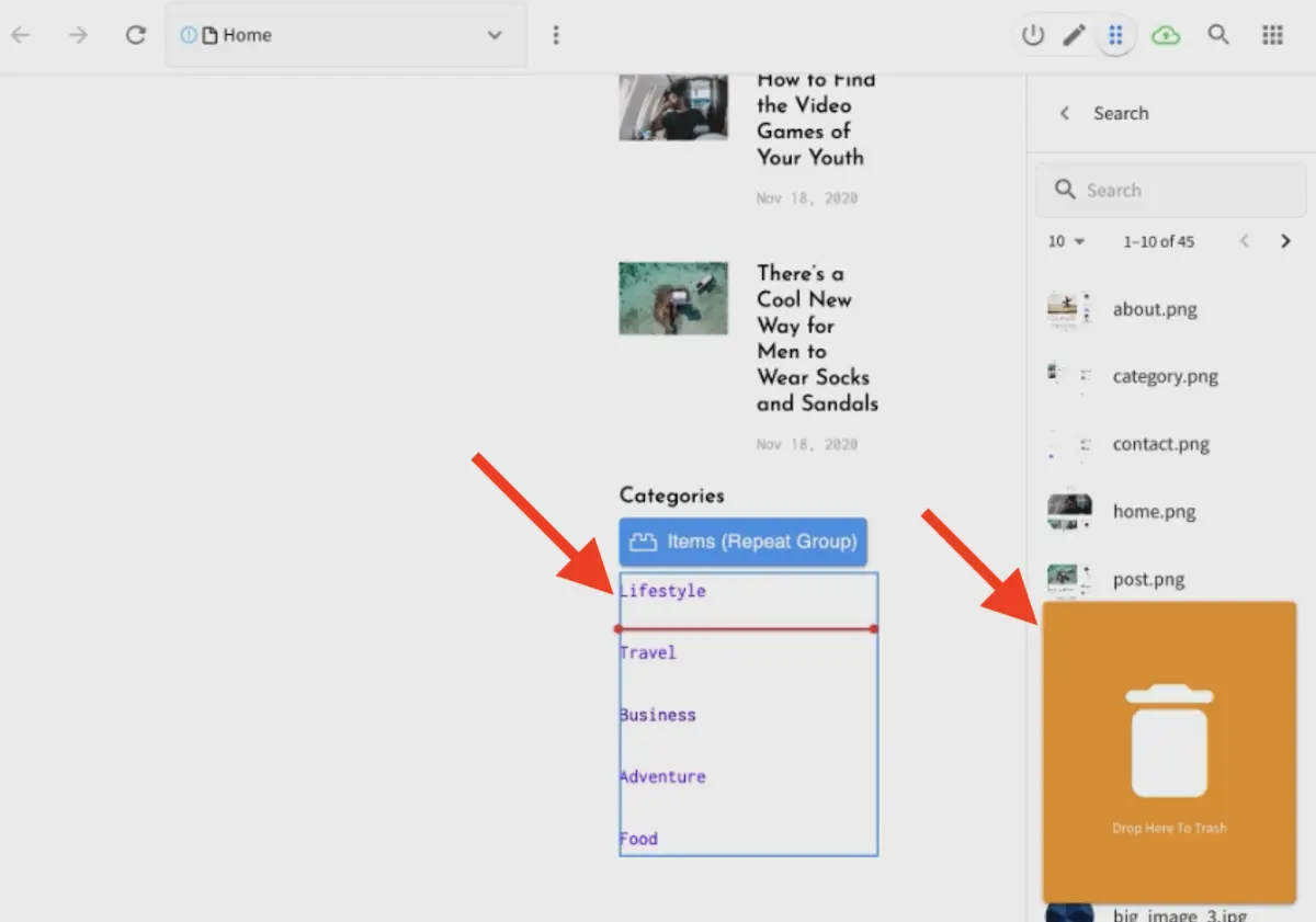
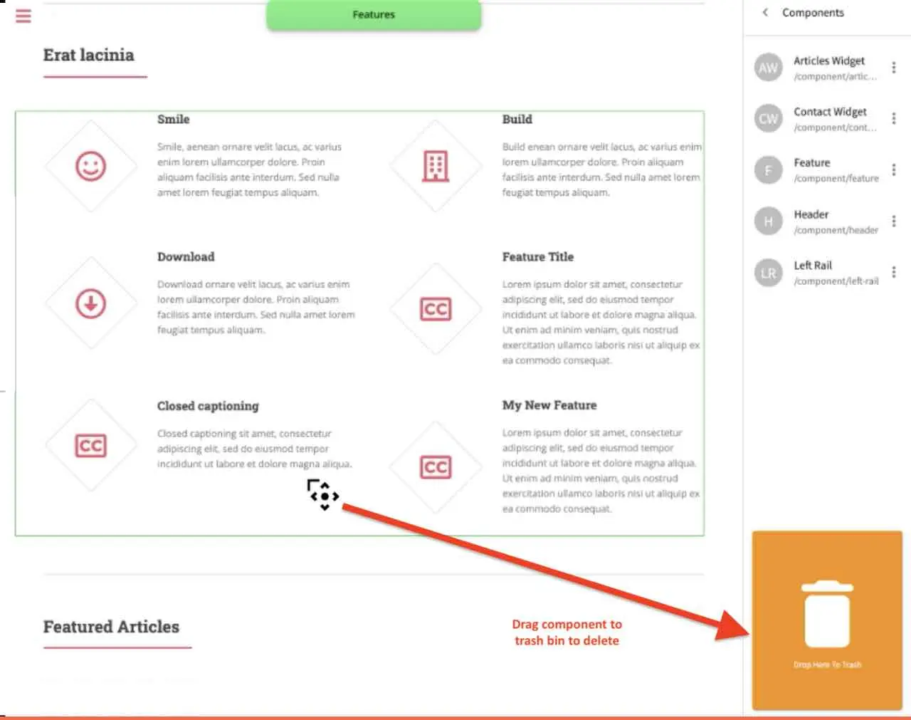
Deleting components
To remove a component from the drop target, just drag the feature to the trash bin that appears on the bottom right of the screen when dragging around a component.
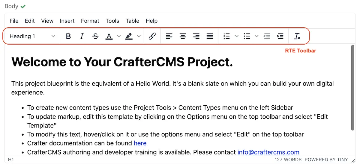
Working in the Rich Text Editor(RTE)
The RTE (Rich Text Editor) is intended to provide an in-context editing experience from within a form (and through preview via the XB) that allows authors to arrange and style content without needing to know HTML. In an RTE field, the RTE toolbar is at the top, and is always available regardless of how far down you scroll in the RTE field.
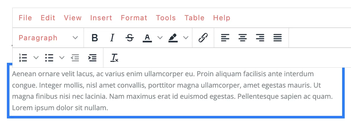
RTE Screen in a Form Dialog
RTE Screen in Preview Using XB
There are a number of tools available from the RTE out of the box for editing your content. Custom tools may also be added to the RTE, depending on your needs. Please see the developer section Rich Text Editor Configuration of the docs for more details.
Code Samples
The RTE allows authors to insert and embed code samples. To insert code samples, click on Insert then Code sample....
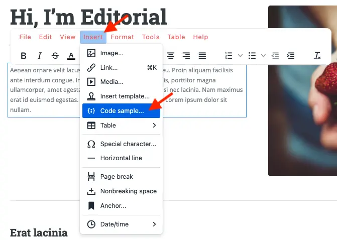
RTE Screen for inserting a code sample
Below is an example of a code sample inserted via the RTE. To edit the code sample in the RTE, double click on an empty space in the code sample block and not on the text as shown below:
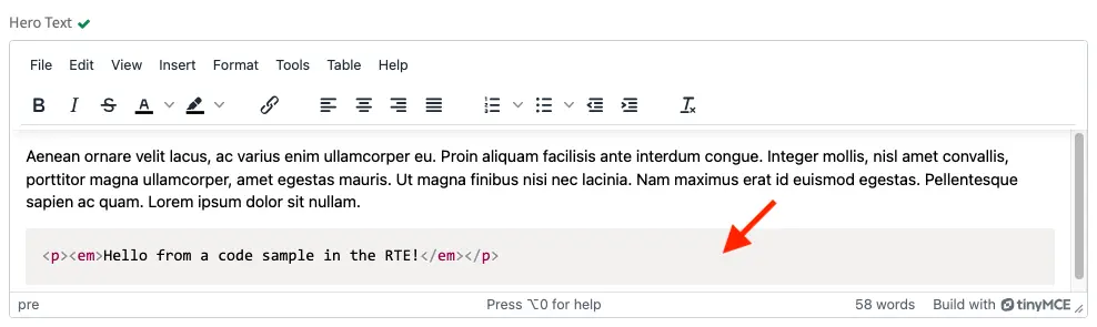
RTE Screen for an example code sample
Note
The best practice for editing code samples is to double click on the existing code sample to open the code sample editor.
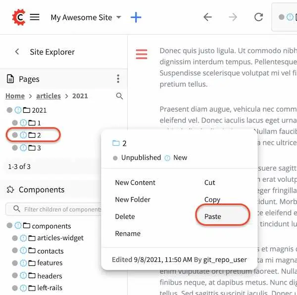
Copying a Page
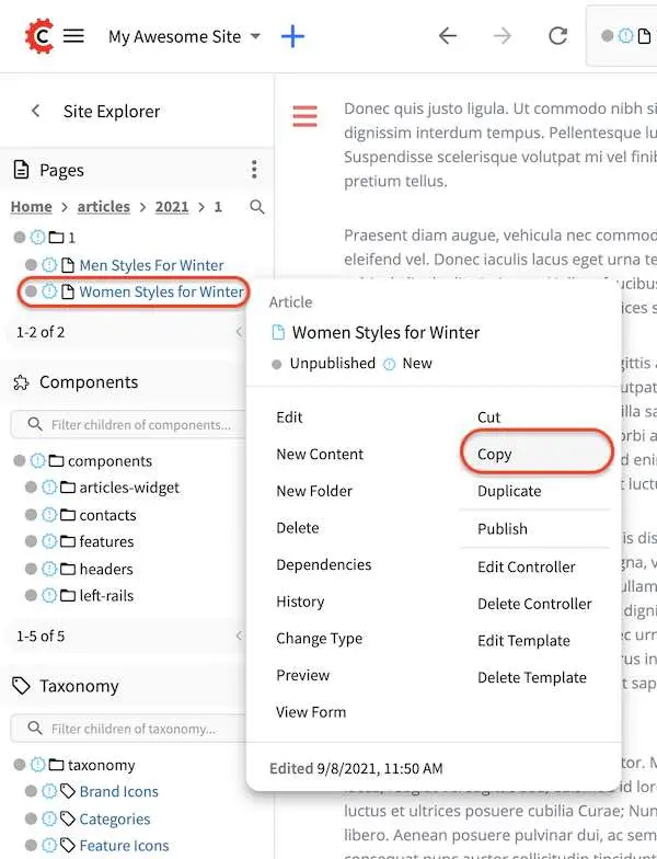
To copy a page, in the Sidebar panel, click on the Pages folder. Navigate to the level and location within the project navigation tree where you want to copy content, then click on the three dots next to the page and select Copy
In the Sidebar panel, navigate to the level and location within the project navigation tree where you want to paste the copied content, then click on the three dots next to it and select Paste
Depending on how the page content type has been modeled (dependencies), copying and pasting a page
may also create copies of items in the page. These dependencies are setup by the developers when
creating the content type. Generally, when an item on a page is uploaded to the following locations:
/site/components/item/.* or /static-assets/item/.*, when the page containing those items is
copied, a copy of the uploaded items are created.
To learn more about these dependencies and see examples, see Item Specific Dependencies or Copy Dependencies Configuration.
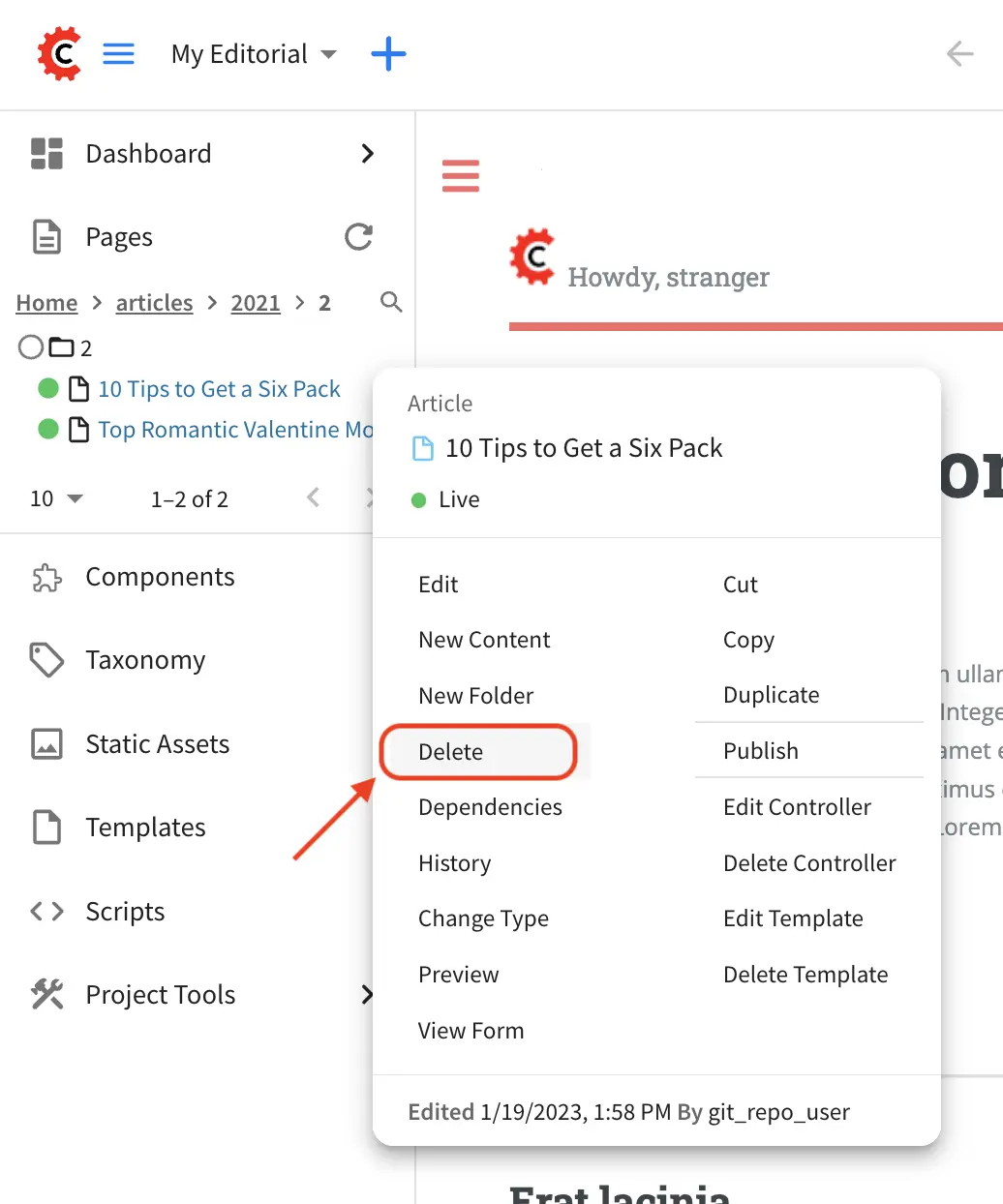
Deleting a Page
Users with permission to delete content can delete a page from a project. To delete a page, in the Sidebar panel, click on the Pages folder. Navigate to the level and location within the project navigation tree where you want to delete content, then click on the three dots next to the page and select Delete
A dialog confirming the action will appear. Check the I understand that deleted items will be published immediately.
checkbox to enable the Delete button.
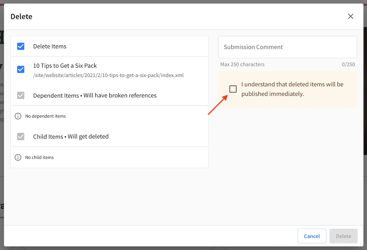
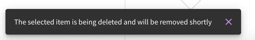
Click on the Delete button. A snackbar at the bottom left of the screen will appear to inform you of the
item deletion.
Disabling a Page
A page content type can be modeled to disable a page in content delivery via the reserved variable disabled.
This variable indicates an object is “hidden” in live and cannot be retrieved via services like search or the
site item service.
To model a content type that allows disabling a page, do the following:
Open the content type you’d like to add
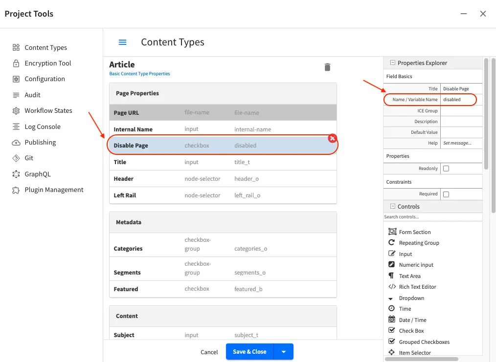
disabledby opening the Sidebar, then clicking onProject Tools->Content Type, then select the desired page content typeDrag a
Check Boxcontrol to thePage Propertyform section. Set theTitleto something descriptive, sayDisable Pageand remember that theName/Variable Namevalue needs to be set todisabled. Save your changes.
Let’s take a look at an example of a page content type with disabled and how the page appears in preview and
in delivery. We will be using a project created using the Website Editorial blueprint named
my-editorial for this example.
We’ll open the content type Article of the project. Below is the Article content type modeled
with disabled, as described above.
Let’s now disable an article in the project, then publish it and see how the project behaves in delivery when a page has been disabled.
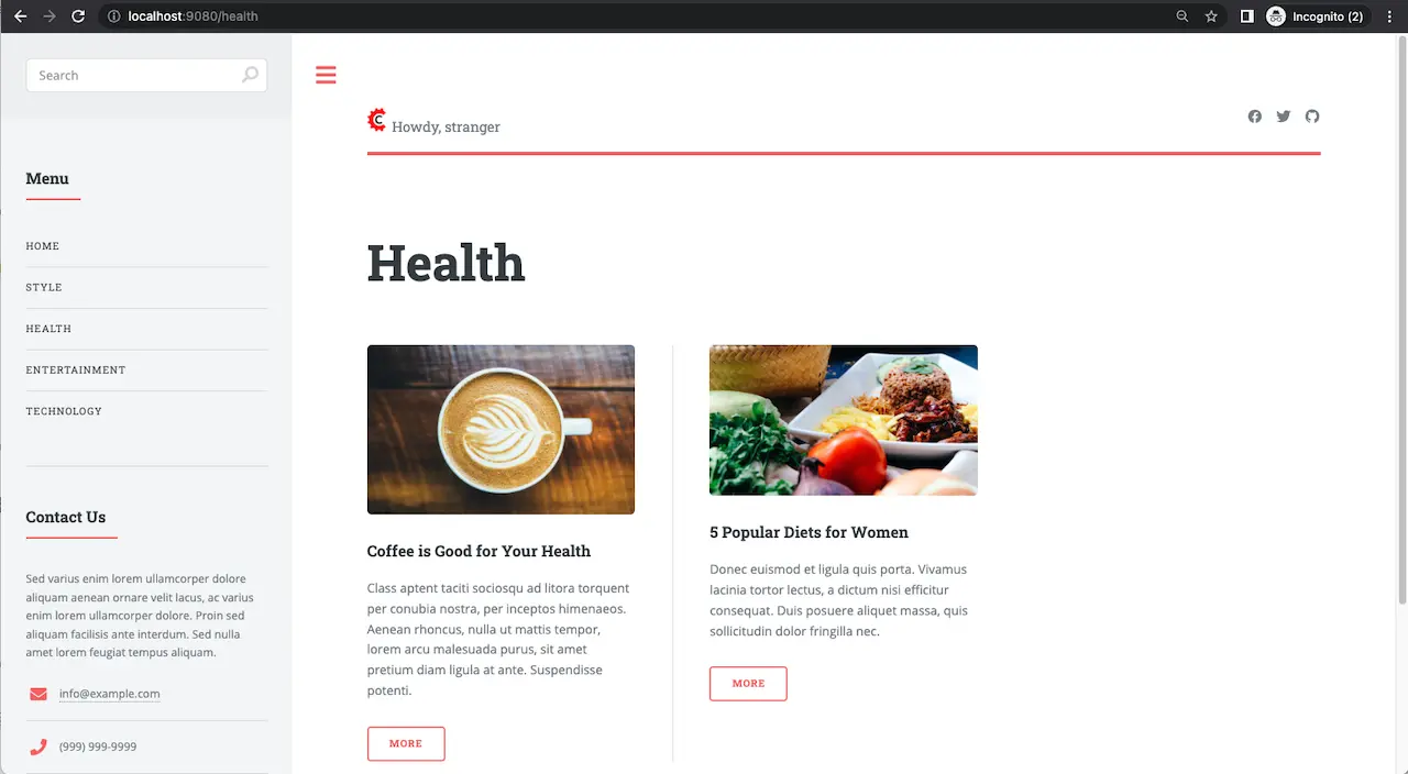
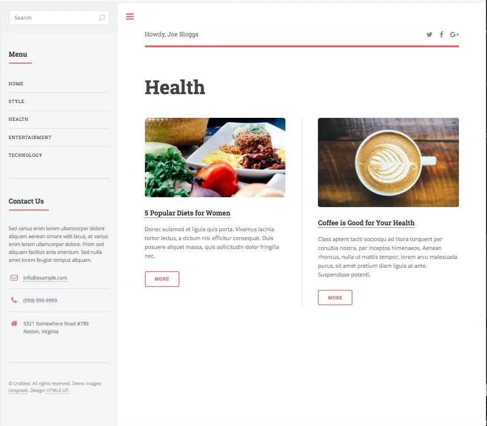
We’ll disable the article 10 Tips to Get a Six Pack. First, we’ll take a look at how the Health
category page looks like with the article still enabled in Preview by opening the Sidebar, then clicking
on the Home page then finally click on the Health category on the left-rail.:
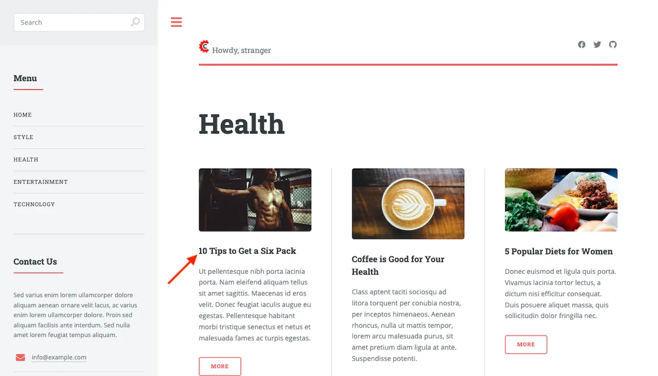
Notice above that there are three articles listed in the Health category page and it contains the
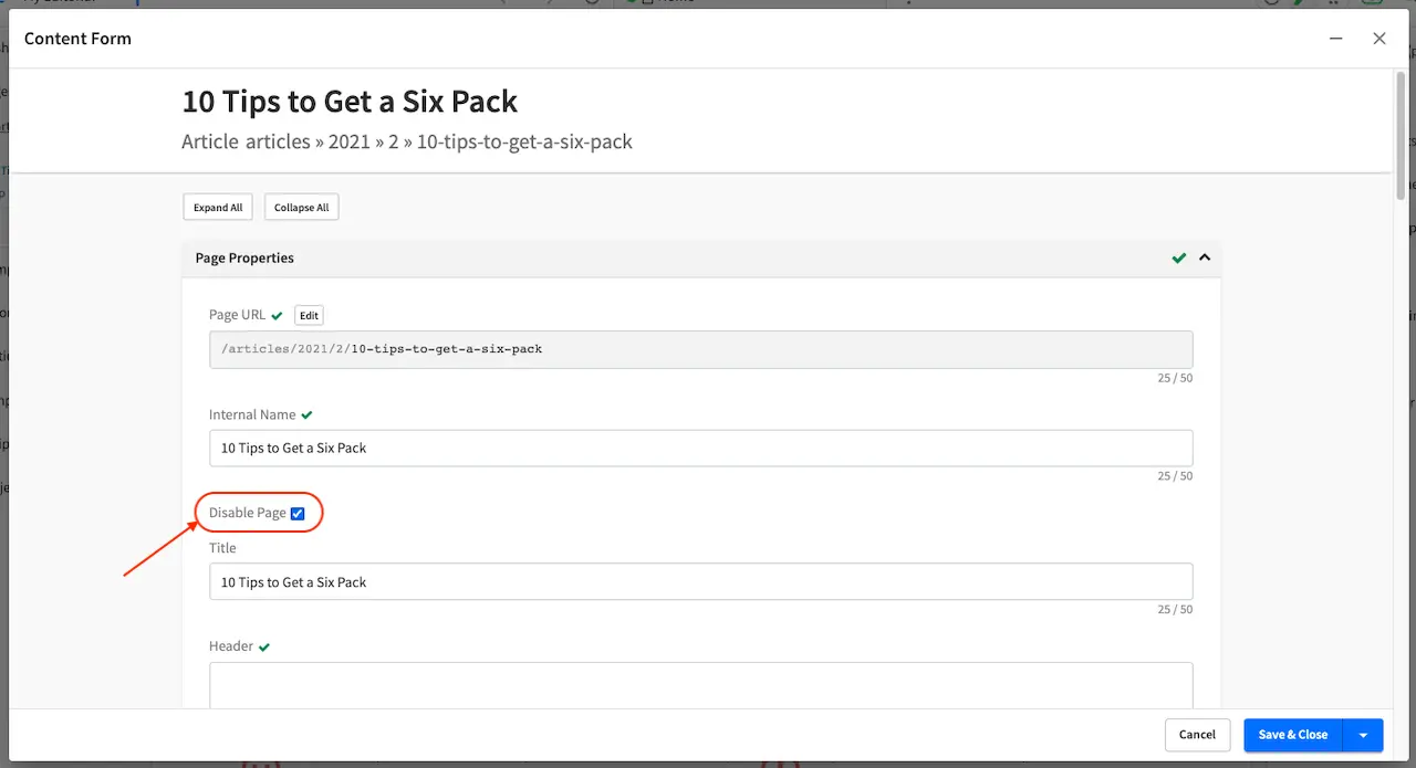
article that we are now going to disable. To disable the page 10 Tips to Get a Six Pack, open the
Sidebar, then navigate to /articles/2021/2/. Click on the three dots next to the article then select
Edit, which will open a form allowing us to edit the article. Once the form opens, put a checkmark
on the Disable Page field under the Page Properties section then save your changes.
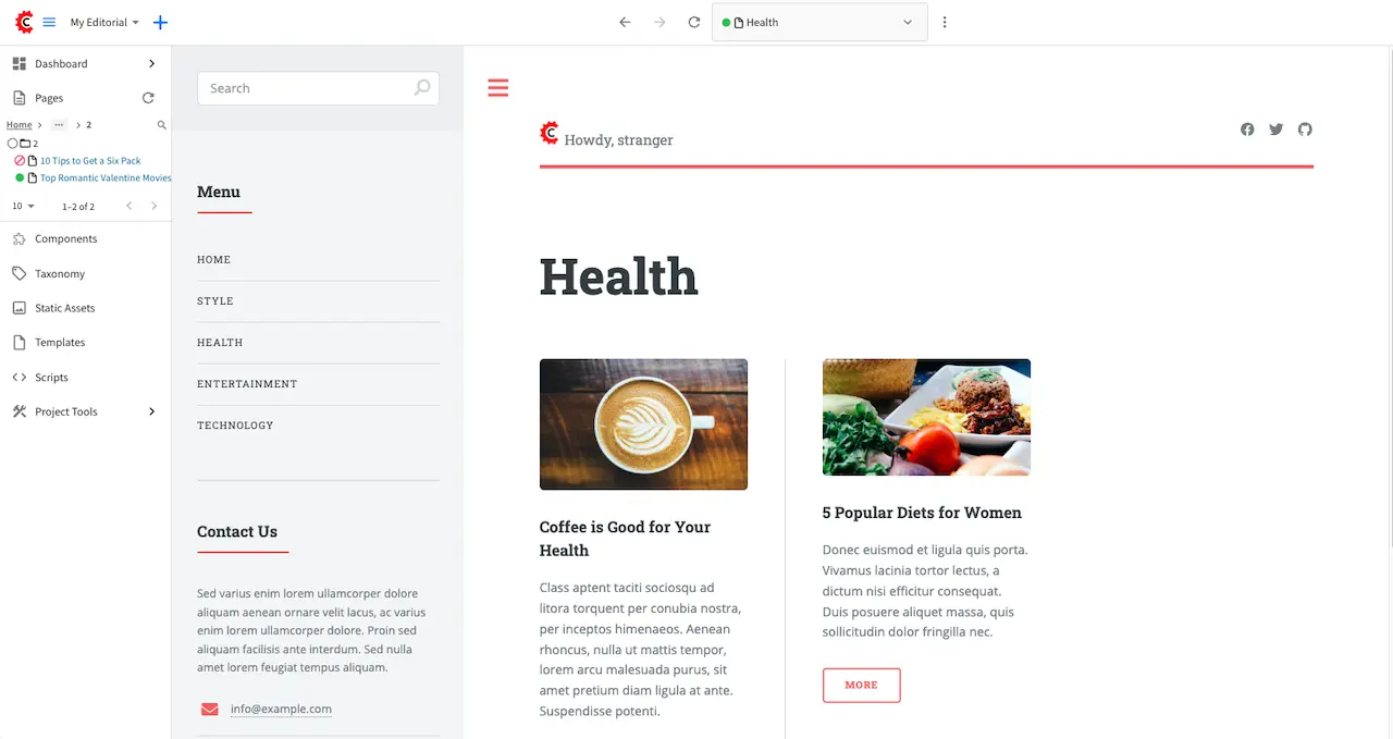
Preview the Home page and click on the Health category on the left-rail. Notice that the article we
disabled is not listed in the preview. Note too that on the Sidebar, the article we disabled will have
a red circle with a slash on it indicating that the page is disabled.
Finally, we’ll publish the changes we made to the article and verify that in delivery, the article we
disabled is not available/accessible. To publish your changes, on the Sidebar, click on the three dots
next to the article we just edited, then select Publish. A Publish dialog will appear. Check the
information in the dialog and make changes as required, then click on the Publish button.
In your browser, go to localhost:9080?crafterSite=my-editorial to view your project in delivery. Next,
we’ll view the Health category page and verify that the article 10 Tips to Get a Six Pack is not listed:
Working with Assets
Assets are binary files, typically images, videos, etc. which can be uploaded directly by Authors from the project navigation tree to CrafterCMS.
Note
CrafterCMS supports the following characters in file and folder names:
Alphanumeric, ,_,-,(,)
as a regex:
[a-zA-Z0-9-_ ()]+
It’s important to point out that Crafter Studio enforces this regex in its UI. However, if you’re working outside of Studio (in your IDE, for example) and you violate these rules, problems may arise downstream, so it’s best to stick the allowed characters.
Adding Assets
To upload a file (images, videos, etc.), in the Sidebar click on Static Assets, then click again on the folder named static-assets. This will show you a list of folders containing assets already uploaded, such as images, fonts, etc.
Creating a Folder
If the file you are uploading does not belong in any of the existing folders, you can just create another folder to upload your file to by doing the following:
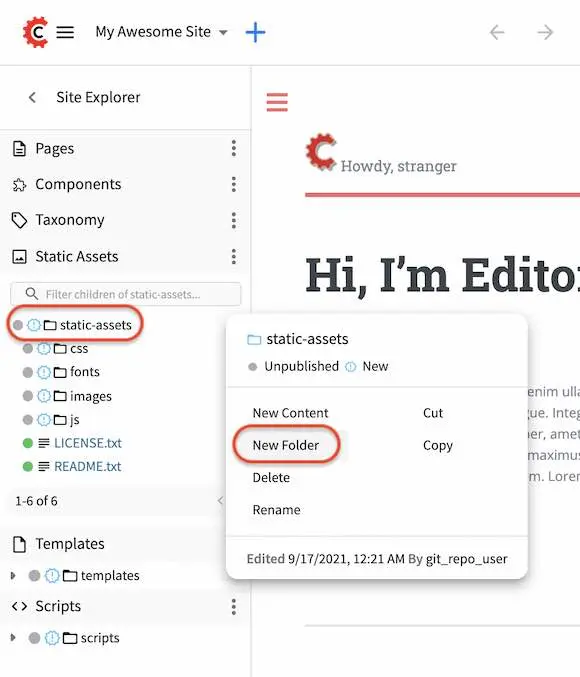
Click on the three dots next to the folder static-assets, then select New Folder
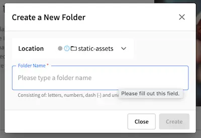
Enter a name for the new folder then click on the Create button.
Adding a File
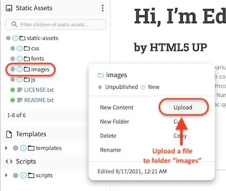
To add a file, from the folder static-assets, navigate to the folder you want to add the files to, then click on the three dots next to the folder and select Upload
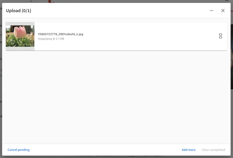
The upload dialog will come up and if you have multiple files to upload, you can drag and drop or browse for files that you want to upload.
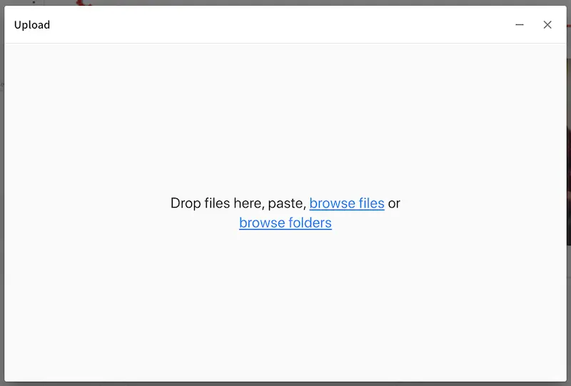
Click on the X to close the upload dialog or click on “Add more” if you want to add more files
Adding a File from One of the Upload Controls
A file may also be added via one of the upload controls and data source in a content form, such as
the Image control together with the Image uploaded from desktop data source.
To upload using one of the controls, while editing a content form, click on the button for adding/replacing an asset which would give you an option to use an existing asset or to upload an asset.
The upload dialog will come up. Click on the Choose File button to browse for the file you want to upload.
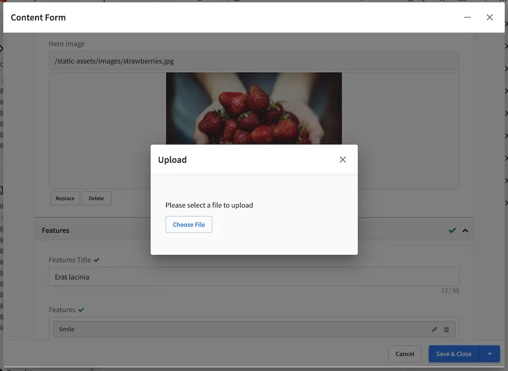
Once the file is uploaded, the dialog will close and the asset will now be in the content form.
Removing Assets
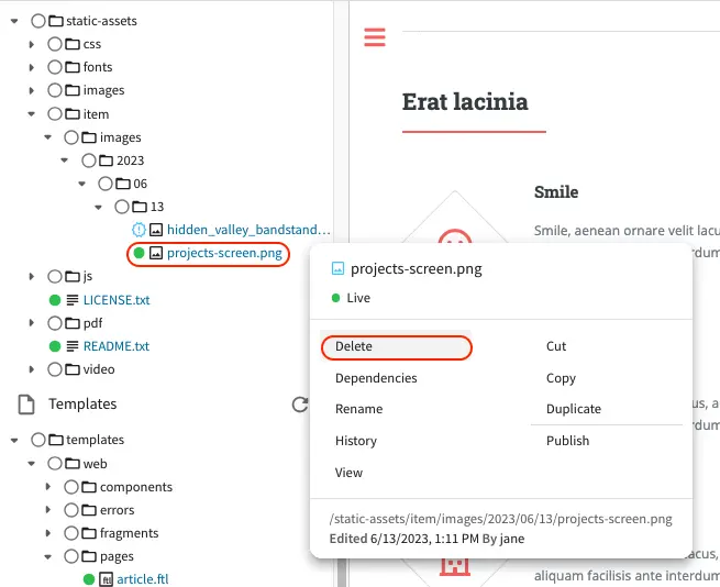
To delete an asset, navigate to the asset you want to delete in the project navigation tree. Click on the three dots next to the asset, then select Delete
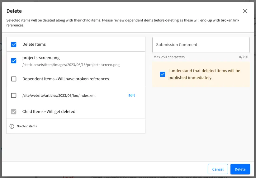
Put a checkmark on By submitting, deleted items will be published immediately. to enable the
Delete button. Click on the Delete button if you want to delete the listed files, or
click on Cancel if you don’t want to delete the asset.
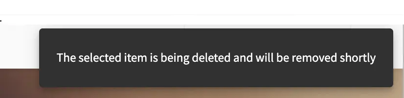
After clicking on the Delete button, a snackbar at the top right of your browser will appear to inform you that the item/asset has been pushed for delete.
Asset Versioning
All changes to static assets are tracked and can be reverted to an older version. For static assets, like images, videos, etc., to access the History dialog, select the static asset that you want to view the history of from the project navigation tree, under the folder Static Assets, then click on the History menu of the context navigation menu at the top of your browser or, click on the three dots next to the asset you want to view then select History
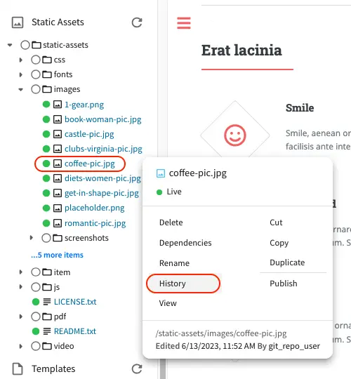
Notice that for assets, you can only revert to the version selected.
Searching
This section describes how Content Authors can search for different things in Crafter Studio while creating content.
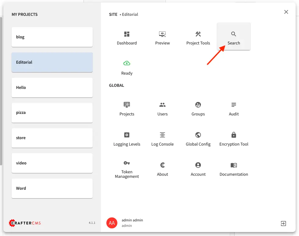
To do a search in Crafter Studio, point your mouse to the navigation menu icon on the top right, which will display the name of the icon, Navigation Menu, click on it then select Search under Project
You can also access Search by clicking on the magnifying glass icon on the top right, which will then display the name of the icon, Search, when you point your mouse on the icon.
Search allows you to find objects in the system through keywords. Each result is a content type of one sort or another. An option to delete, edit/view and the content type is provided with each result. You can view the results in a list or a grid, like below:
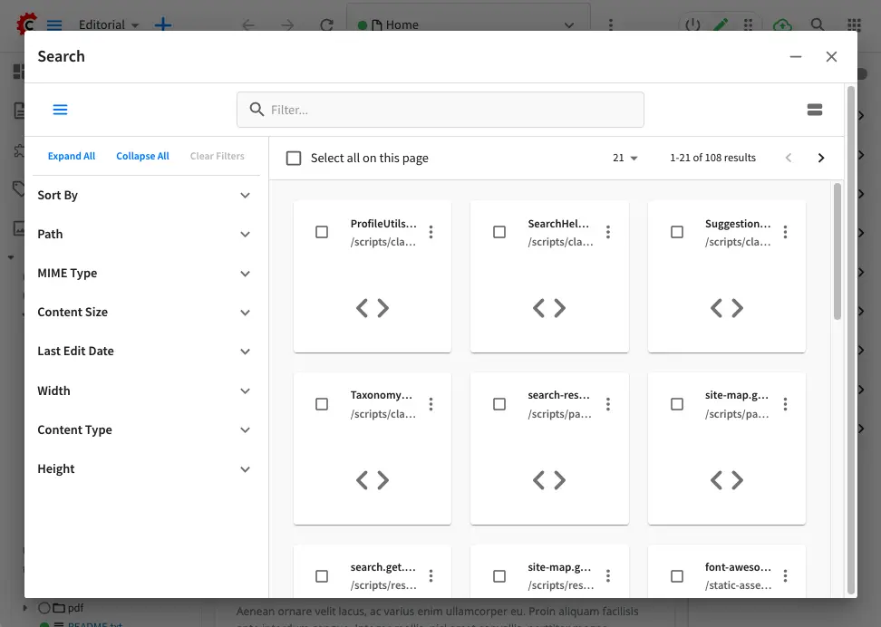
Here’s the search results in list view:
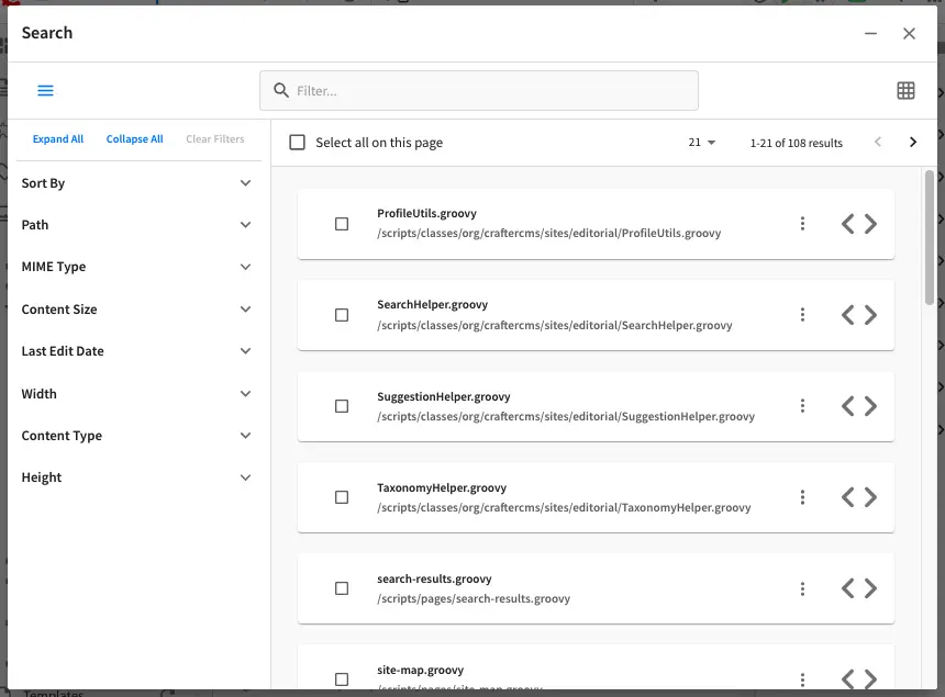
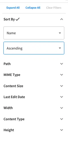
Filtering Results: Crafter Studio supports multiple ways to filter search results. Depending on your search results, different filters will be available. Generally, you can sort your search results based on the following:
Sort By * Relevance * Name * Width * Content Type * MIME Type * Content Size * Last Edit Date * Height
Path
Width
Content Type
Mime Type
Content Size
Last Edit Date
Height
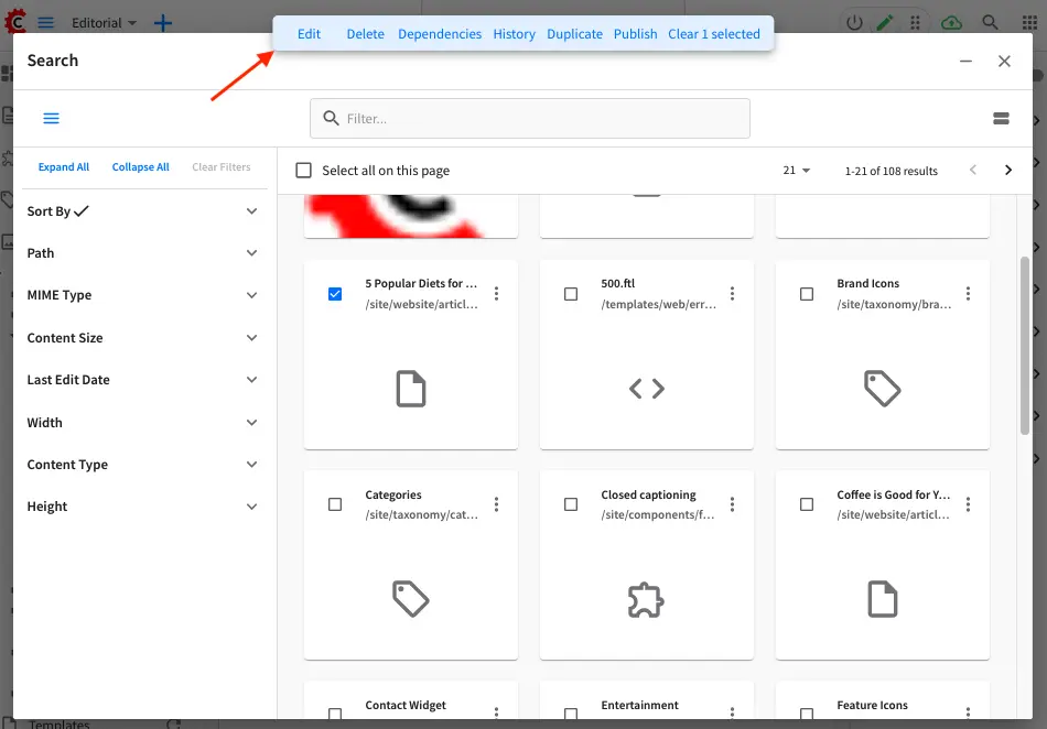
Result Selection: Note the checkboxes for each result type . Just as you can select multiple items on the dashboard and then interact with them in bulk, the same is true with search. You will have checkboxes that allow you to choose many items and access to the context nav to take action on those items. If you are selecting specific items for a control in a form you will be able to choose whatever number of items are expected by the control.
Workflows
This section describes the simple default workflow available from CrafterCMS.
Workflow and Scheduled Deployments
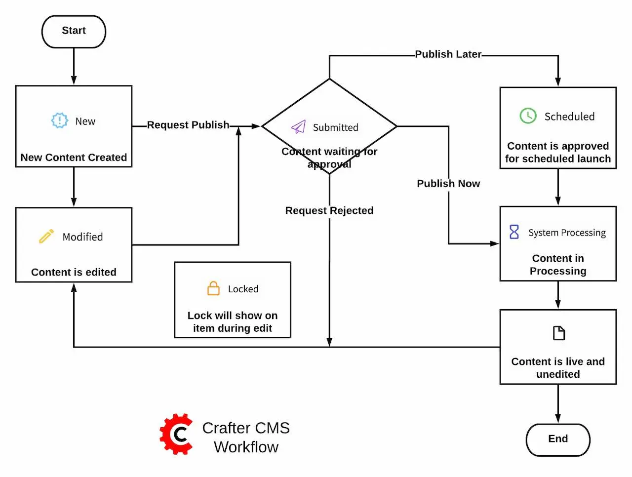
Workflow is the act of moving content through its lifecycle. A simple workflow option that includes submission, review/reject and approve and publish immediate / publish on a schedule options are provided by default. Workflow options are available to specific content, such as pages or static assets, etc. The available workflow options for users depends on the Role the users are assigned with. As the content goes through the workflow options, notification emails are sent out to corresponding users based on the workflow option. To setup the email addresses, please see the section Site Administrators, Configure Simple Workflow Notifications and Dialog Messages and User/Group Management. Below is a diagram showing the default workflow steps.
We will be looking at the workflow steps in this section. Workflow is managed through dialogs. Below is a sample dialog:
Submitting Content for Approval
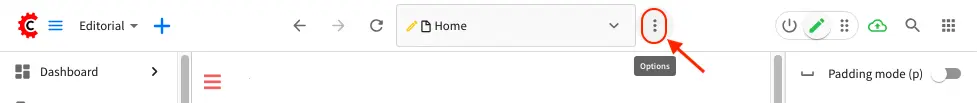
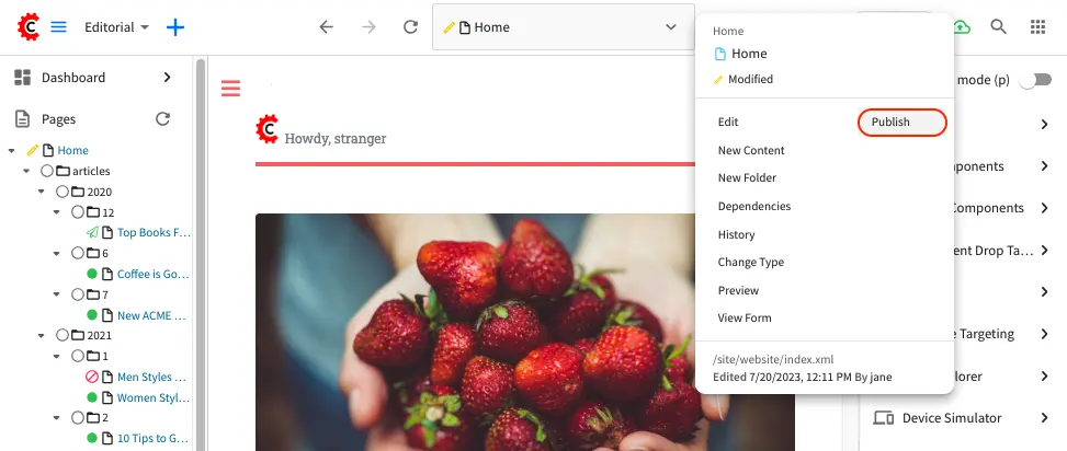
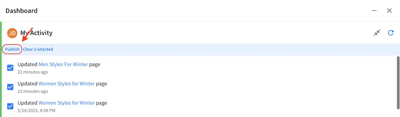
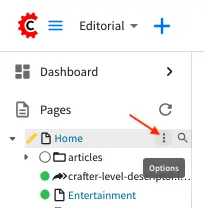
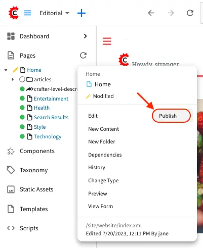
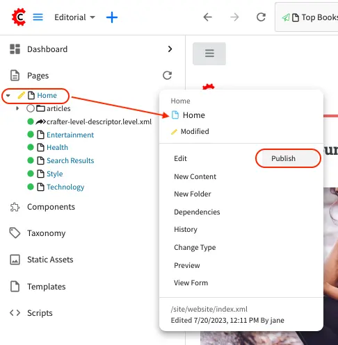
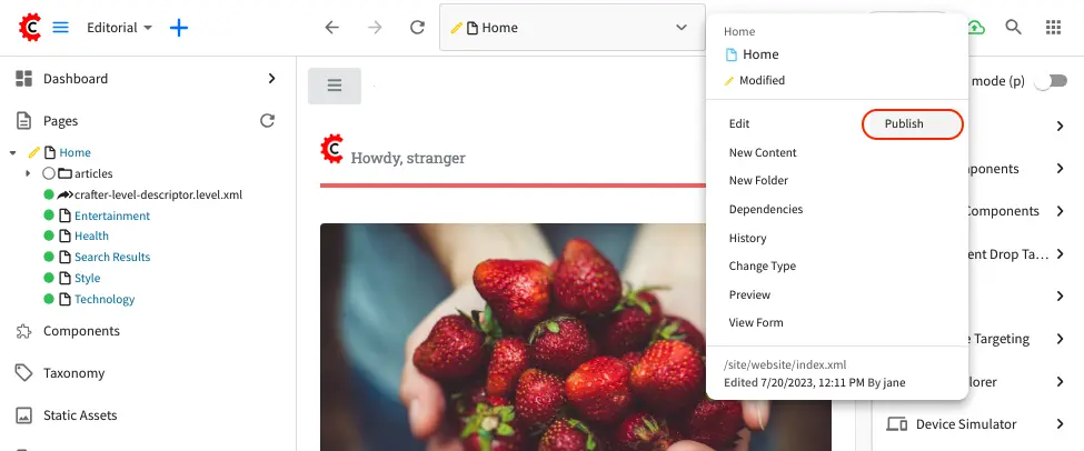
After creating/editing content, a request to publish content can be done by clicking on Publish. A Publish submission can be initiated from a preview screen through the toolbar by clicking on the three dots next to the address bar or by clicking on the three dots next to the article in the Sidebar (for single items), or from the Dashboard (where items can be batch checked).
Initiate a Publish through the toolbar at the top:
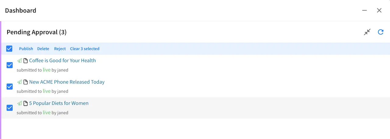
Initiate Publish batch checked through the dashboard:
Initiate Publish by clicking on the three dots next to the content from the Sidebar:
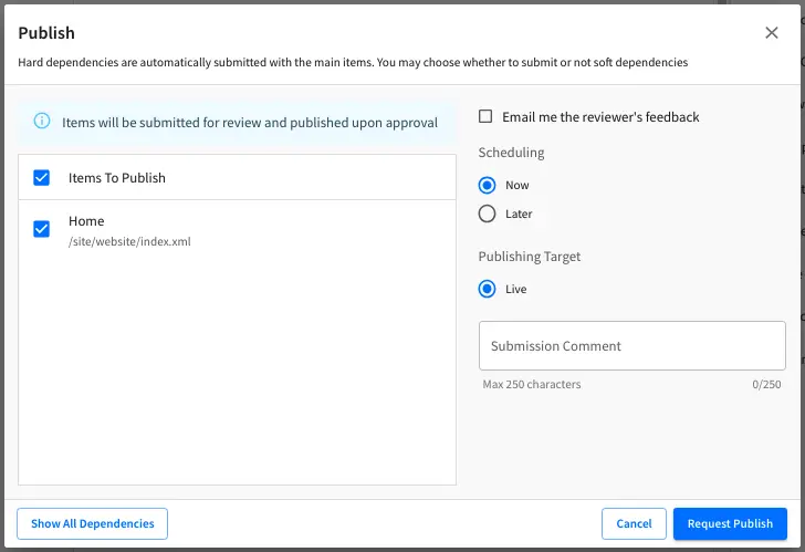
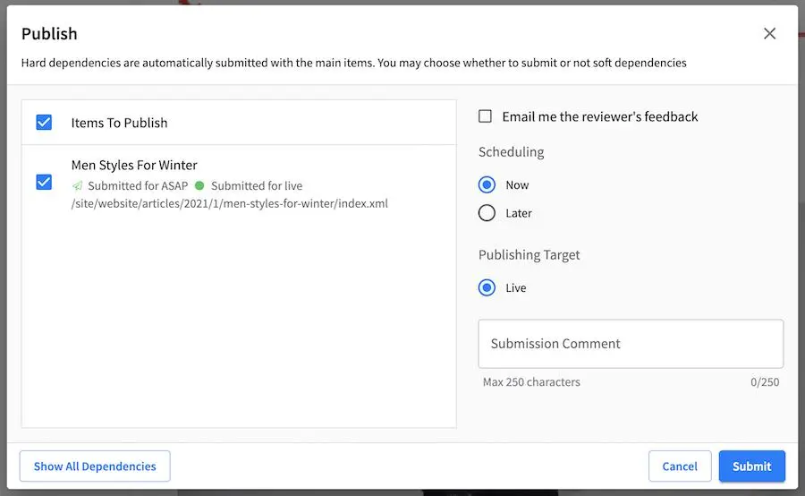
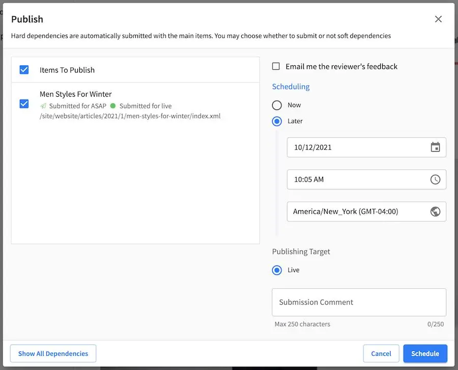
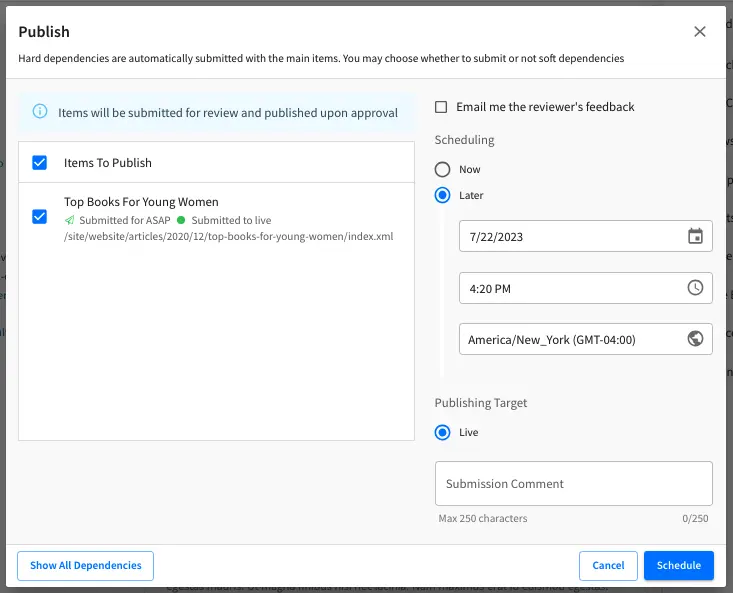
When sending the request for publish, you have the option of requesting to publish your content now, or to schedule publishing of your content at a later time and date.
Users with permission to publish can also make changes and request approval for publishing their changes
by checking the Request approval checkbox in the Publish dialog
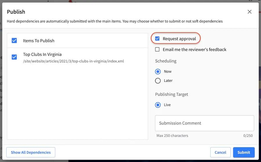
To make approval mandatory for publish requests for users with publish permission, see here.
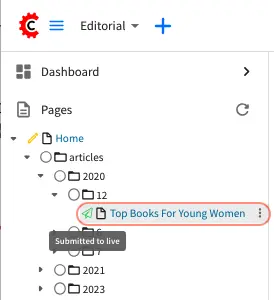
After clicking on the Submit or Schedule button (depending on the option selected for publishing now or later), a notification email will be sent to the project’s approvers. Notice also, that the toolbar now displays the icon for Submitted

You’ll also notice the Submitted icon is displayed next to the content item in the Sidebar for the content you just submitted a request for publish and contains the text Submitted for live
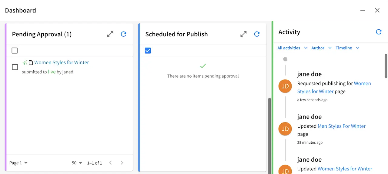
The Submitted icon also appears next to the content submitted for publish in the dashboard:
Publishing Content
After a request for publish has been sent, the next step in the workflow is for an approver (a user with publishing rights) to approve or reject the request for publishing. Notification emails are sent out when an item has been approved for publish or rejected.
Approve & Publish Request
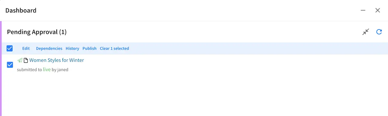
To approve content for publishing, there are a few ways to access the Publish workflow option for approving a publish request. One way is by going to the dashboard, then in the Pending Approval dashlet, look for the article you want to approve, then put a check mark next to it.
Another way to access the Publish option is by going to the Sidebar, then navigate to the article you want to approve, then click on Options (the three dots next to it).
Yet another way to access the Publish option is by going to the Sidebar and then navigating to the article and opening it for preview. After opening the article for preview, go to the toolbar and click on Options (three dots) next to the address bar.
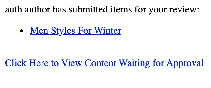
You can also preview the article that you want to approve by clicking on the link provided in the email sent to the approver, which should give you the Publish option too in the toolbar Options. Below is a sample notification email sent to the approver when user author sent a request to publish content. To modify/setup your notification emails, please contact your site administrator. To see more details on how to configure your notification emails, see the section for Site Administrators in Configure Simple Workflow Notifications and Dialog Messages
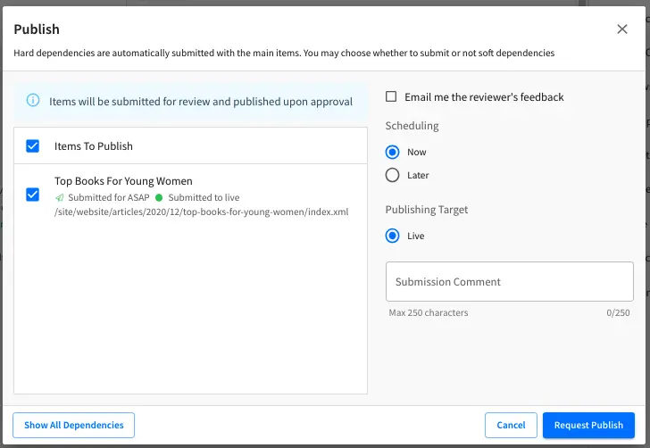
Below is the dialog that loads after clicking on Publish. The item scheduling selected in the dialog depends on what the requester has chosen when the request to publish was sent. In the image below. the selected scheduling for the item is for the Now. Click on Publish to publish the content now.
In the image below, the requester sent the request to publish with a schedule. Click on the Schedule button to schedule the publishing of the item. The dialog with the date and time when selecting the Later radio button allows the approver to schedule or reschedule the submitted item.
Once an item has been scheduled to be published, notice the workflow icon next to the article in the Sidebar nav tree, the dashboard and in the context nav when you preview the scheduled for publish item.
The dashboard allows batches of scheduled and non-scheduled items to be pushed live at the same time. Clicking on Publish will change the schedule of all items to be pushed live at the same time.
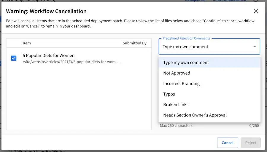
Reject Publish Request
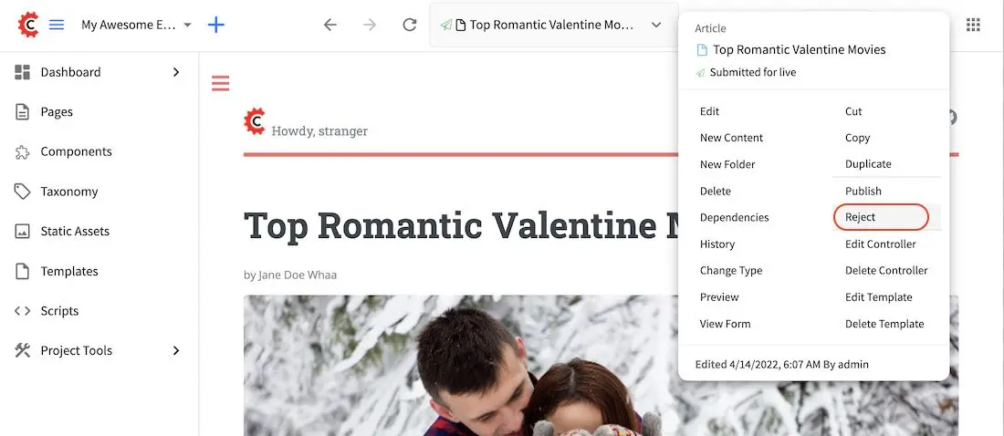
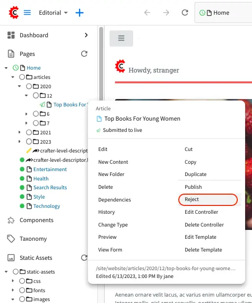
To reject a request for publish, open the item for preview, then in the toolbar Options, select Reject.
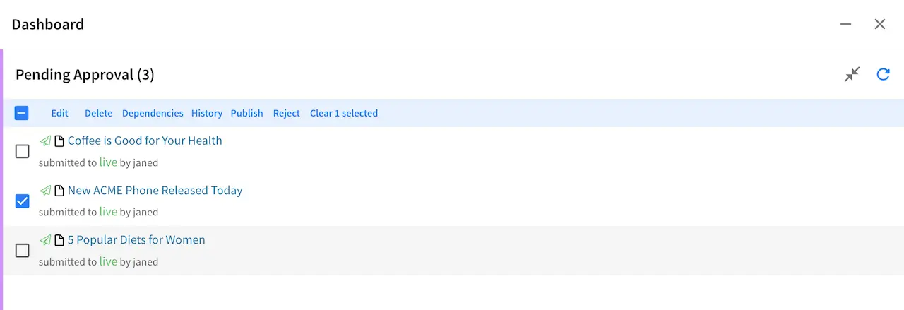
Another way to access the Reject option is by opening the dashboard and placing a check mark next to the
item to be rejected, Reject should now be available in the context nav.
Approvers may type their own rejection comments or pick canned rejection reasons from the drop-down menu.
Once selected, the editable text area field will be filled with the corresponding rejection notice / ready
for comments in the Rejection Comment box.
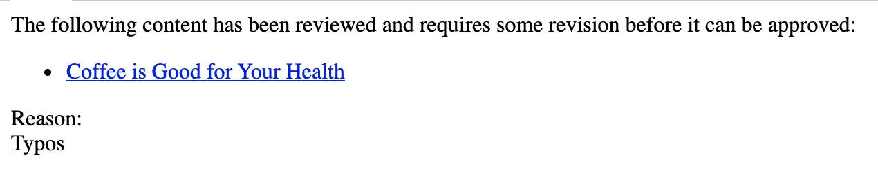
Once an item has been rejected, a notification email will be sent to the requester. Below is an example notification email of rejection:
Audience Targeting
This section describes how authors can use audience targeting in creating/previewing experiences.
Targeting allows an author to see what the project would look like if it were being browsed by a user with a given set of attributes. It also allows an author to tag the content being authored to the configured attributes on the project.
Tagging Pages
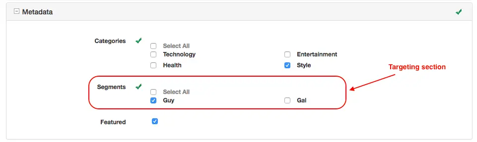
When creating a page in a project created using the Website Editorial blueprint, content can be targeted to the page visitor’s segment. This is done by tagging which segment the page is targeted for.
To tag a page, in the Sidebar panel, click on the Pages folder. Navigate to the level and location within the project navigation tree where you want to tag the content, then right click and select Edit. Depending on how tagging was named/setup, go to the section for tagging content and check the box next to the attribute the page is targeted for.
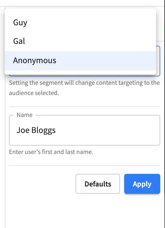
In the example below, targeting is in the Metadata section, under Segments, where the available segments are Anonymous, Guy and Gal, and the page is currently tagged for the segment Guy.
Viewing the Project with Different Segments
The authoring environment can be configured with any number of predefined attributes for targeting. A set of attributes is like a profile, in fact it behaves exactly the same way but instead of setting up and signing in as specific users to test different scenarios authors can simply switch back and forth between the available configured attributes.
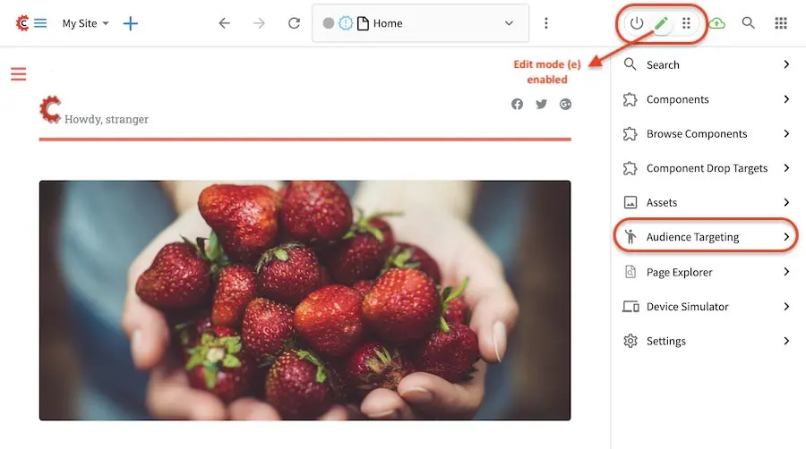
To find out the current active targeting attributes, switch Edit Mode to on (pencil icon found on the
top right of Studio, which then opens the experience builder panel on the right hand side). Click on
Audience Targeting and the current attribute values will be displayed in the panel. You can have as
many attributes as you need for your project. To add other attributes, please see the section
Targeting in the developer’s section of the documentation.
In the Website Editorial blueprint that we are using, the targeting attribute used is Segment.
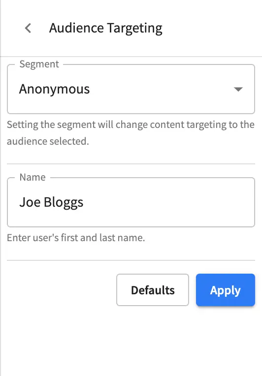
To view what the project would look like if it were being browsed by a certain segment, open
Audience Targeting by switching on Edit Mode on the upper right hand of Studio, click on
Audience Targeting then select the segment you would like to see the project with.
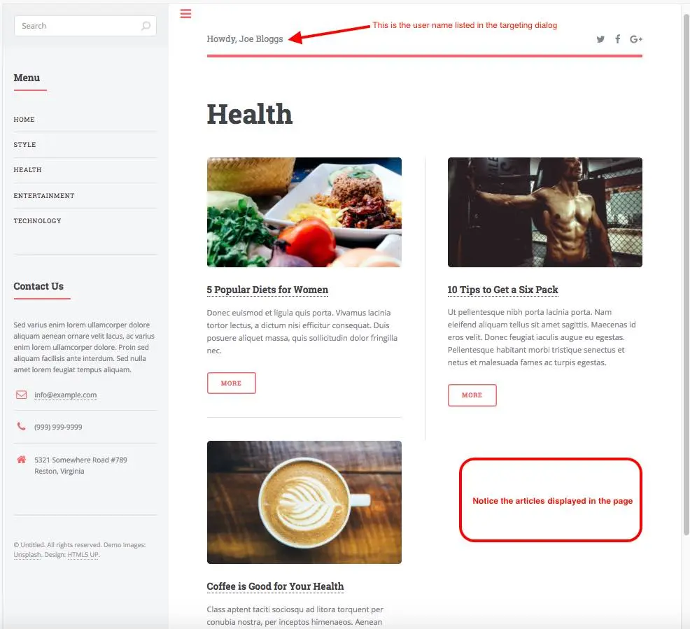
Below is a page with the segment set to Anonymous. Notice the articles available on the page.
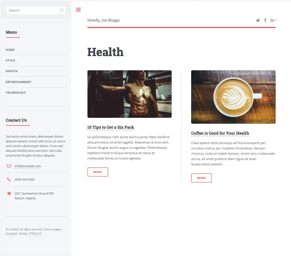
Selecting a different segment than the currently selected one, will cause the preview for all channels to immediately respond with content for a user with the attributes selected. Below, the segment Guy is selected. Notice the articles available on the page has changed to display only articles targeted to segment Guy
Here, the segment Gal is selected. Again, notice the articles available on the page.
As mentioned above, you can setup/configure as many attributes as needed to target your content and for more information. Please see the sections on targeting, Targeting in the developers section of the documentation and Audience Targeting and Targeting in the site administrators section of the documentation for more information.