
Freemarker Template In-Context Editing
Studio Support
Studio support contains various tools that allow developers to integrate and enable CrafterCMS’s In-Context Editing (ICE) features. It’s important to understand that these macros ONLY RENDER IN PREVIEW and DO NOT add additional structure to your markup. It only adds attributes to your markup (i.e. no additional elements will be inserted to your HTML tree). A minimal amount of JavaScript/CSS is injected in to your page to enable ICE controls on your marked sections.
Note
If your cstudio-support.ftl uses siteContext.overlayCallback to check if Engine is running in preview mode, please update your file to use modePreview instead as siteContext.overlayCallback and related classes are being discontinued in Engine.
Search for
siteContext.overlayCallbackcalls in yourcstudio-support.ftlfile:cstudio-support.ftl<#macro toolSupport> <#if siteContext.overlayCallback??> <script src="/studio/static-assets/libs/requirejs/require.js" data-main="/studio/overlayhook?site=NOTUSED&page=NOTUSED&cs.js"></script> <script>document.domain = "${Request.serverName}"; </script> </#if>Replace with
modePreviewto check if Engine is running in preview mode:cstudio-support.ftl<#macro toolSupport> <#if modePreview> <script src="/studio/static-assets/libs/requirejs/require.js" data-main="/studio/overlayhook?site=NOTUSED&page=NOTUSED&cs.js"></script> <script>document.domain = "${Request.serverName}"; </script> </#if>
In-Context Editing Pencils
In context editing renders pencils on the screen that invoke editing controls when clicked. This allows authors to quickly/visually identify editable content and make changes.
To enable in-context editing simply add the following attribute to the container/element where you want to place the editing control
<@studio.iceAttr component=contentModel iceGroup="author"/>
Tag Attributes
Attribute Name |
Required |
Expected Value |
|---|---|---|
iceGroup
|
No (unless path is not supplied)
|
the label/id assigned to iceGroup on
fields in your content model.
|
path
|
No
(unless iceGroup is not supplied)
|
the path of the item. This is typically
just mode.storeUrl.
If path is not supplied the system
will assume the outermost object e.g.
the page as the path.
|
label
|
No (but it’s a best practice)
|
UI will use label if it exists. Otherwise
the iceGroup or path will be used.
|
component
|
Yes
|
a SiteItem object
|
Example:
<img <@studio.iceAttr iceGroup="image" label="Promo Image 1" /> src="${contentModel.image!""}" alt="${contentModel.alttext!""}"/>``
Component Drag and Drop Zone
Drag and drop makes it easy for authors to visually assemble pages. Authors simply choose a component from a pre-defined list of components/widgets, drag them on to the screen, place them where they want (in defined drop zones), and then configure them. Authors may also move components from one zone to another or remove components.
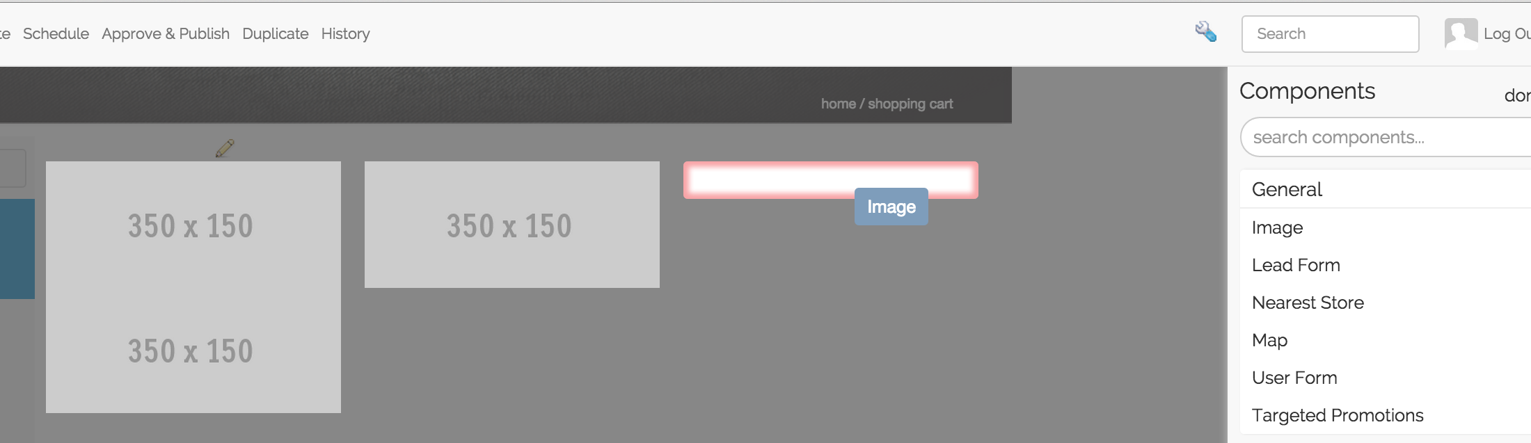
To define a drop zone for components simply add the componentContainerAttr attribute with the component tag to the container element where you want your components to render
<@studio.componentContainerAttr target="bottomPromos" component=contentModel />
Tag Attributes
Attribute Name |
Required |
Expected Value |
|---|---|---|
target
|
Yes
|
The name of the field in the parent model
where component references will be stored.
This is typically an item selector field type.
|
component
|
Yes
|
a SiteItem object
|
Example:
    <div class="span4 mb10" <@studio.componentContainerAttr target="bottomPromos" component=contentModel /> >
            ...
    <div>
If you want to learn how to configure the Drag and Drop panel please read the following document: Drag and Drop Configuration.
Rendering components from the target inside the container
The template needs to render the components that are referenced. The basic code to do this looks like:
    <#if contentModel.bottomPromos?? && contentModel.bottomPromos.item??>
          <#list contentModel.bottomPromos1.item as module>
            <@renderComponent component=module />
          </#list>
    </#if>
Note that the code is simply iterating over the collection of objects and calling render component. NO markup is being inserted in this example. The component template is rendering itself. It’s up to you if you want to insert markup around sub-components. Full example of typical component drop zone
    <div class="span4 mb10" <@studio.componentContainerAttr target="bottomPromos" component=contentModel /> >
          <#if contentModel.bottomPromos?? && contentModel.bottomPromos.item??>
            <#list contentModel.bottomPromos.item as module>
              <@renderComponent component=module />
            </#list>
          </#if>
    </div>
If the component to be rendered is an embedded component, the tag parent with a SiteItem object for the value needs to be added to renderComponent if the component to be rendered is not the current item, like below:
<@renderComponent component=module parent=contentModel/>
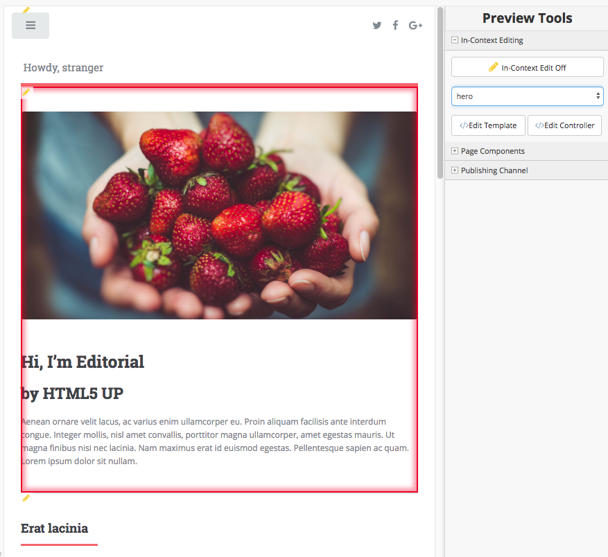
Let’s take a look at an example using a site created using the Website Editorial blueprint. In the Home page of the site, the features section contains embedded components feature. To render the embedded components from the target inside the container, note that the tag parent=contentModel is not required since the component to be rendered is the current item:
 1<!-- Section -->
 2  <section <@studio.iceAttr iceGroup="features"/>>
 3    <header class="major">
 4      <h2>${contentModel.features_title_t}</h2>
 5    </header>
 6    <div class="features" <@studio.componentContainerAttr target="features_o" component=contentModel />>
 7      <#if contentModel.features_o?? && contentModel.features_o.item??>
 8        <#list contentModel.features_o.item as feature>
 9          <@renderComponent component=feature />
10        </#list>
11      </#if>
12    </div>
13  </section>
As noted above, the code is simply iterating over the collection of objects (feature component) and calling render component. The component template is rendering itself.
Note
Here are some guidelines to follow when working with drop zones:
The drop zone should have no markup inside of it besides the render tag e.g.
<@renderComponent ... />The components should have the
componenttag out the outermost markup elementMake sure that the markup is well formed, with matching opens and closes
Identifying components in the template
In order for authors to interact with components, to drag them around the screen for example the templating system must know how to identify them. To identify a component simply add the following attribute to the outer most element in the component template’s markup
<@studio.componentAttr component=contentModel />
Tag Attributes
Attribute Name |
Required |
Expected Value |
|---|---|---|
path
|
No
|
the path to the component. Typically this is
simply contentModel.storeUrl
|
ice
|
No
|
true or false. If true the component will
automatically render ICE (in context editing)
controls for you. This is helpful on simple
components. Larger components may be so complex
that multiple ice elements make sense. In the
latter case omit this attribute or set it to
false and manually add your own ICE attributes
to the component template
|
iceGroup
|
No (unless path is not
supplied)
|
the label/id assigned to iceGroup on
fields in your content model.
|
component
|
Yes
|
a SiteItem object
|
Example
<img <@studio.componentAttr component=contentModel ice=true /> src="${contentModel.image!""}" alt="${contentModel.alttext!""}" />
Note
Remember to have an item selector control in the form definition for each drop zone
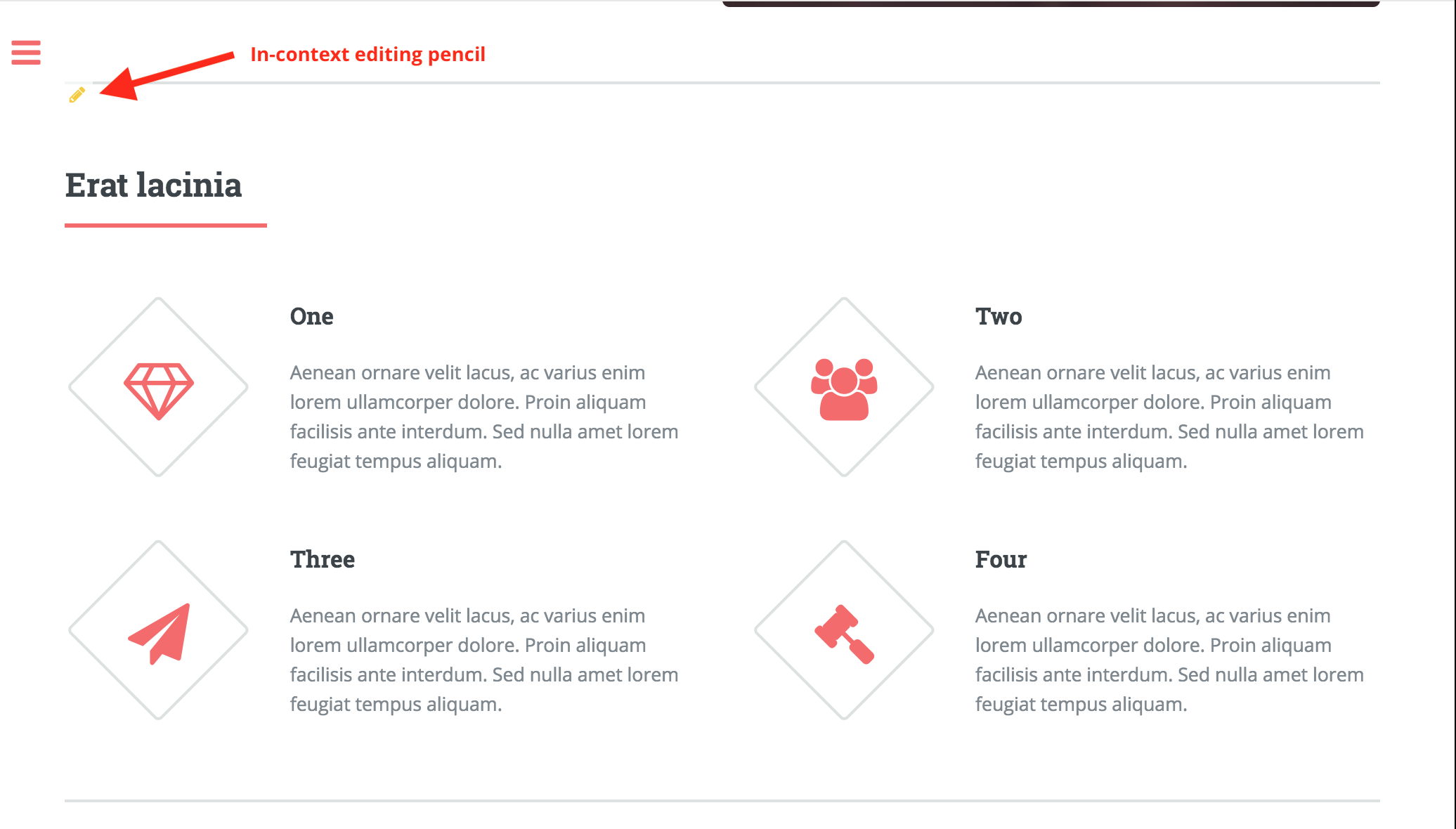
Let’s take a look at an example of enabling in-context editing pencils for embedded components, using the Website Editorial bp, feature embedded component through the <@studio.componentAttr /> tag.
Here’s how the features section pencils look like before enabling pencils on the embedded components:
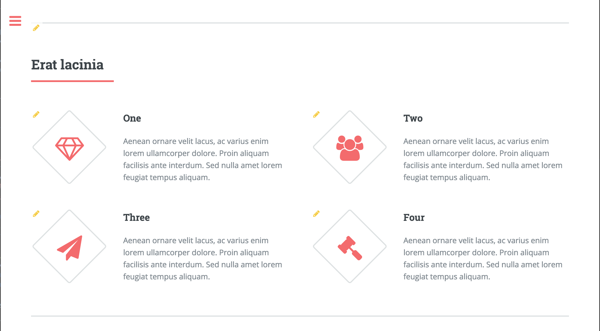
To enable the in-context editing pencils of the features component, add the attribute tag ice with the value set to true like below:
<article <@studio.componentAttr component=contentModel ice=true />>
Here’s how the features section pencils look like after enabling the in-context editing pencils for embedded components:
Engine Support
At the top of your page or component (whatever it is you are rendering, include the following) import:
<#import "/templates/system/common/crafter-support.ftl" as crafter/>
Components
Render Component
Need to render a sub component of some kind?
<@renderComponent component=module />
Render Components
Need to iterate through a list of components and render them WITHOUT any additional markup?
<@crafter.renderComponents componentList=contentModel.bottomPromos />