Drag and Drop Configuration
The drag and drop configuration file defines the categories and their corresponding components for the drag and drop panel.
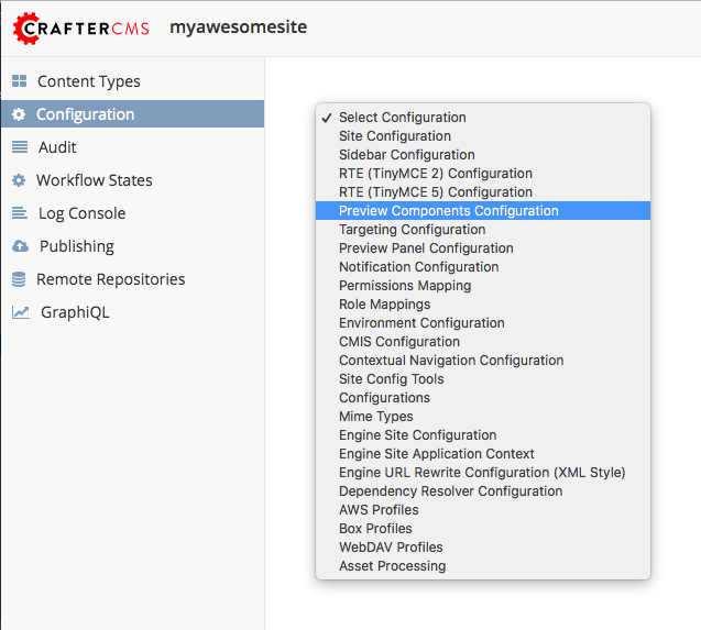
To find this configuration xml through studio follow the next instructions:
Click on
 located in the Sidebar.
Choose Configuration from the menu.
Select Preview Components Configuration.
Sample
CRAFTER_HOME/data/repos/sites/SITENAME/sandbox/config/studio/preview-tools/components-config.xml
 1<?xml version="1.0" encoding="UTF-8"?>
 2    <!--
 3      This file configures the drag-and-drop components available in the Preview Tools. Those components can then
 4      be dragged and dropped on a drop-zone within a page.
 5
 6        The structure of this file is:
 7
 8      <config>
 9        <category> (list of components that can be created on the fly during the drag and drop)
10          <label />
11          <component>
12            <label />
13            <type /> (reference content type of the component)
14            <path /> (where to store these components)
15          </component>
16        </category>
17        <browse> (list of browse paths of where to find ready components to be dragged/dropped)
18          <label />
19          <path /> (where to look for)
20        </browse>
21      </config>
22    -->
23    <config>
24      <category>
25        <label>General</label>
26        <component>
27          <label>Feature</label>
28          <type>/component/feature</type>
29          <path>/site/components/features</path>
30        </component>
31      </category>
32      <browse>
33        <label>Features</label>
34        <path>/site/components/features</path>
35      </browse>
36    </config>
Description
Category
List of available category tags
Tag
|
Description
|
|---|---|
Category
|
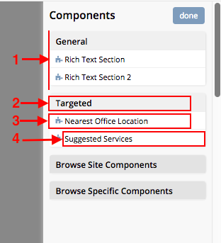
This tag contains each category of the panel. See #1 in the image below.
|
Label
|
Each
<category> element must contain a <label> element that specifiesthe category name. See #2 in the image below.
|
Component
|
This tag refers to the component which the user can drag and drop into the
preview page selected. See #3 in the image below.
|
Label
|
Each
<component> element must contain a <label> element that specifiesthe component name. See #4 in the image below.
|
Type
|
Content-Type assigned to create the new component.
|
Path
|
Path where the new component will be created.
|
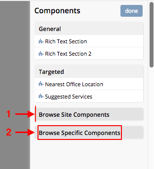
Browse
The Browse functionality is useful when the user wants to drag and drop an existing component.
List of available browse tags
Tag
|
Description
|
|---|---|
Browse
|
This tag contains each browse section in the panel. See #1 in the image below.
|
Label
|
Each
<browse> element must contain a <label> element that specifies thebrowse label to display in the panel. See #2 in the image below.
|
Path
|
Path where the user will select the component to drag and drop into the
preview page selected.
|