Working with Pages
This section describes how content authors can create and use pages to manage content. Templates are used for page layouts in CrafterCMS. A developer usually creates the templates that authors can then use to manage content.
Adding a Page
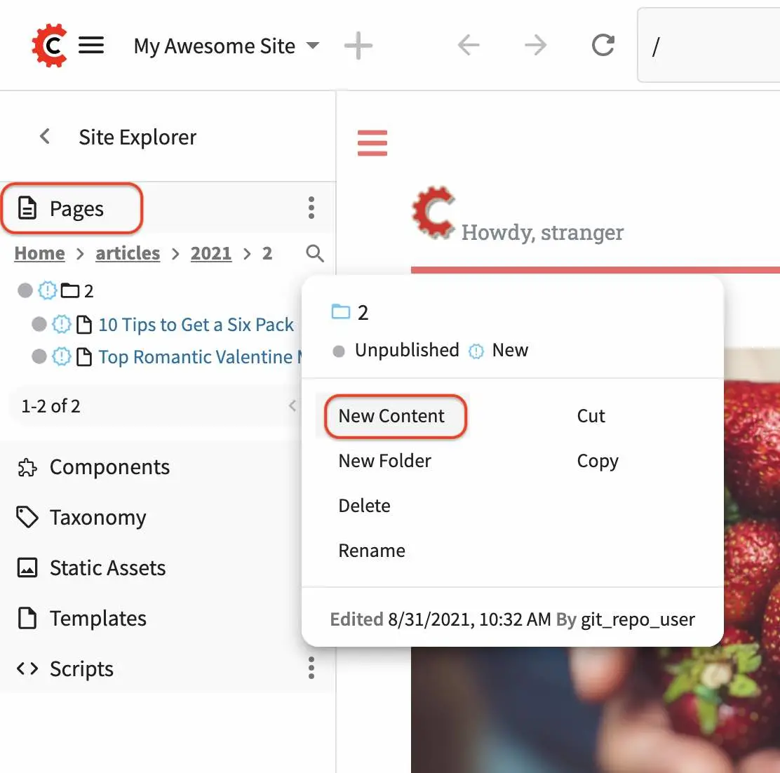
To add a page, in the Sidebar panel, then click on Pages. Navigate to the level and location within the path navigation tree where you want to create the content, then click on the three dots next to the parent page and select New Content
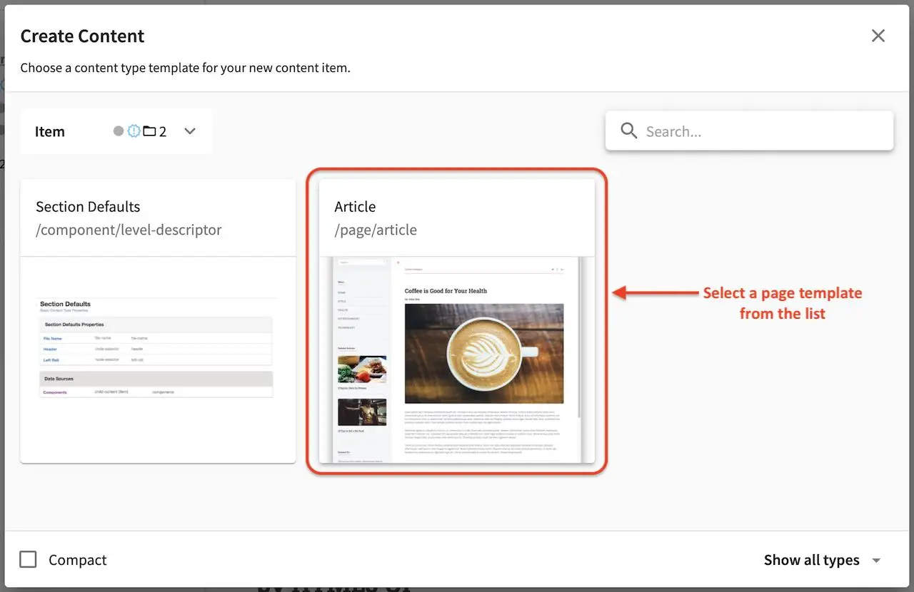
You will then be prompted to choose a content type. Select a starter page template from the list shown. If you need a template that’s not available or want to modify the template, ask a developer to add/modify the template that you want.
A form will open containing the template selected. You can now start adding content. Required fields have a red ‘x’ after the field label. The number of required fields within each section is displayed in the Section bar for that section.
When data is entered into a field, the red ‘x’ will change to a green checkmark and the section bar will update with the new status.
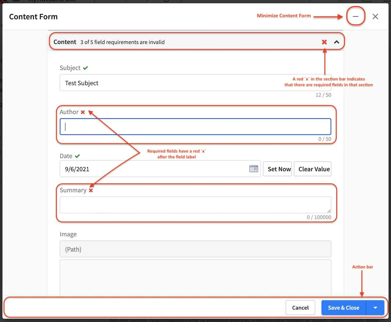
An action bar is available at the bottom of the screen that cannot be scrolled away. This bar allows users to Save as Draft, Save & Minimize, Save & Preview, Save & Close or Cancel.
Save as Draft will save the content entered on the form and leave the New Page/Editing dialog open
Save & Minimize will save the content entered on the form, then minimize the form
Save & Preview will save the content entered on the form then close the form and load the preview screen with the newly saved data
Save & Close will save the content then close the form.
Cancel will close the form without making any changes and will warn users if there are unsaved changes.
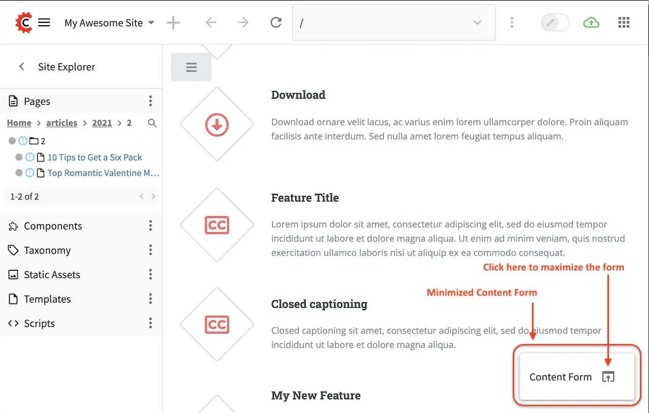
To minimize the form, click on the - at the top of the Content Form right next to the x. When a form is minimized, it will appear at the bottom right of the screen with an arrow pointing up next to it. To maximize the form, simply click on that arrow pointing up.
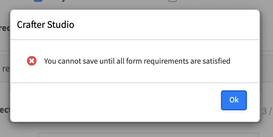
An error form will appear when you try to Save and Close without filling out all the required fields.
Editing a Page
There are multiple ways to edit a page.
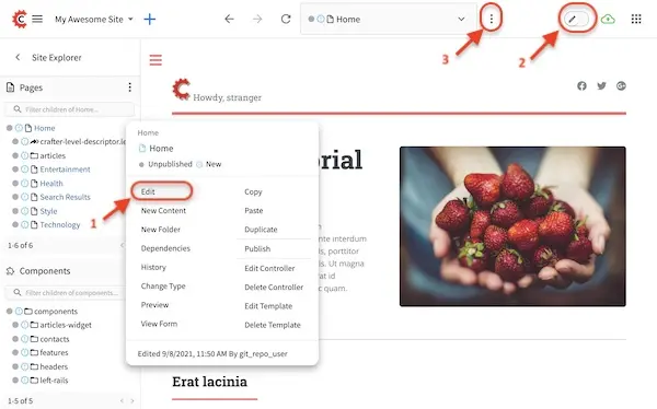
In the Sidebar panel click on Pages. Navigate to the level and location within the path navigation tree where you want to edit the content, then click on the three dots on the right and select Edit. A form containing the page content you want to edit will open.
In the Sidebar panel click on Pages. Navigate to the level and location within the path navigation tree where you want to edit the content and click on it to preview the page. Toggle
Edit Modeto on (switch at the top right corner) to turn on in-context editing and the experience builder panel, if it’s not turned on yet. Move your mouse over to the area you would like the edit. As you’re moving the mouse around the page, notice that the cursor changes to a pencil on editable sections. Click anywhere editable on the page to start editing.In the Sidebar panel click on Pages. Navigate to the level and location within the path navigation tree where you want to edit the content and click on it to preview the page. Click the three dots next to the address url on the toolbar found at the top of your screen. Click on
Edit. A form containing the page content you want to edit will open.
Versioning
CrafterCMS tracks all changes to pages/contents/static assets in your project.
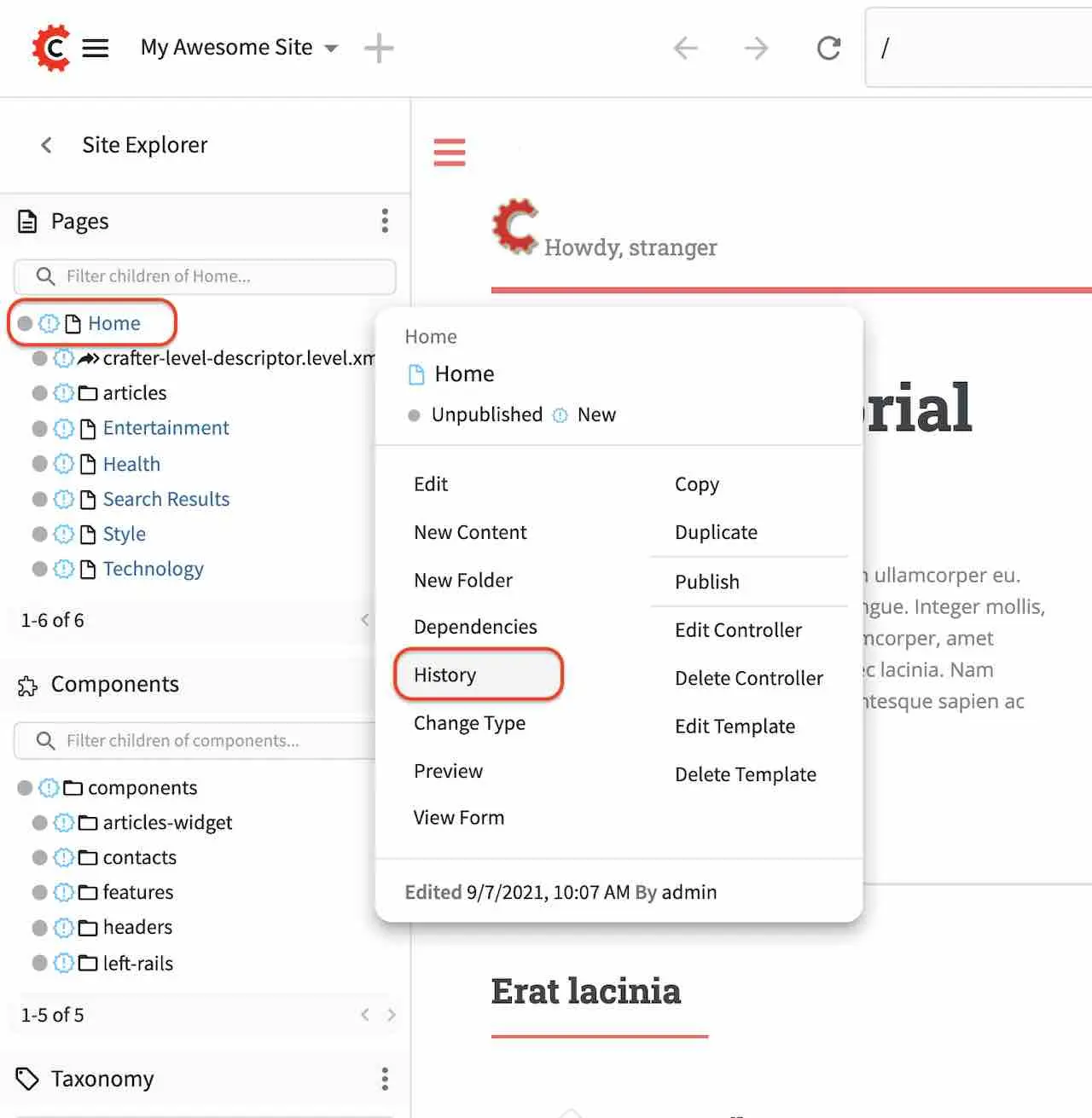
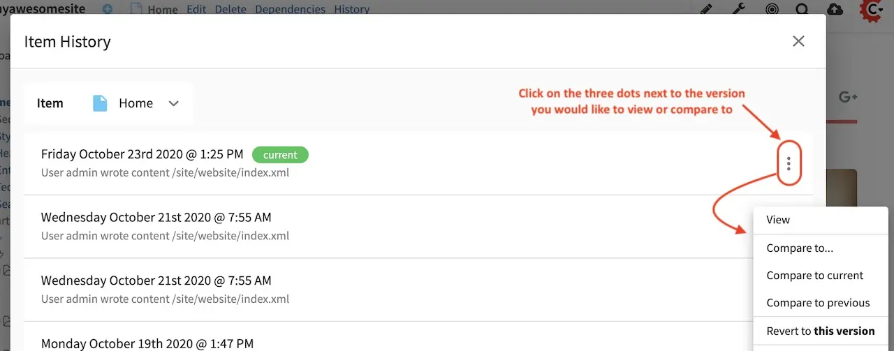
All page changes/versions can be viewed, compared with other versions and reverted to an older version. There are a couple of ways to view the History of your desired page. Navigate to the page you want to view the history of from the project navigation tree.
After selecting the page you want, click on Options (the three dots next to the address url at the top of your browser) then select History.

Another way to view the history of a page is by clicking on the three dots next to the page you want on the Sidebar and then selecting History
Version History
There are a number of things that you can do in the Version History dialog. On the right hand side of the dialog, for each entry/version on the list, there are a number of actions that you can perform on the version you selected, accessible by clicking on the three dots next to it.
Actions
|
Description
|
|---|---|
View
|
View details of the selected version of the page such
as the creation date, last modified date, page content
|
Compare to …
|
Compares the selected version to the version selected
by the user
|
Compare to current
|
Compares the selected version to the current version
of the page
|
Compare to previous
|
Compares the selected version to the previous version
of the page in the list
|
Revert to this version
|
Reverts the page content to selected version
|
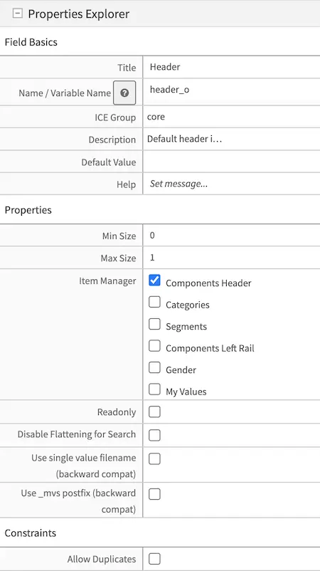
Form based editing
Form controls are the building blocks of forms. It lets you get content into the system.
Forms are the means by which content is captured in Crafter Studio. A form generally maps to or represents a type of object in the system for example a certain kind of page - like a section page or a banner or video. Let’s look at some common elements of a form and examine some of the controls that we use to get content in to the system.
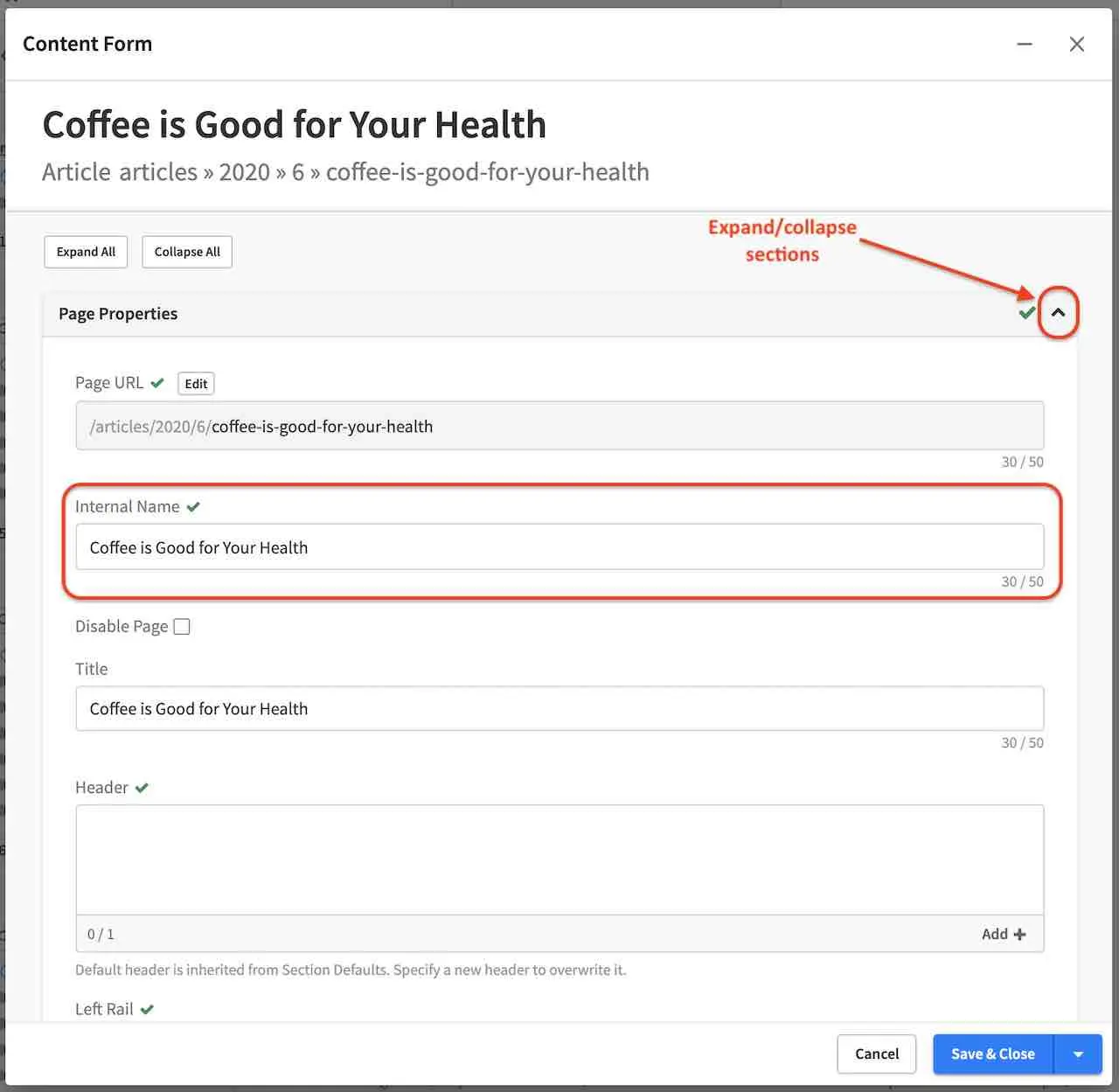
When a new page is created or a page is edited, the form interface for these functions will open in a new dialog. A user can Expand or Collapse all of the sections on the page using the “Expand All” or “Collapse All” links at the top of the page. Clicking the +/- control on the Section Label will toggle the expanded or collapsed state for each section.
The number of required fields within each section is displayed in the Section bar for that section.
An icon in front of the Section Label will display a red ‘x’ (when required fields are not complete), or a green check mark (when all required fields are complete) to denote status.
Every required field will have a red ‘x’ icon after it’s Field Label.
When data is entered into a field the red ‘x’ will change to a green check mark and the section bar will update with the new status. An action bar is available at the bottom of the screen that cannot be scrolled away. This bar allows users to Save, Save & Minimize, Save & Preview, Save & Close or Cancel and minimize/maximize the form.
Save as Draft will save the content entered on the form and leave the New Page/Editing dialog open
Save & Minimize will save the content entered on the form, then minimize the form
Save & Preview will save the content entered on the form then close the form and load the preview screen with the newly saved data
Save & Close will save the content then close the form.
Cancel will close the form without making any changes and will warn users if there are unsaved changes.
To minimize the form, click on the - at the top of the Content Form right next to the x.
The fields within each section are completely modular and can be applied to any given page as needed. This modularity allows us to craft edit pages for any new screens as they arise without the need for specific UI work on the edit screen.
Editing Controls
Here are some controls that authors may encounter while editing content:
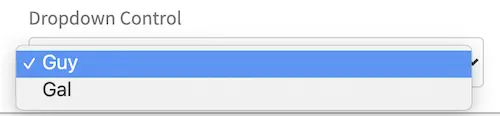
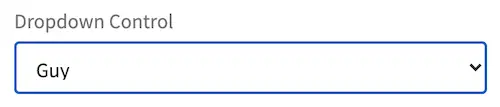
Dropdowns - Allows the user to select an item from the list. When not selecting an item from the dropdown, the selected item is shown on the box.
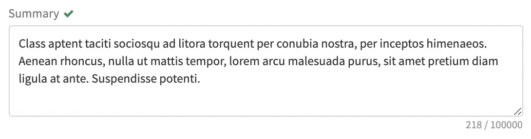
Text areas - Allows the user to enter text up to the character limit indicated at the bottom of the text area input box.
Checkbox - Allows the user to make a choice, depending on what was setup.

Group checkboxes - Allows users to select one or more items in a group
Input boxes - Simple text input control allows users to input text up to the character limit indicated next to the input box. The character limit specifies both the MAXLENGTH and SIZE attributes for the field. The character counter will count up as the user types into the field.
Date/Time pickers - The Date and Time input can allow entry of both Date and Time, only Date or only Time, depending on what was setup.
Rich text editors - What You See Is What You Get (WYSIWYG) editor that allows authors to arrange and style content without needing to know HTML. Below is a more detailed description on working in the RTE.
Repeating Group - Group of controls (1 or more controls) that can be duplicated multiple times by clicking on Add Another. If there are two or more instances, “Move Up” and “Move Down” links will be available which will move the group up or down in relation to the other group instances.
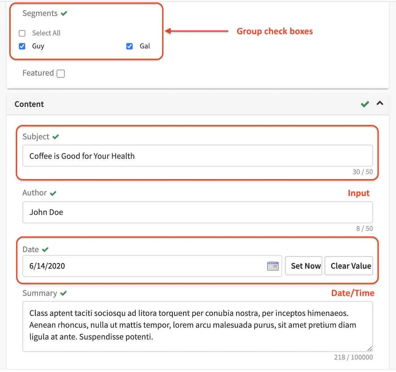
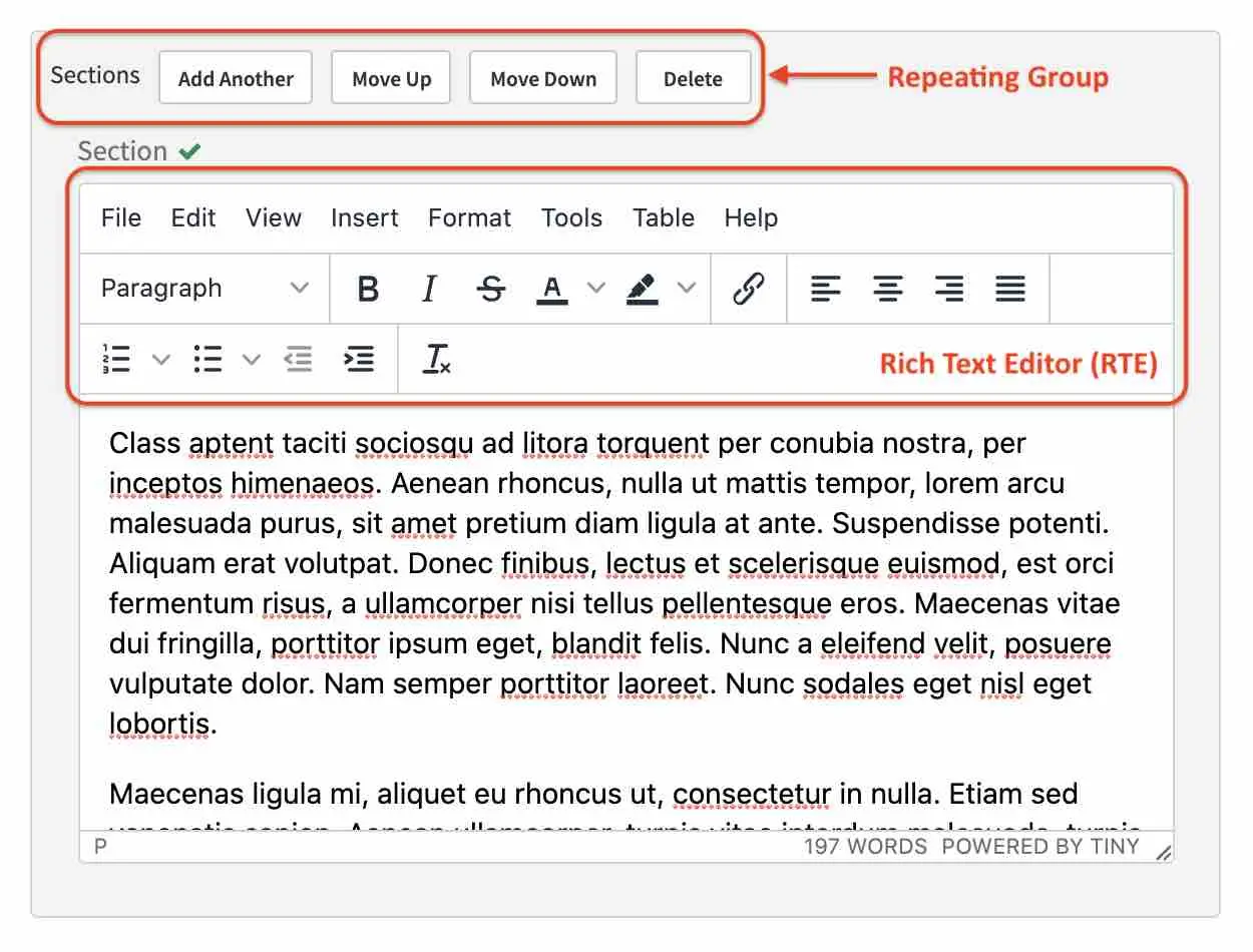
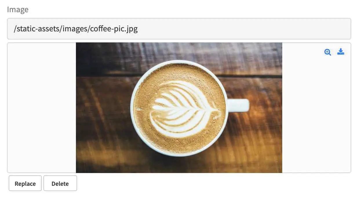
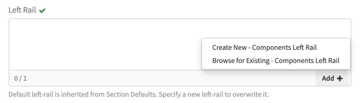
Image pickers - Allows the user to select an image from whatever source is allowed, such as Upload Image or Existing Image (asset uploaded to the system). To select an image, click on Add (when there’s no image selected yet) or Replace to change the selected image
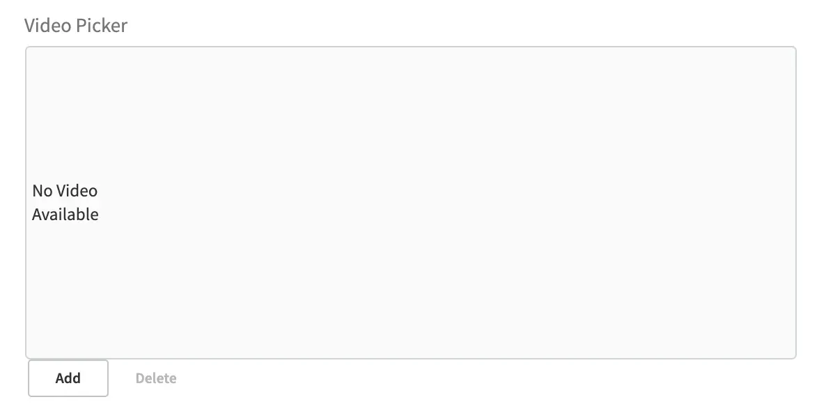
Video pickers - Allows the user to select a video from whatever source is allowed, such as Upload Video (video to be uploaded) or Existing Video (asset uploaded to the system). To select a video, click on Add (when there’s no video selected yet) or Replace to change the selected video.
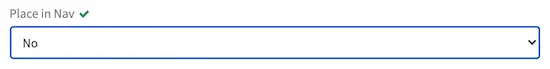
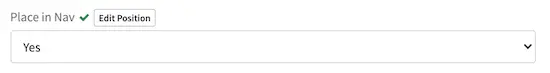
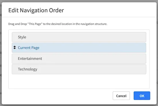
Page Order - Allows the user to change the position of the page in the navigation structure. To change the position of the page, select Yes, an Edit Position button will appear. Click on the Edit Position button, a form will appear that lets the user drag and drop the position of the page the user is editing, called Current Page. The first time navigation is turned on for the page, the Current Page will always default to the top position.
Item Selector - Allows the user to select an item from configured sources. Clicking the Add button opens a menu that lets the user pick from the list. Clicking on Add & Close or Add Selection adds the selected item to the selector list
File name - Allows the user to enter a name for the file. Whitespaces are replaced by a dash automatically and a maximum length for the name is specified next to the filename input box.
Placing Content Components
Drag and drop makes it easy for authors to visually assemble pages. Authors simply choose a component from a pre-defined list of components/widgets, drag them on to the screen, place them where they want (in defined drop zones), and then configure them. Authors may also move components from one zone to another or remove components.
The Edit Mode switch puts the page in component construction mode. Regions on the page that are wired to accept components (“drop target”) are highlighted. In the component construction mode, the user may drag an existing component or place a new component to be configured in the drop target. The user may also drag a component from one region to another. Crafter Studio administrators can configure what components are available in this panel.
Drag and Drop Components
Placing new components
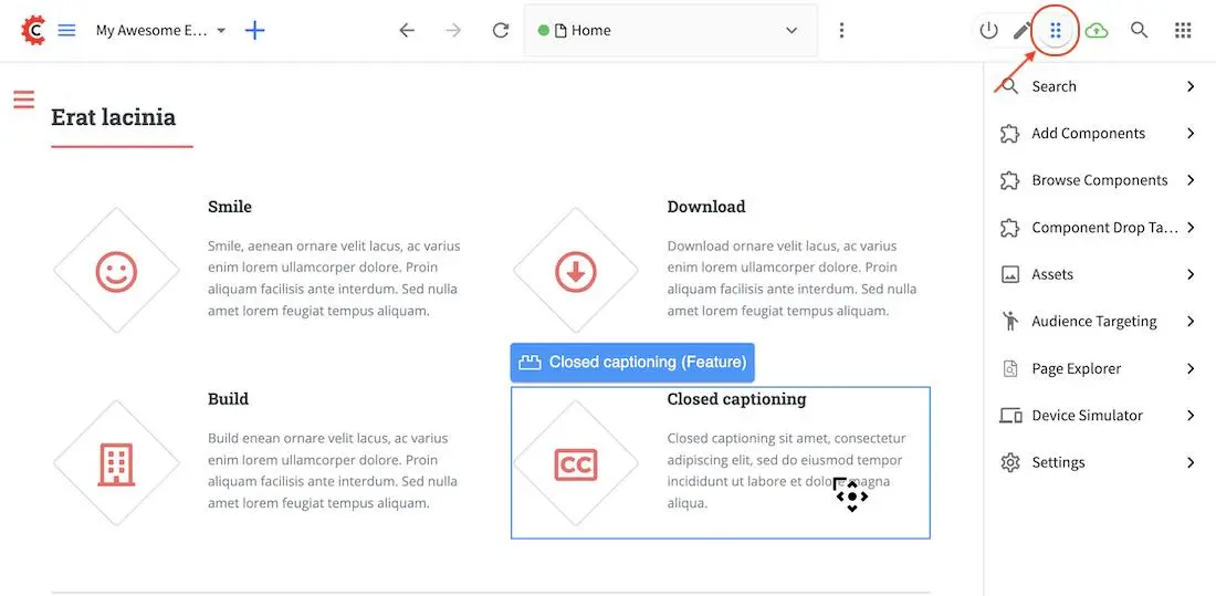
The user may create new components by dragging components from the experience builder panel (Component section) out and on to the drop target on the screen. A new component with default values will then be visible and ready for editing when a new component is dropped on the screen.
Placing existing components
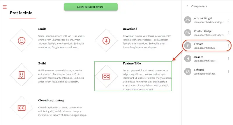
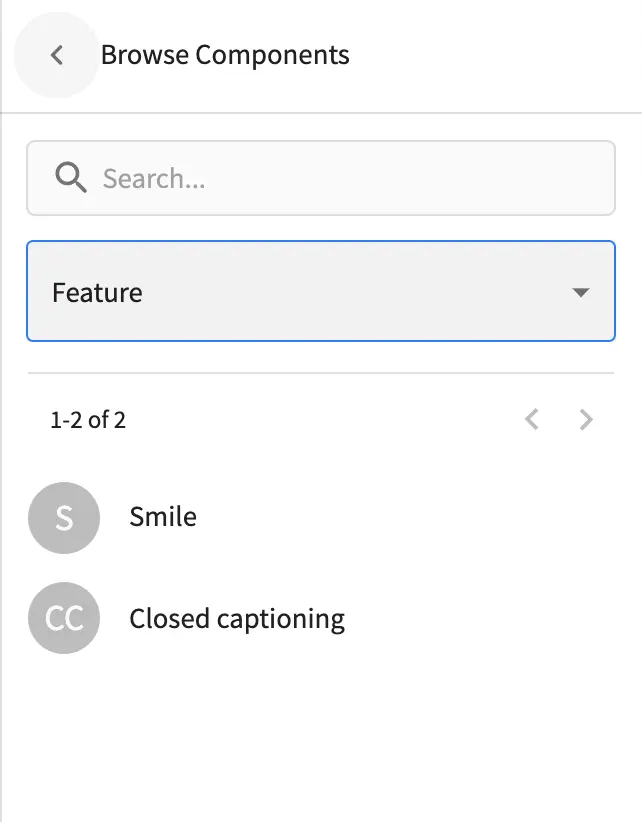
The user may add existing components into the panel by clicking on Browse Components. A list of existing components will be presented that can be dragged and dropped into the drop target
Moving components around
Components inside the drop targets may be moved around to the desired position. Simply click, then drag and drop to the desired position in the drop target.
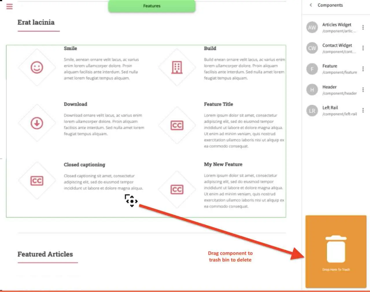
Deleting components
To remove a component from the drop target, just drag the feature to the trash bin that appears on the bottom right of the screen when dragging around a component.
Working in the Rich Text Editor(RTE)
The RTE (Rich Text Editor) is intended to provide an in-context editing experience from within a form (rather than a preview) that allows authors to arrange and style content without needing to know HTML. In an RTE field, the RTE toolbar is at the top, and is always available regardless of how far down you scroll in the RTE field.
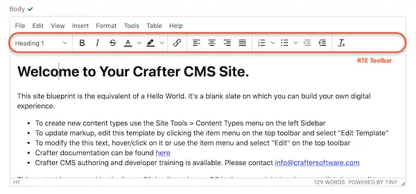
There are a number of tools available from the RTE out of the box for editing your content. Custom tools may also be added to the RTE, depending on your needs. Please see the developer section Rich Text Editor Configuration of the docs for more details.
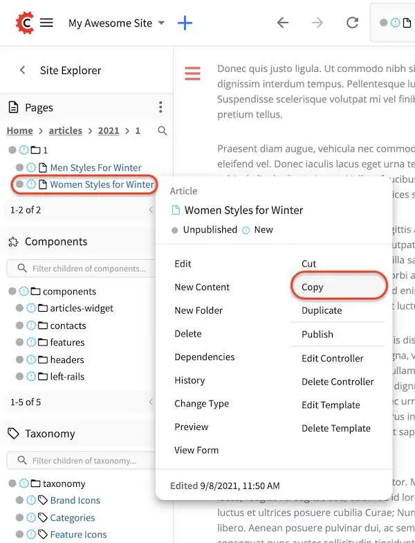
Copying a Page
To copy a page, in the Sidebar panel, click on the Pages folder. Navigate to the level and location within the project navigation tree where you want to copy content, then click on the three dots next to the page and select Copy
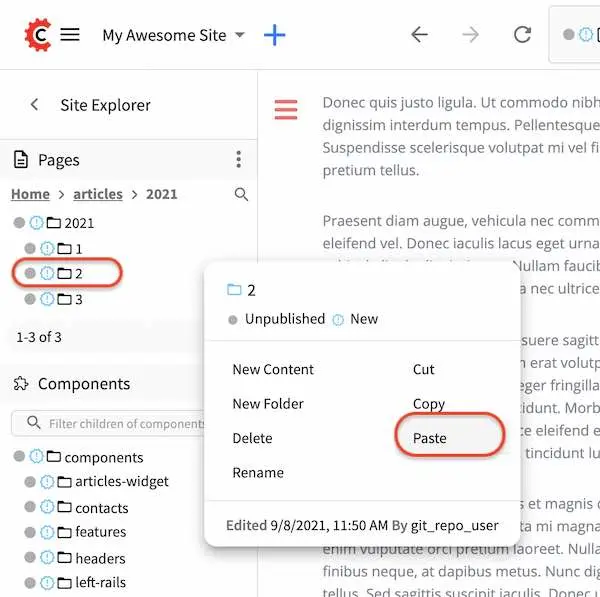
In the Sidebar panel, navigate to the level and location within the project navigation tree where you want to paste the copied content, then click on the three dots next to it and select Paste
Depending on how the page content type has been modeled (dependencies), copying and pasting a page may also create copies of items in the page. These dependencies are setup by the developers when creating the content type. Generally, when an item on a page is uploaded to the following locations: /site/components/item/.* or /static-assets/item/.*, when the page containing those items is copied, a copy of the uploaded items are created.
To learn more about these dependencies and see examples, see Item Specific Dependencies or Copy Dependencies Configuration.
Deleting a Page
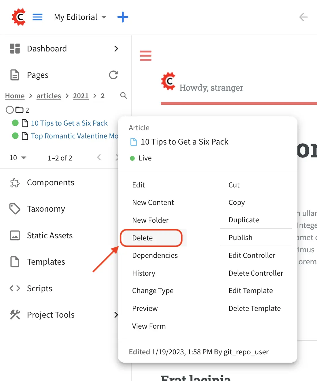
Users with permission to delete content can delete a page from a project. To delete a page, in the Sidebar panel, click on the Pages folder. Navigate to the level and location within the project navigation tree where you want to delete content, then click on the three dots next to the page and select Delete
A dialog confirming the action will appear. Check the I understand that deleted items will be published immediately.
checkbox to enable the Delete button.
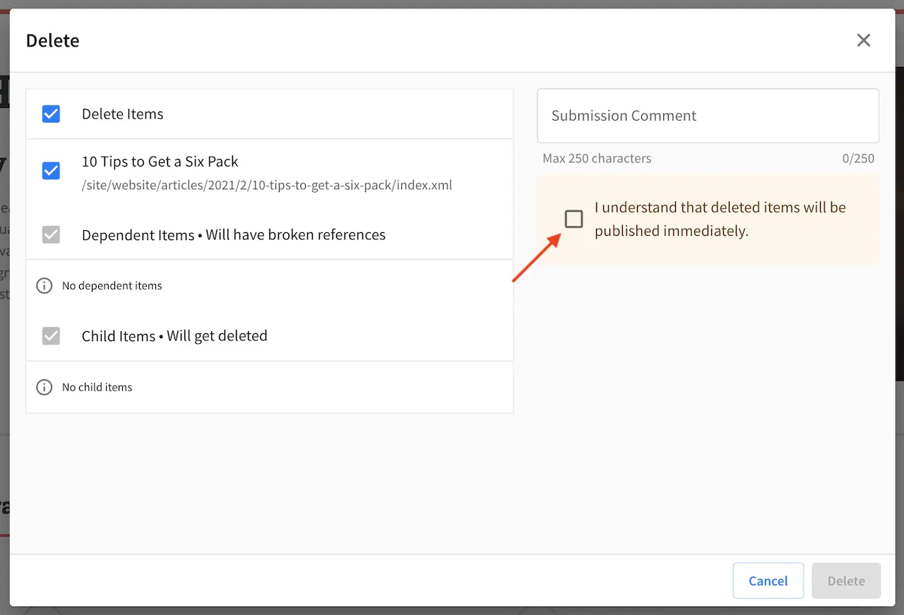
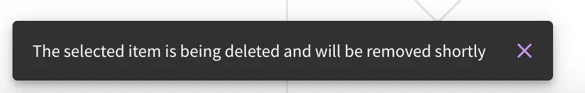
Click on the Delete button. A snackbar at the bottom left of the screen will appear to inform you of the
item deletion.
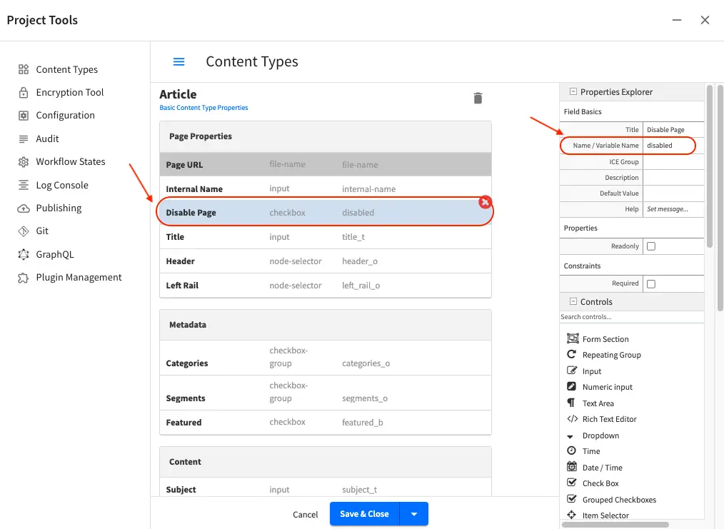
Disabling a Page
A page content type can be modeled to disable a page in content delivery via the reserved variable disabled.
This variable indicates an object is “hidden” in live and cannot be retrieved via services like search or the
site item service.
To model a content type that allows disabling a page, do the following:
Open the content type you’d like to add
disabledby opening the Sidebar, then clicking onProject Tools->Content Type, then select the desired page content typeDrag a
Check Boxcontrol to thePage Propertyform section. Set theTitleto something descriptive, sayDisable Pageand remember that theName/Variable Namevalue needs to be set todisabled. Save your changes.
Let’s take a look at an example of a page content type with disabled and how the page appears in preview and
in delivery. We will be using a project created using the Website Editorial blueprint named
my-editorial for this example.
We’ll open the content type Article of the project. Below is the Article content type modeled
with disabled, as described above.
Let’s now disable an article in the project, then publish it and see how the project behaves in delivery when a page has been disabled.
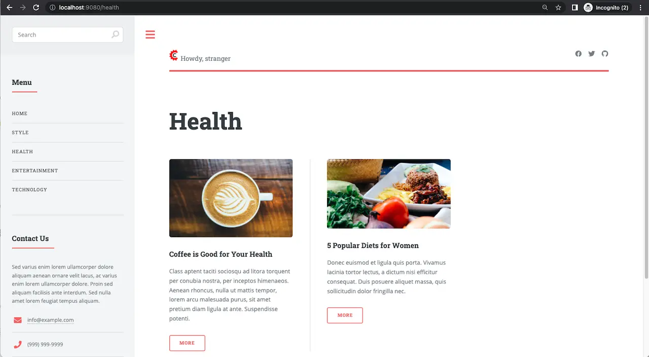
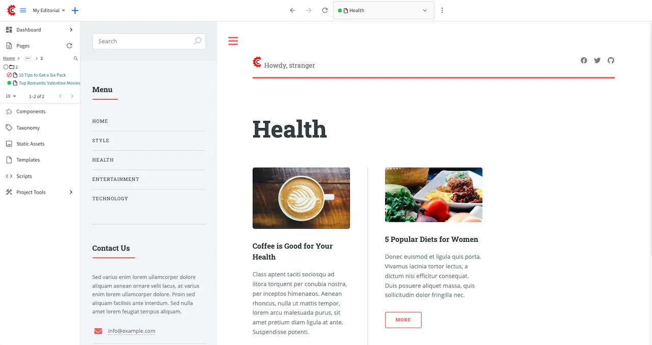
We’ll disable the article 10 Tips to Get a Six Pack. First, we’ll take a look at how the Health
category page looks like with the article still enabled in Preview by opening the Sidebar, then clicking
on the Home page then finally click on the Health category on the left-rail.:
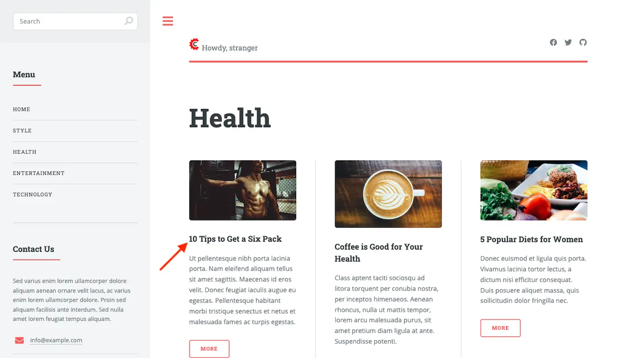
Notice above that there are three articles listed in the Health category page and it contains the
article that we are now going to disable. To disable the page 10 Tips to Get a Six Pack, open the
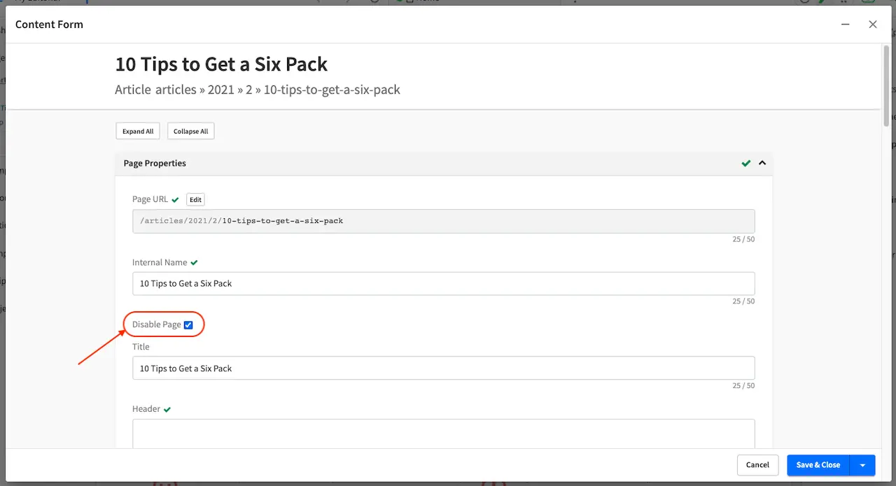
Sidebar, then navigate to /articles/2021/2/. Click on the three dots next to the article then select
Edit, which will open a form allowing us to edit the article. Once the form opens, put a checkmark
on the Disable Page field under the Page Properties section then save your changes.
Preview the Home page and click on the Health category on the left-rail. Notice that the article we
disabled is not listed in the preview. Note too that on the Sidebar, the article we disabled will have
a red circle with a slash on it indicating that the page is disabled.
Finally, we’ll publish the changes we made to the article and verify that in delivery, the article we
disabled is not available/accessible. To publish your changes, on the Sidebar, click on the three dots
next to the article we just edited, then select Publish. A Publish dialog will appear. Check the
information in the dialog and make changes as required, then click on the Publish button.
In your browser, go to localhost:9080?crafterSite=my-editorial to view your project in delivery. Next,
we’ll view the Health category page and verify that the article 10 Tips to Get a Six Pack is not listed: